Programming Design Systems
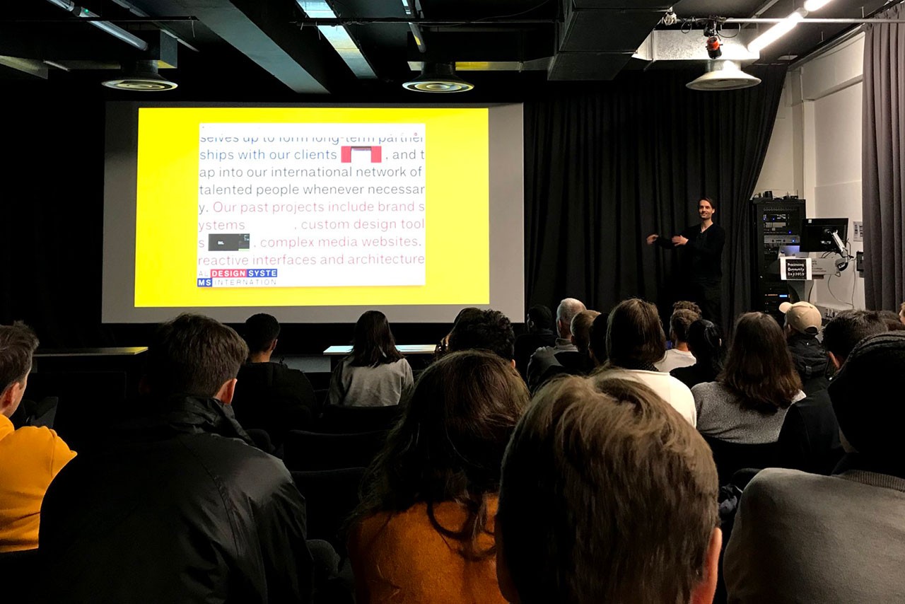
Hello everybody. Before I begin, I would like to say that I am thrilled to be a part of this event. I have spent a lot of my time since 2012 teaching designers and artists to code, and it is really wonderful to see an event like this happen. I am hosting Processing Community Day Copenhagen next weekend, so I am hoping to learn a lot of stuff and meet a lot of interesting people today. So a big thanks to Joel and the team for inviting me here.
Today I want to talk about my book
Programming Design Systems as well as my new design practice Design Systems International.
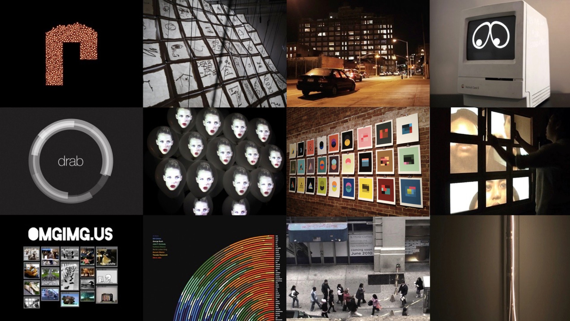
But first, let me briefly introduce myself. My name is Rune Madsen, and I first of foremost think of myself as a designer who just happens to use programming languages to build the kind of products that I care about.
My work tends to span a few categories, from the more artistic installation and gallery work, to the professional (I used to work at the New York Times and as a Creative Director for O’Reilly Media), and I have been teaching at New York University since 2012, recently for three semesters in Shanghai. But I think the common thread in all of this is the merging of design and code.

I recently co-founded what we call a deeply technical design studio named
Design Systems International with my talented designer friend Martin Bravo , where we work hands-on with many of the ideas that I am going to talk about today. I will show some of our work at the end also.
So that is a little bit about me. Before I begin, I was wondering if we can do a quick headcount. How many of you have tried programming before? How many of you are students? And how many of you consider yourself designers? Thanks a lot, that is always good to know.
Why Programming Design Systems?
I want to begin by spending some time talking about why I am writing this book. From 2012 to 2018, I was teaching at the Interactive Telecommunications Program (also called ITP), which is an almost 40-year old graduate program at New York University that very much shares the same values as the Processing Foundation: To make learning how to program accessible to communities that normally do not feel included or think of themselves as technical. It is a very diverse graduate program both in age groups and in the fields represented, and we are proud that the student body is majority women – which is rare for a program focused on programming languages and electronics. It is also home to Daniel Shiffman from the Coding Train YouTube channel who some of you might know.
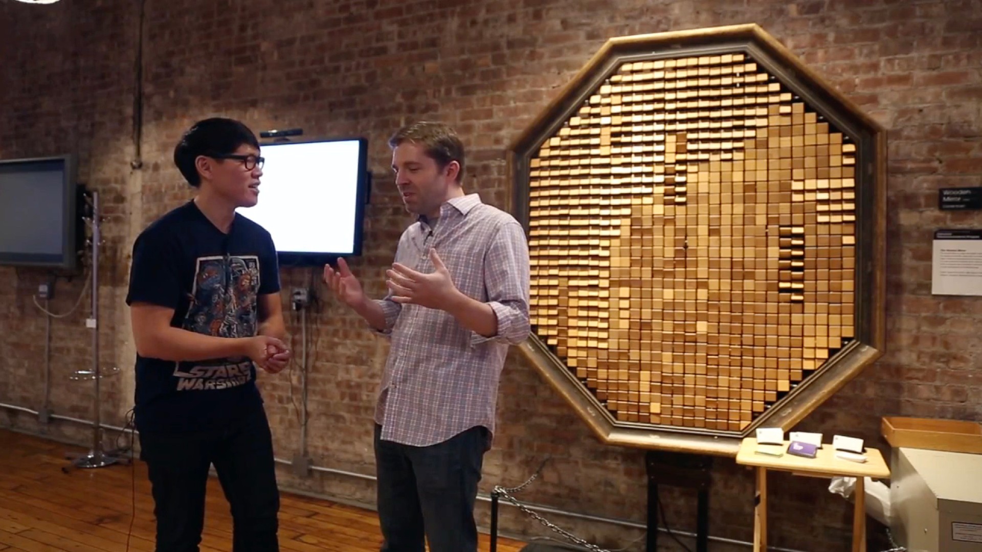
The way we think about the computer at ITP is quite different than that of a traditional engineering program. We teach hard skills, but only because our students need them in order to make the kind of creative projects they care about: They want to learn P5.js so they can make an animated comic, or they want to learn Processing so they can make a generative poster that looks different every time you print it.
I really like this approach because in this way, programming languages become just another tool, a very powerful tool, that enable us to produce creative projects. And it gets us away from a world where we separate people into technical people who can program the computer on the one side and creative people who use their hands on the other side.
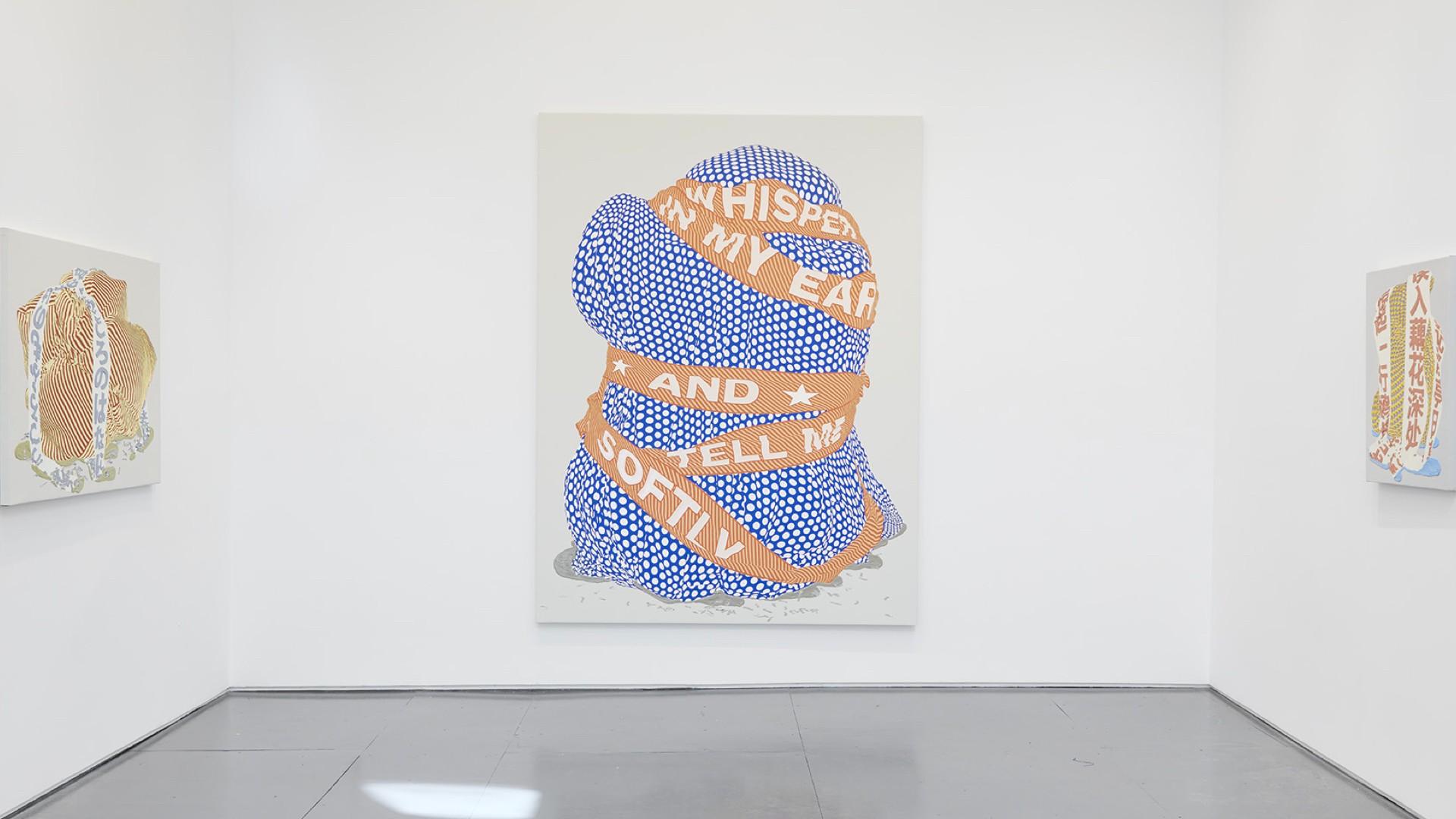
So if you are a painter and you were trained to use a bunch of tools such as pigments, brushes, pencils, charcoal, there is no reason why you should not also learn how to program and see where this takes you creatively. So we really try to lower the barriers to entry for people who normally do not consider themselves programmers. This also gives me a chance to show my talented friend
Alex Dodge, who uses lasercut stencils created from generative 3D models to create these very graphic, almost graphic design-like, paintings.
However, one thing that has struck me watching students get introduced to programming languages is that computers are such a powerful tool that if we don not really keep our eyes on it, the computer ends up taking all our focus.
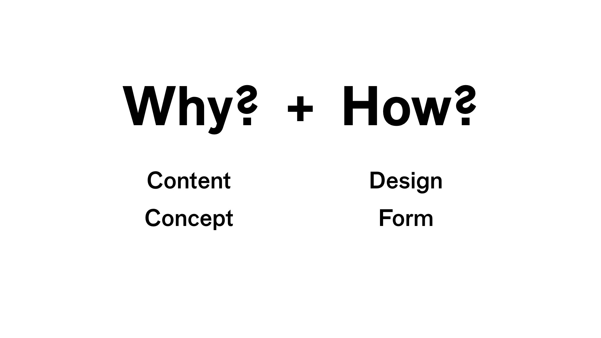
If we assume that every creative project is (in simple terms) made up of the why (the concept or the content) and the how (the design or the form), the creative coding community (or whatever we should call it) tends to focus a whole lot on the how.
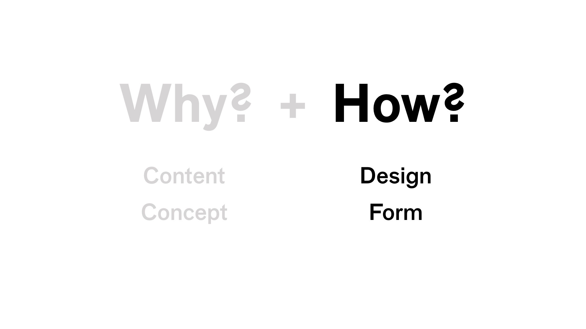
This means that we spend a lot of time on what a thing looks like and how it is made, and very little time asking why it should even exist in the world. I began noticing this in my classroom where students would mostly comment on the technical sufficiency and visual style of a project, and rarely on the concept. I think that is a very natural thing when you are introduced to a powerful tool, but it also means that we completely lose our connection to fine arts education.
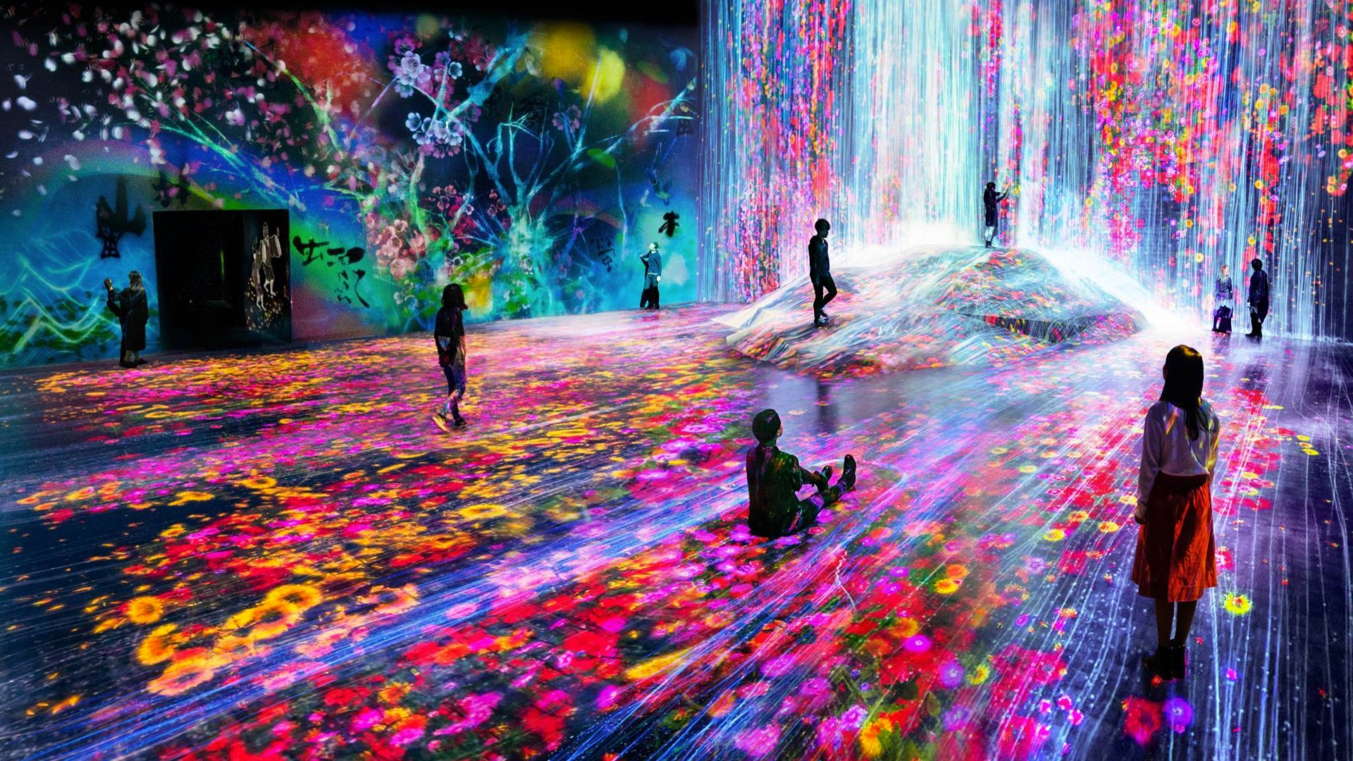
If you have ever been at an interactive museum exhibition, waving your arms to make flowers grow, wondering what the purpose is, ...
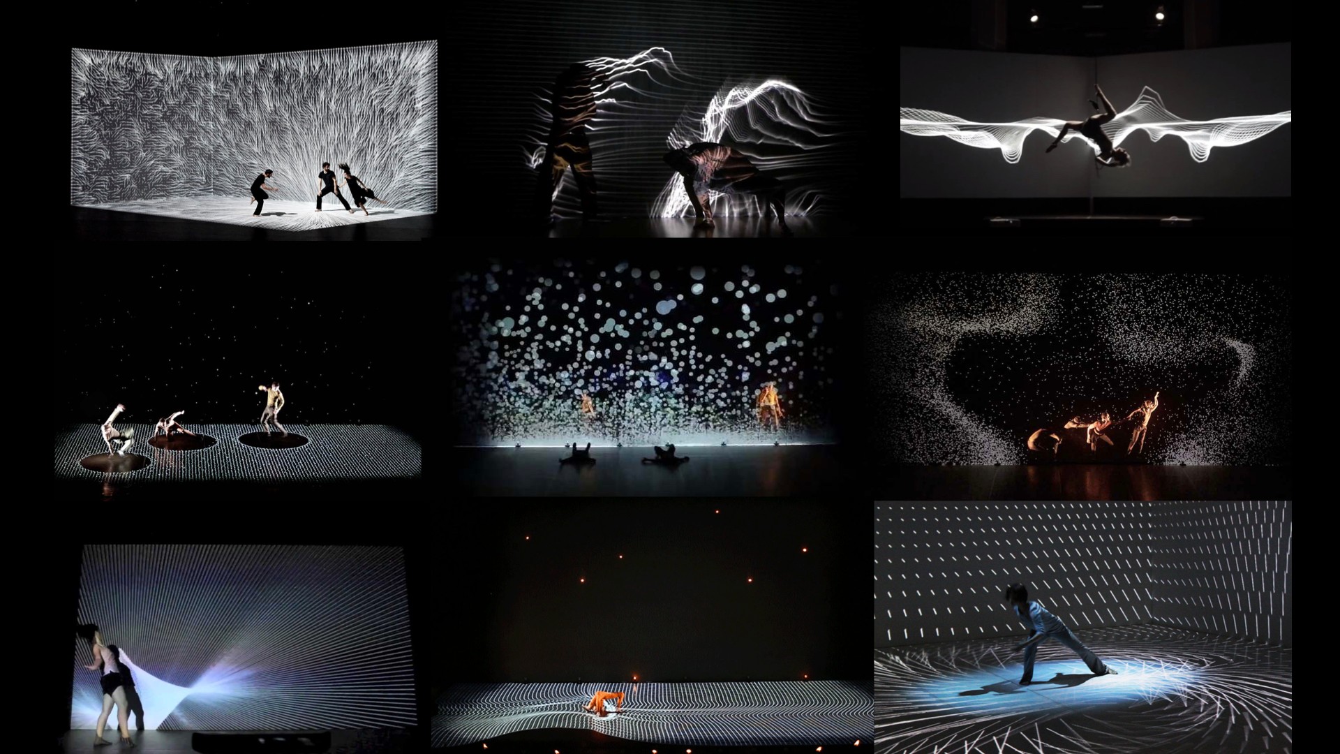
... or seen this monoculture of dance performances with motion-enabled projections that makes you wonder whether it is us using the computer or it is the computer using us, you know what I mean. It is not that these projects are bad, but I do not get much satisfaction from them.
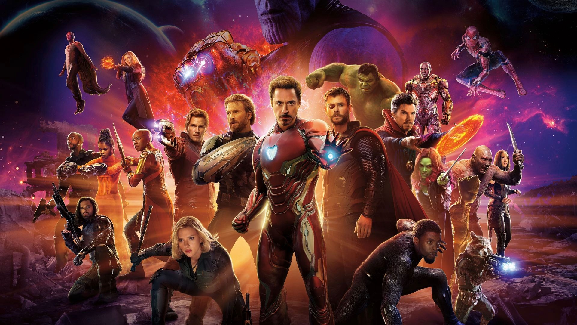
You can compare this to the new Marvel movies. I wondered for a long time why they are unbearable for me to watch. I recently heard Douglas Rushkoff say in podcast about another TV-show,
“It went through me like cheese doodles. It is constructed for me to keep eating it […], but it actually does not deliver any nutrition”.
So I wanted to teach a class that could teach code and concept at the same time.
Why Graphic Design?
So why focus on graphic design? I think there are many reasons why such a book should exist.
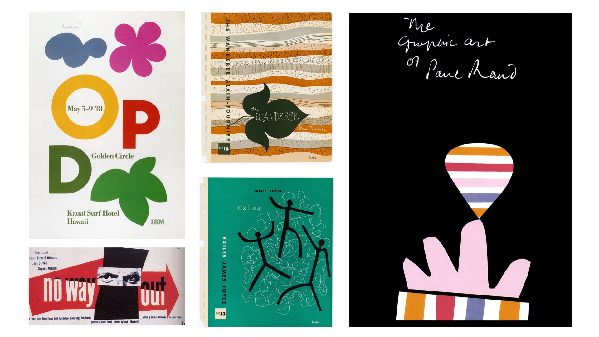
My primary reason is that what graphic design products looked like 25 years ago is not at all what they are today. We used to live in a world of static design products where the word design described most of the production process. If you are making a poster, the final product is really not that much different from the proposed design.

But today most design products are digital and created in software, and the visual design is just a small part of what makes up the design product.
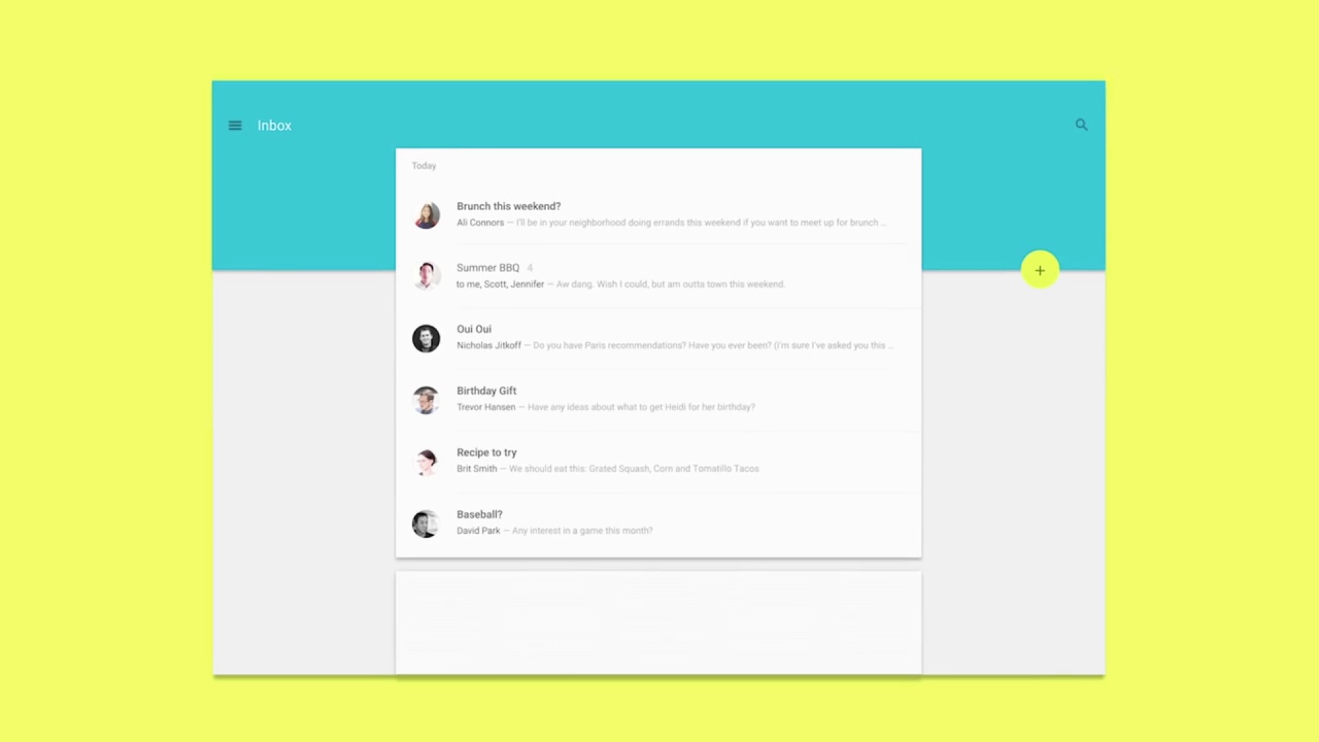
What makes a digital design product good is, yes the visual design, but also all the things that make it come alive: animations, loading of live data, haptic feedback, etc. And the problem is that none of this can be designed in a traditional graphic design tool. All of this requires the use of programming.
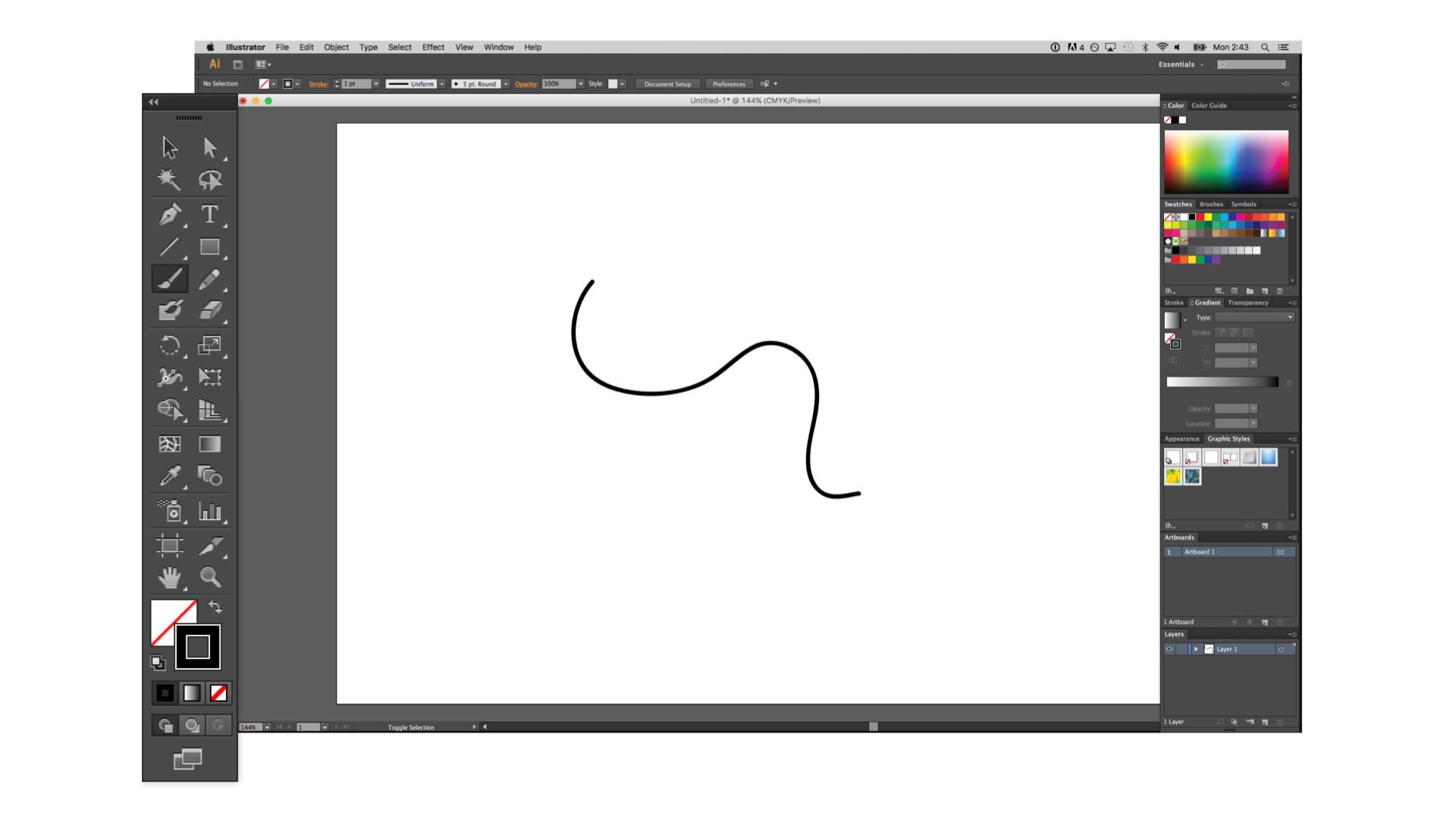
If you look at the tools that graphic designers use, it is apparent that it is a field built on manual work. Most of the tools in Photoshop, Illustrator, or sketch are entirely modelled on manual processes that came before the computer: The crop tool, the marquee tool. Even though you are doing it with the mouse, it is still a manual drawing process. So we know that traditional design tools are very bad at prototyping complex systems.
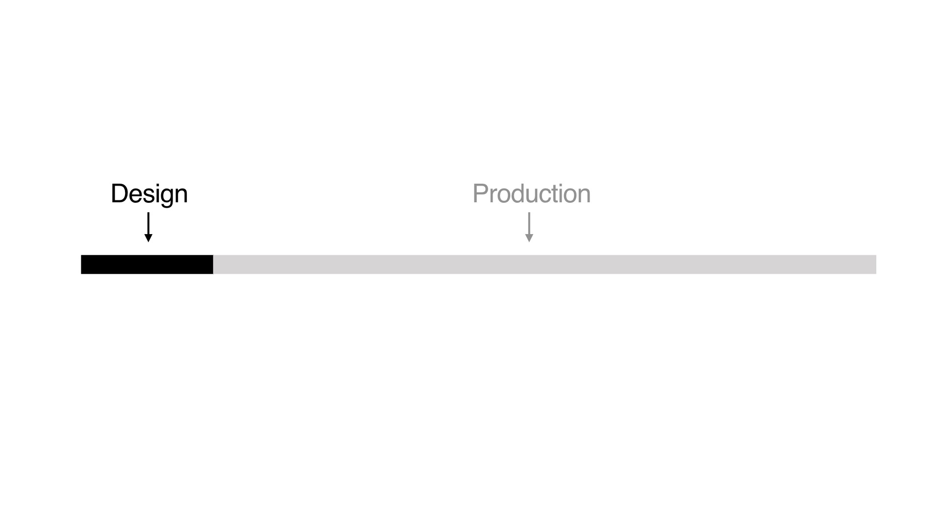
So if you insist that designers should only use traditional design tools, you end up defining design as a very small part of what it means to make something.
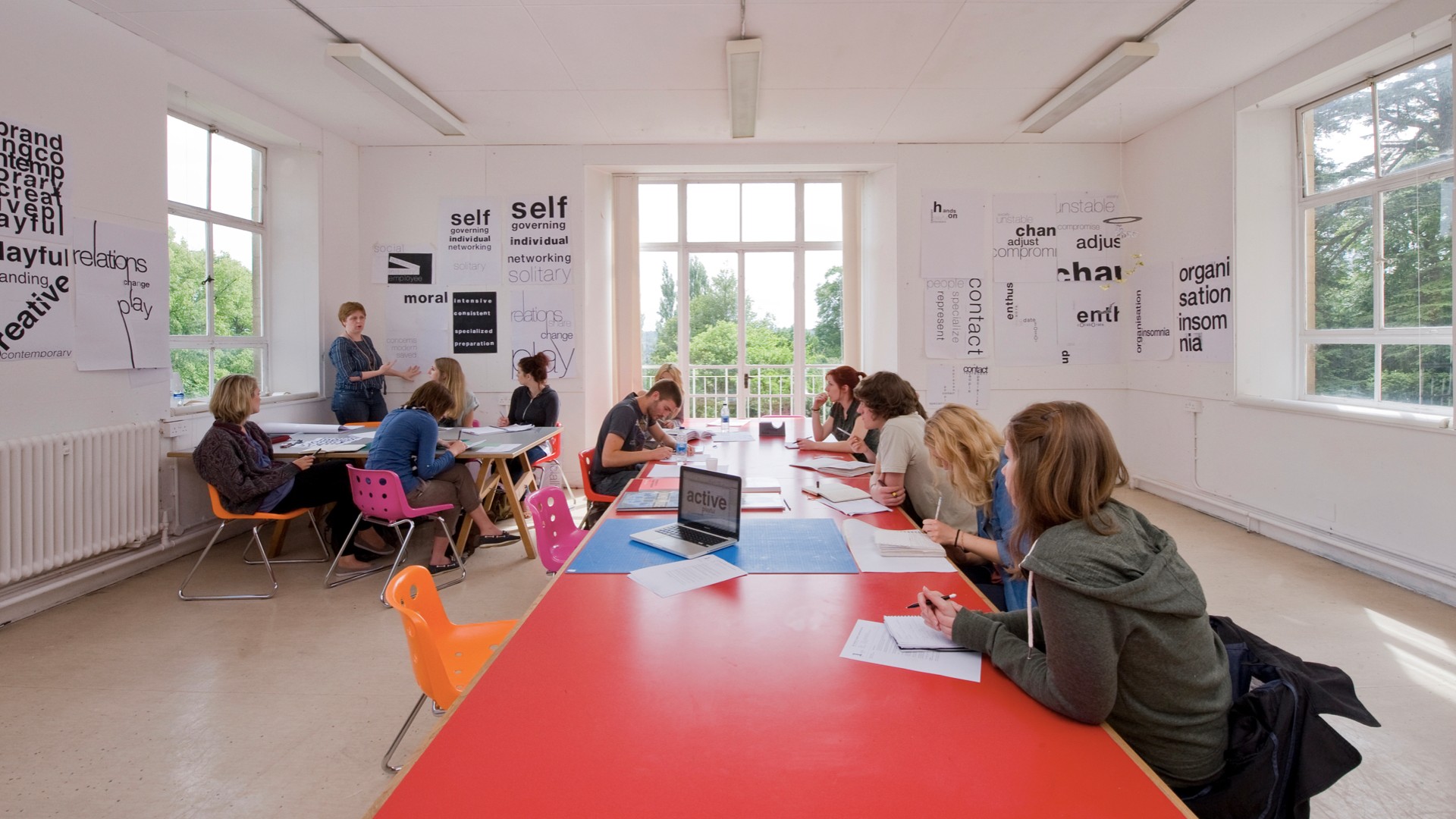
You would think that design schools would understand that this is happening and change their curriculum to keep teaching what they are good at, but expand their toolset to include new technologies. Unfortunately what seems to happen is that many design schools find it too hard to teach code, so they double down on this idea that designers should be creative people who come up with ideas, and then more technical people should implement them.
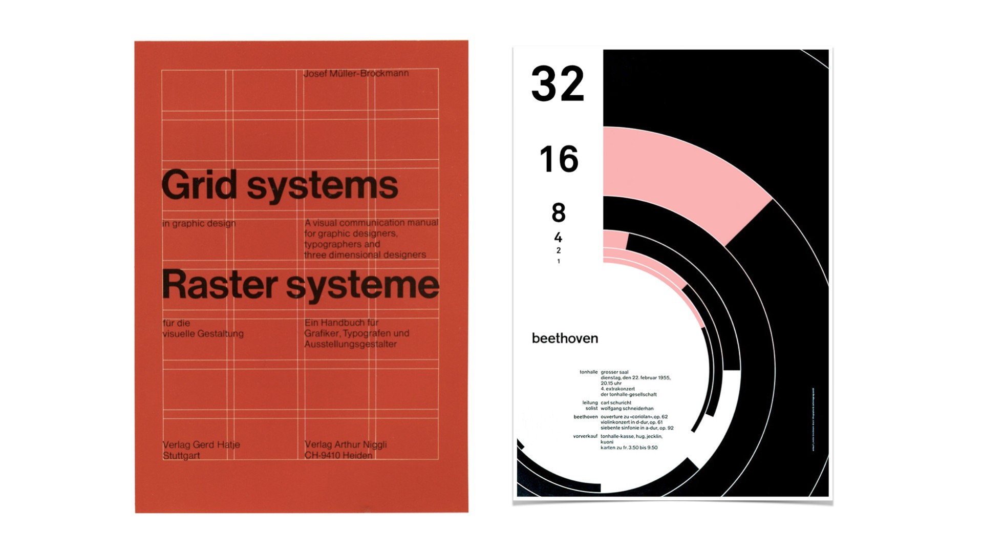
I think that is really unfortunate because it leaves us with an educational system where the design schools teach conceptual thinking but in a frame of mind where the designer is someone who makes posters and book covers, and technical schools that teach code but not conceptual thinking. I am off course generalising here, because there are many amazing art+technology schools, but I do think that a common problem here is that there is no foundational book that thinks about graphic design (shape, color, typography, layout, etc) in terms of programming languages.
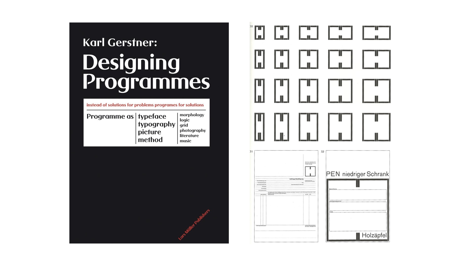
And that is really frustrating because the history of graphic design is full of books applying systems and rules to the design process. Even before the computer, designers were using algorithms to help them design better, so I find it particularly odd that the field of graphic design has not embraced these new tools.
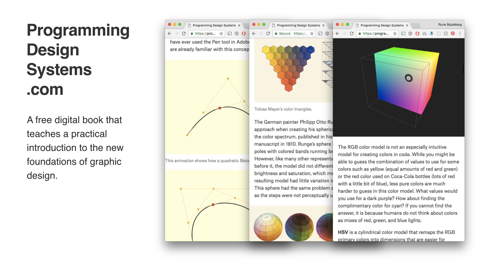
So that is why I am writing my book. The subtitle of the book is “A free digital book that teaches a practical introduction to the new foundations of graphic design”, and it is available for free on
programmingdesignsystems.com .
The very brief concept is that it is actually a book about the fundamentals of graphic design. So I talk about how to effectively communicate concepts or content with shapes and color. It just happens to be that when I explain how to draw things, I do not use traditional static design tools such as Photoshop or Illustrator but p5.js. The focus is on the why?, but I use code as a way of showing the how?. And I have finally come to a point where I have written enough chapters that I can talk about them in detail, so I would like to run through each part of the book and explain the ideas.
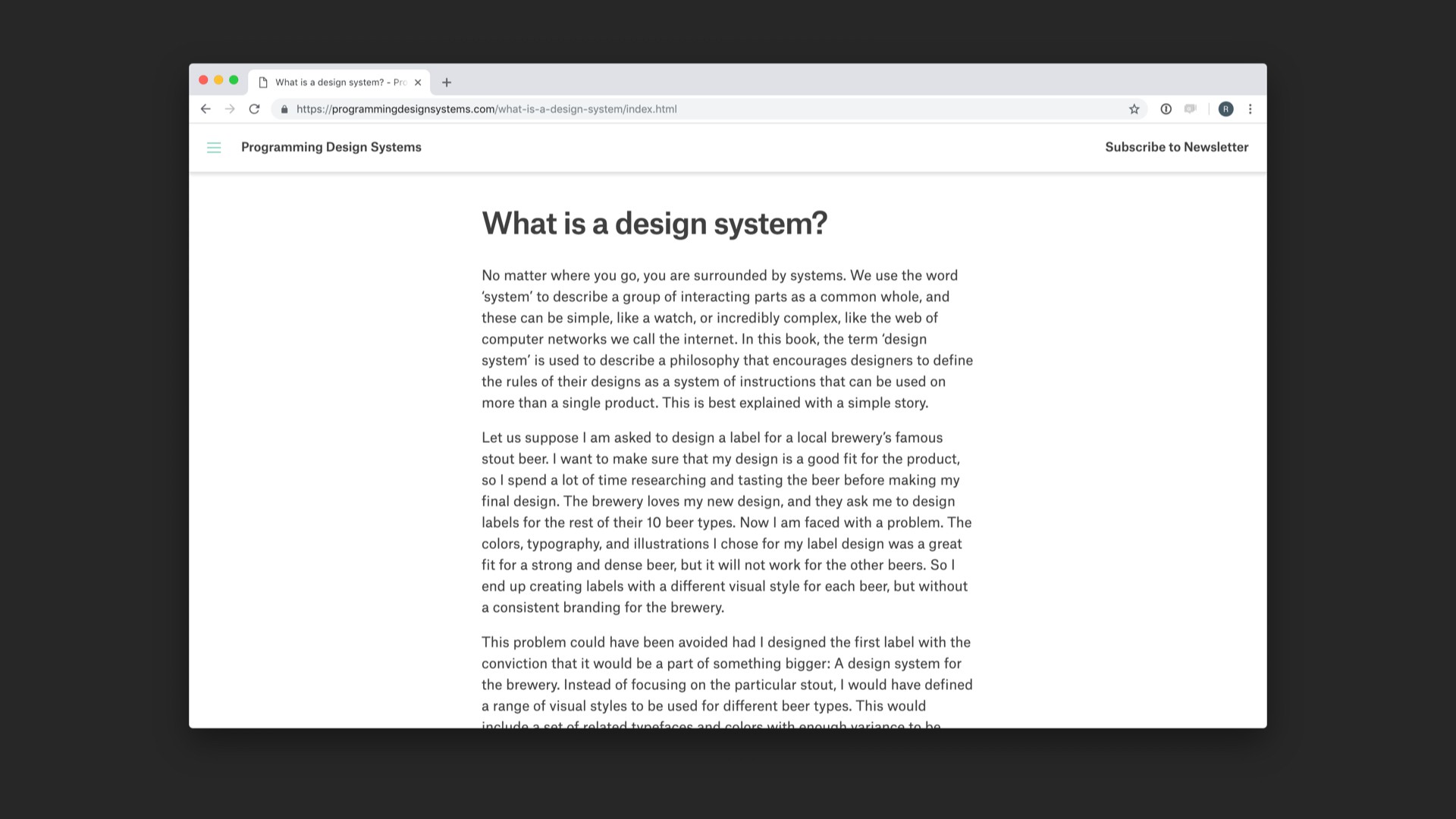
The book starts with an introduction and foreword titled What is a Design System?, to help readers understand this cryptic word that has become so trendy over the last couple of years. If you take anything away from my book, it is that designers should start thinking in what the American computer scientist Donald Knuth calls meta-design.
![Quote shows on screen. 'Meta-design is much more difficult than design; it's easier to draw something than to explain ho to draw it. [...] However, once we have successfully explained how to draw something in a sufficiently general manner, the same explanation will work for related shapes, in different circumstances; so the time spent in formulating a precise explanation turns out to be worth it.' By Donald Knuth, The METAFONT Book.](/static/60276e8b02322d1e3f8a9b504245c3a5/9d72c/slide-028.jpg)
Reads quote. This idea that instead of just drawing something, designers should explain to a computer, in code, how to draw it, is really powerful. The way I demonstrate this idea in my book is with a simple example.
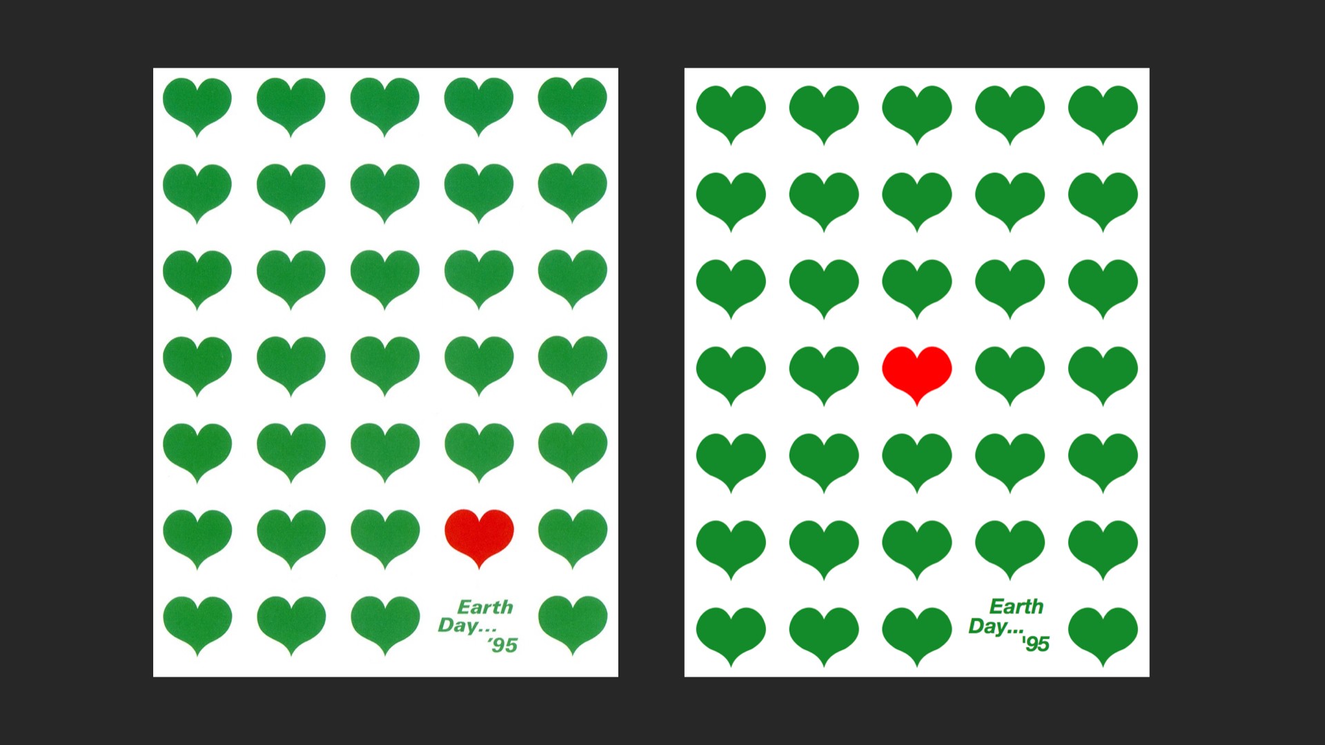
Imagine a poster (to the left) designed by a famous graphic designer, in this case Paul Rand. This is designed entirely by hand, possibly in an early version of Photoshop or Quark Express. But even though this poster was done by hand, there is a very clear systematic structure to it: Repeat green hearts in a grid across the page with equal spacing between them. Turn one heart red, and replace one heart with a title. We can take that idea and implement it in p5.js, shown to the right. As you can see, there is not much of a difference between the two versions.
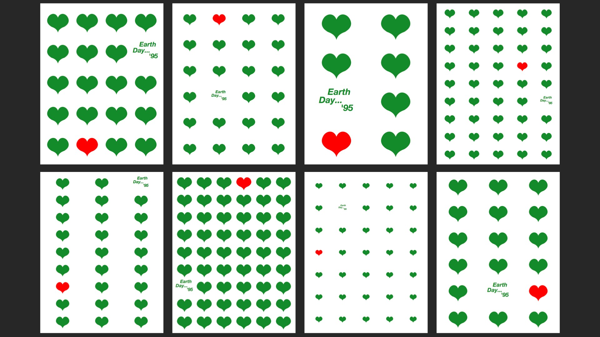
However, once you have implemented it in p5.js, you can easily try out variations of the same idea: What if we had less rows and larger hearts? What if it was really dense spacing? Every iteration of this would take equally long to do by hand, but with the random function in p5.js, you can have a different poster whenever you run your code. I think that is such a powerful idea: It is not only that designers should use code to build digital products, it is also that designers can write these small personal tools that allows them to explore an idea quickly.
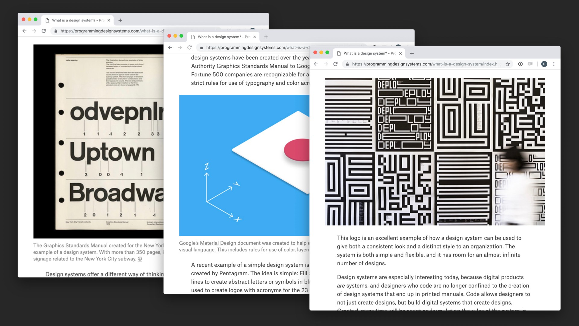
I also trace these ideas of design systems back through history, from Graphics Standards Manuals from the 1970’s to today’s design systems such as Google’s Material Design and more interesting dynamic branding projects.
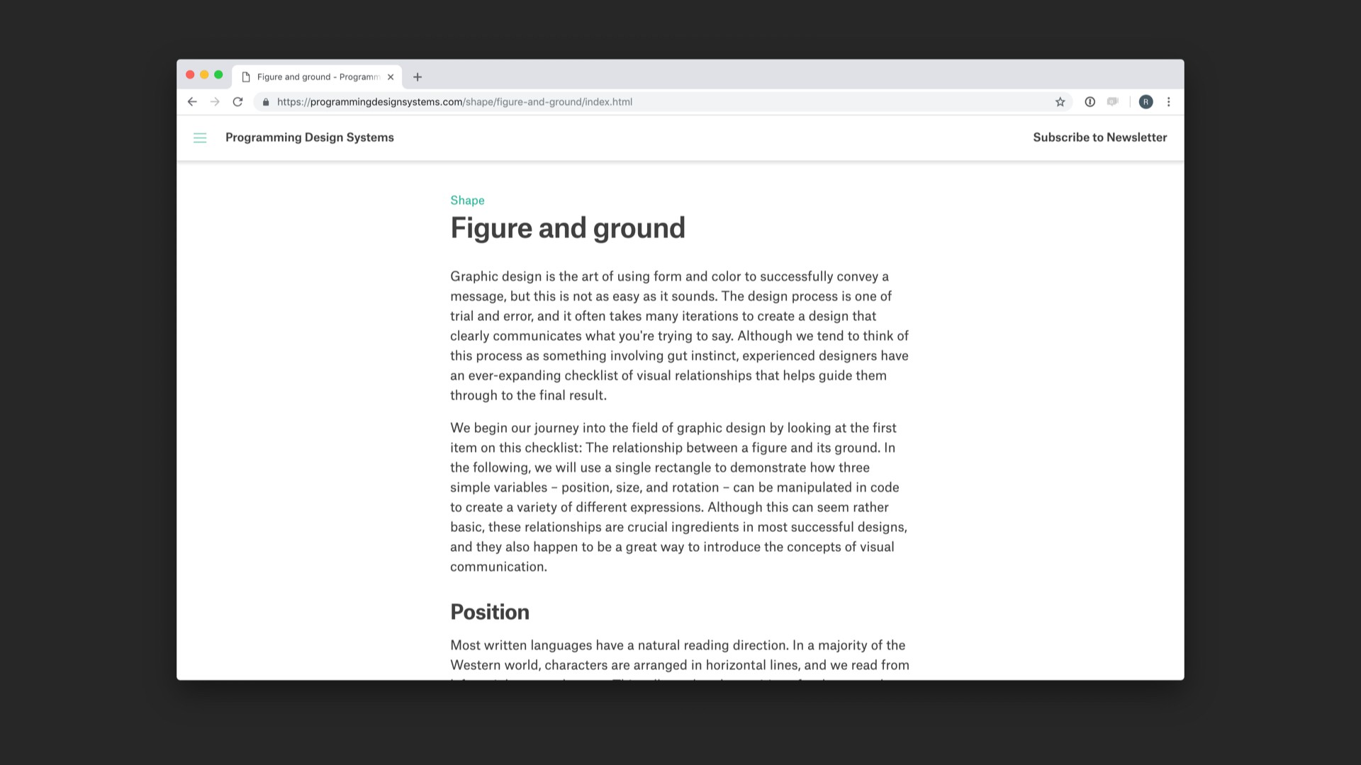
The first part of the book is devoted to the most fundamental thing is graphic design: Using shapes to convey meaning. There are a number of chapters that introduce these ideas, the first one being Figure and Ground where I talk about ...
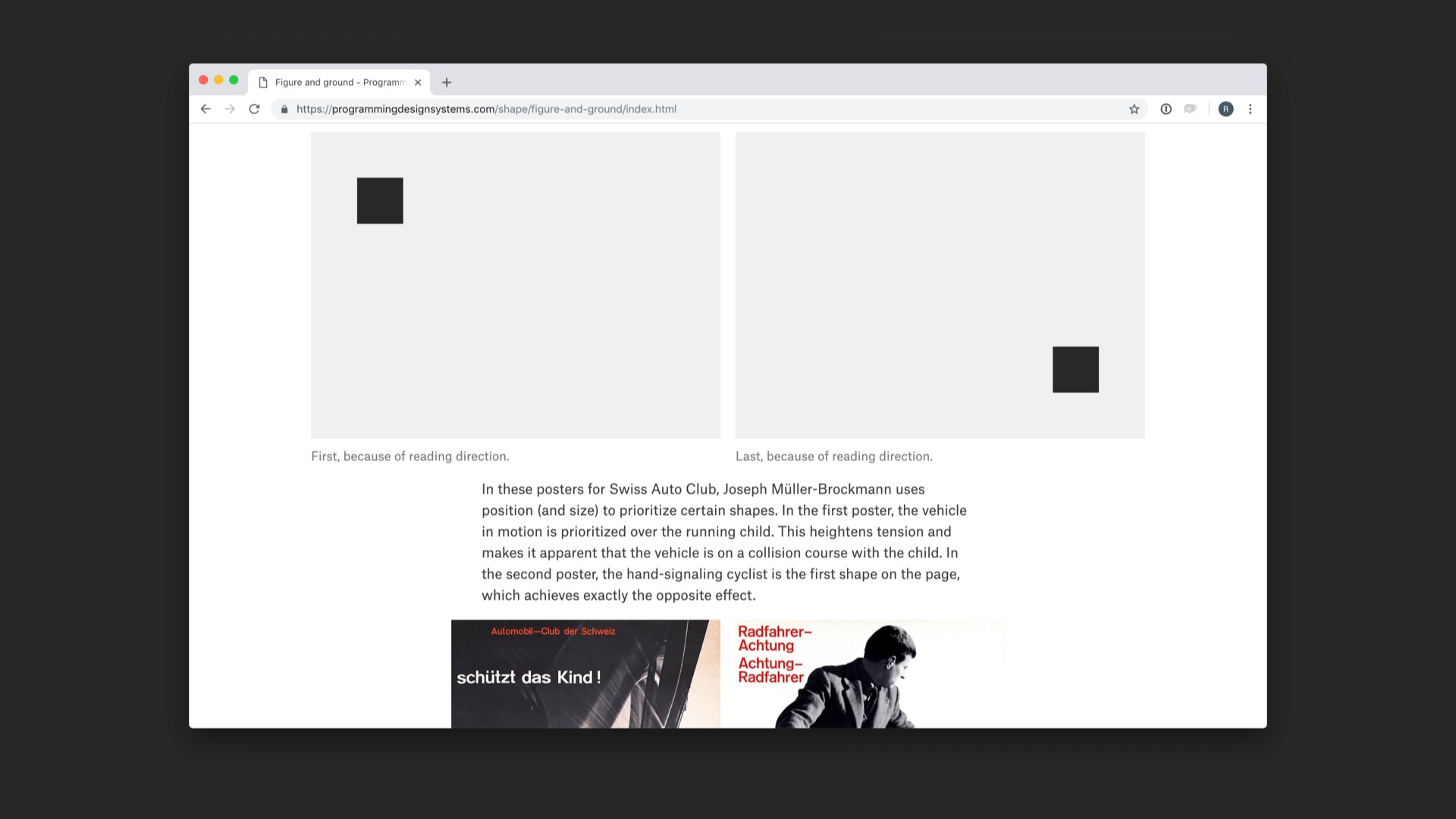
... using position, size, and rotation to communicate a message.
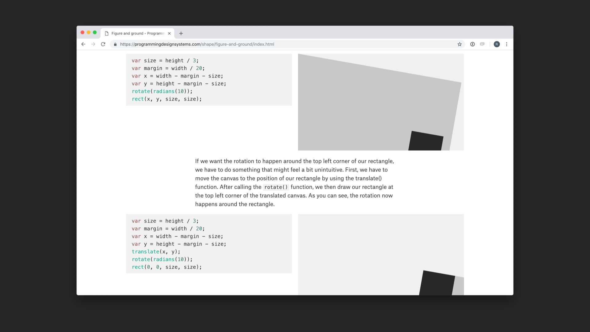
The difference with my book is that it is all using p5.js, so it is both an introduction to graphic design and to JavaScript.
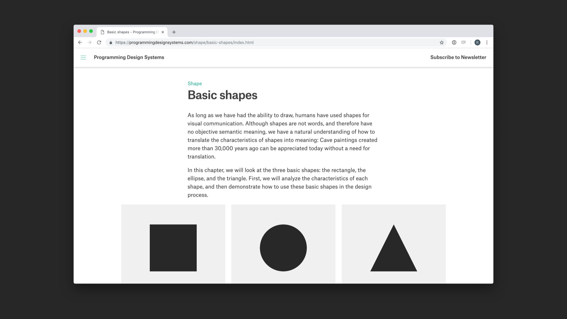
I then move on to talk about basic shapes, and break down the characteristics of each of them.
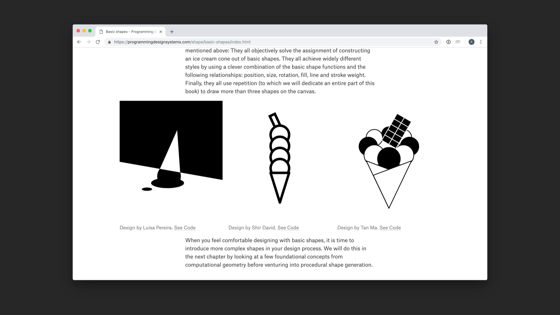
I try as much as possible to show work from my students. Here it is my now famous Ice Cream Cone exercise, which is in the book too, where students have to draw an ice cream cone in black and white using only an ellipse, rectangle, and triangle once in their code. So if they want more than three shapes, they have to use for-loops to achieve it. One thing that I found early on is that graphic design books are often very confusing to students, because they introduce a huge set of techniques or categories, which makes the students think that learning to be a good designer is about memorising all these categories that the author made up. So I start my book very constrained –in the beginning using only black and white and a few shapes– and make readers learn how to use these before moving on to something more complicated.
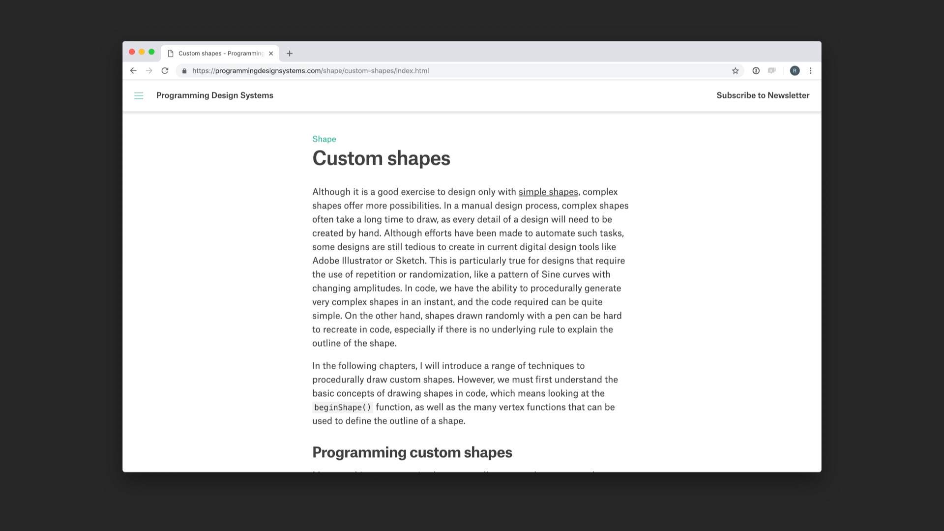
But then slowly I introduce more concepts, such as drawing custom shapes in code with the beginShape() and endShape() functions of p5.js. This requires us to look at ...
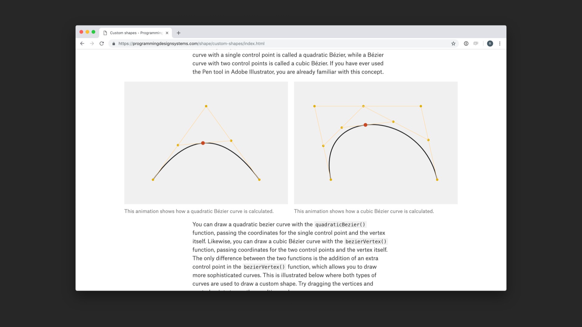
... the concept of Bezier curves and how to use them in code.
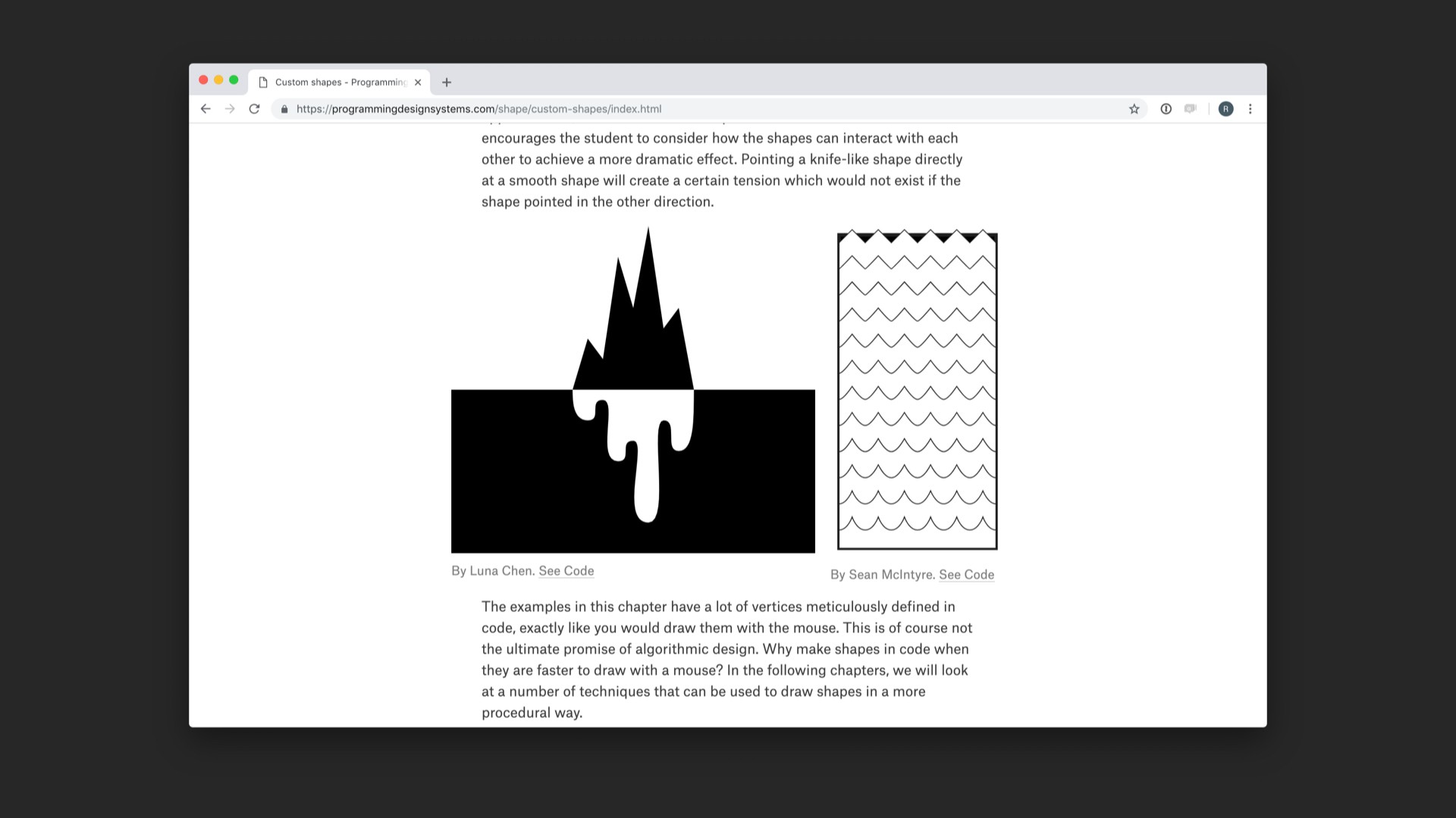
Every chapter of my book has an exercise so the reader can practice what is taught in the chapter. This is the Wet and Sharp assignment, with some examples of student work, where you have to use the beginShape() and endShape() functions to make a design that symbolises the words wet and sharp.
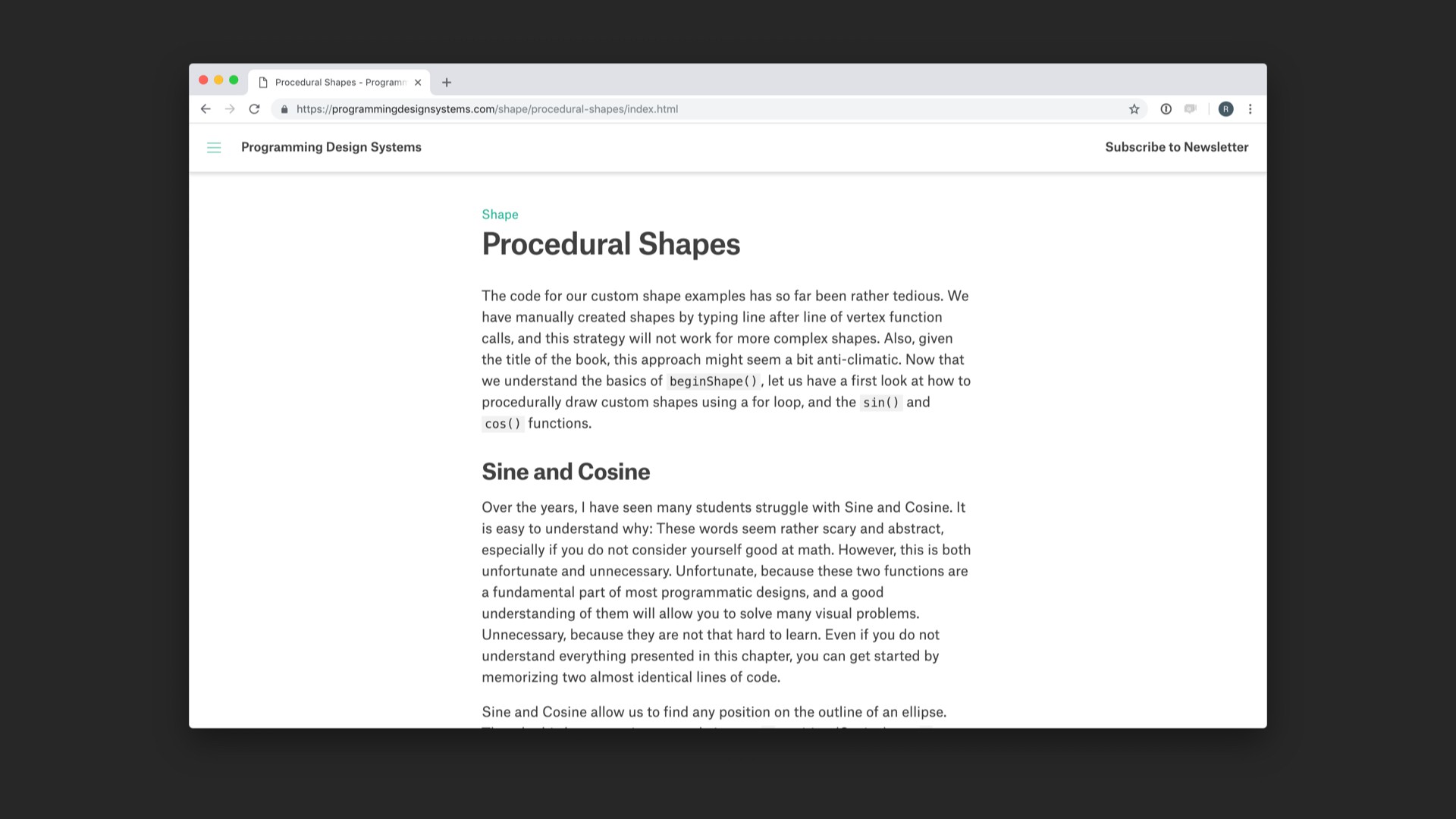
And then finally, as the basic ideas are understood, we start jumping into the really fun stuff: How can you take advantage of the fact that we are using a programming language to create shapes that would take a long time to draw by hand. So we talk about for-loops and ...
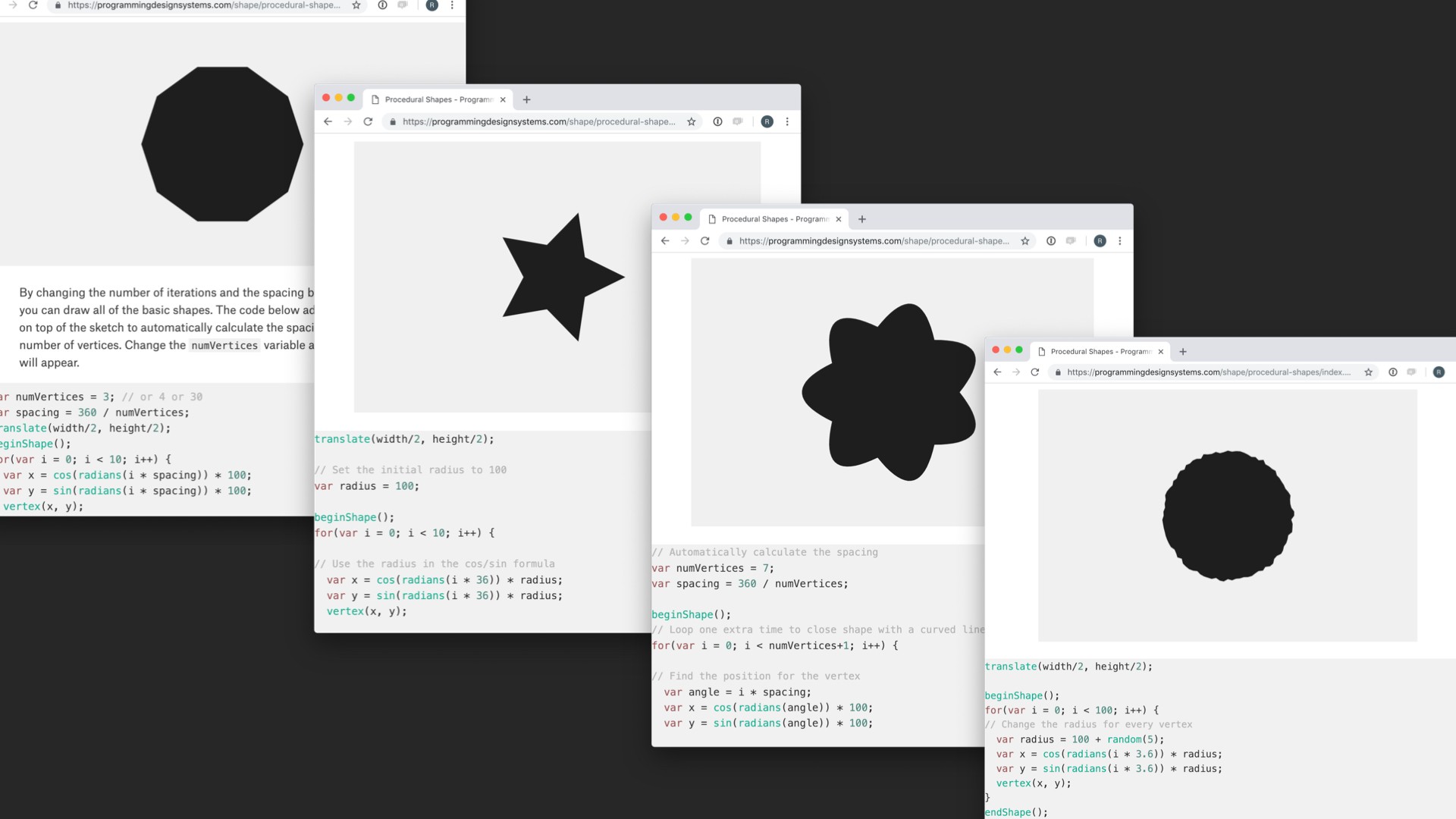
... how to draw a lot of different types of shapes with only a little knowledge of loops and sine and cosine. I spent a long time figuring out how to explain sine and cosine, so if you were really bad in math (like me), I encourage you to read it and tell me what does not make sense. That is the end of the first part of the book.
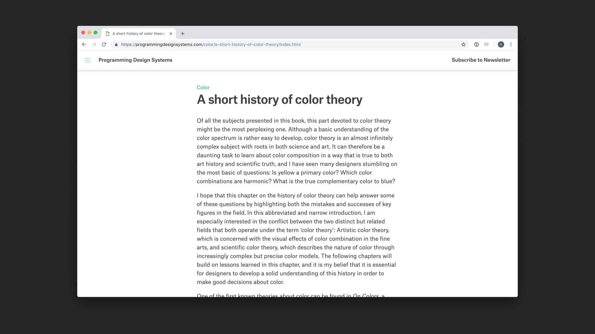
The next part of the book is devoted to one of my favorite topics, color theory.
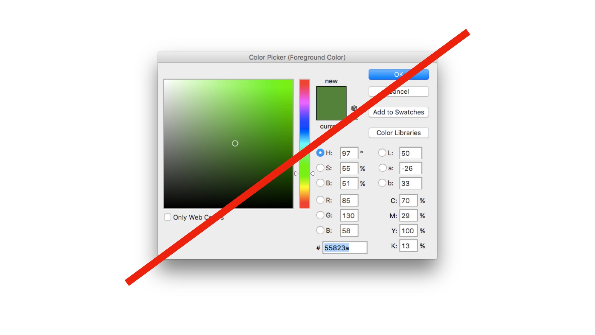
The idea here is that most of us think in color in terms of this thing, the color picker, which is actually a horrible tool for visualizing the color spectrum. To make color combinations that work, you have to think about the relationship between colors, and to know this relationship, you have to think about the color spectrum as a 3D model.
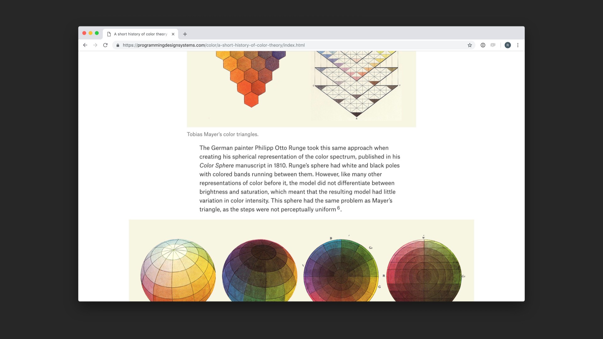
So the first chapter is dedicated to a history of color theory, how scientists and artists have argued about the nature of color, and what the current science tell us about concepts like color harmony – which I learned does not exist as an objective measure.
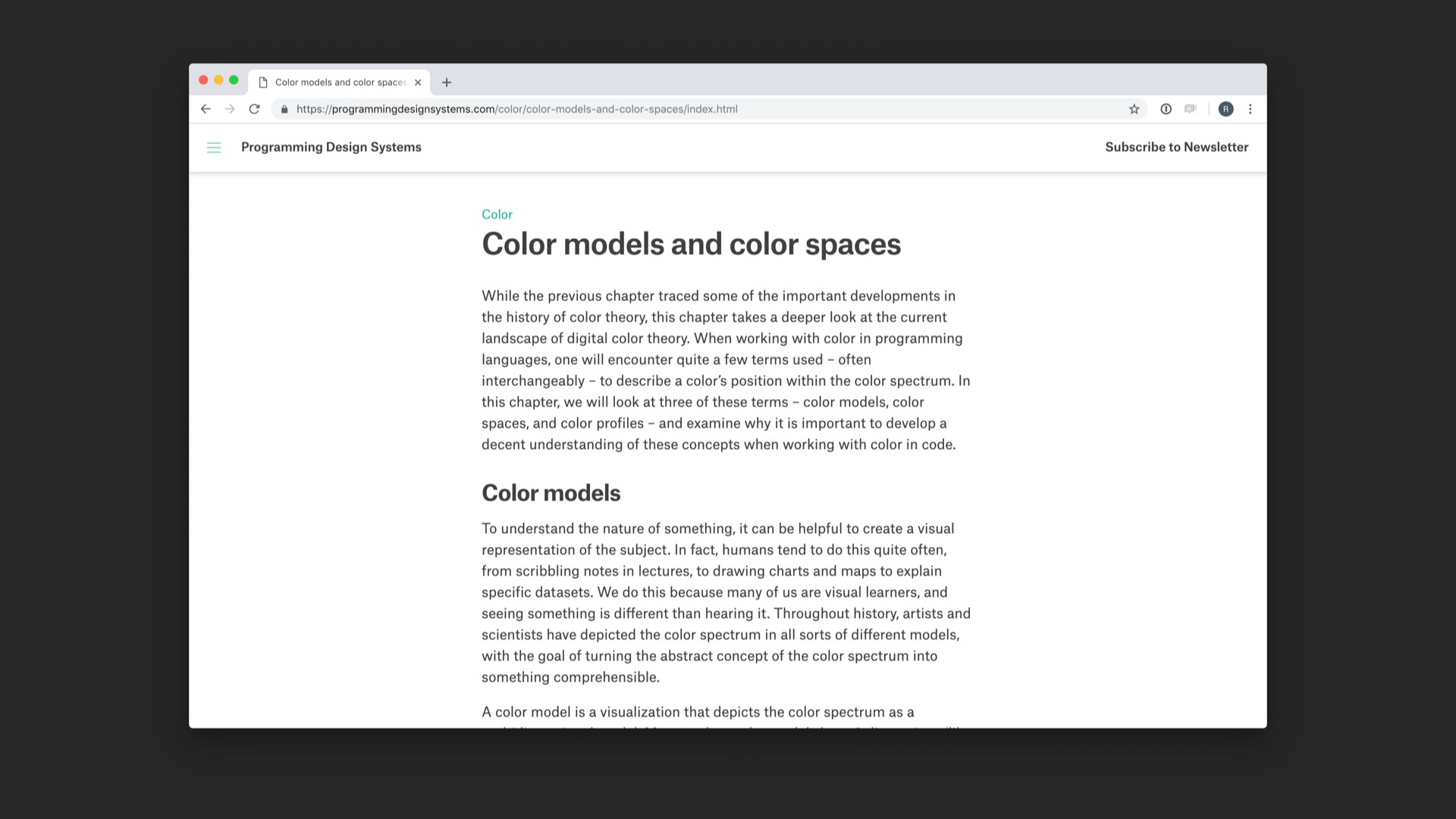
I then venture into the world of color models and color spaces.
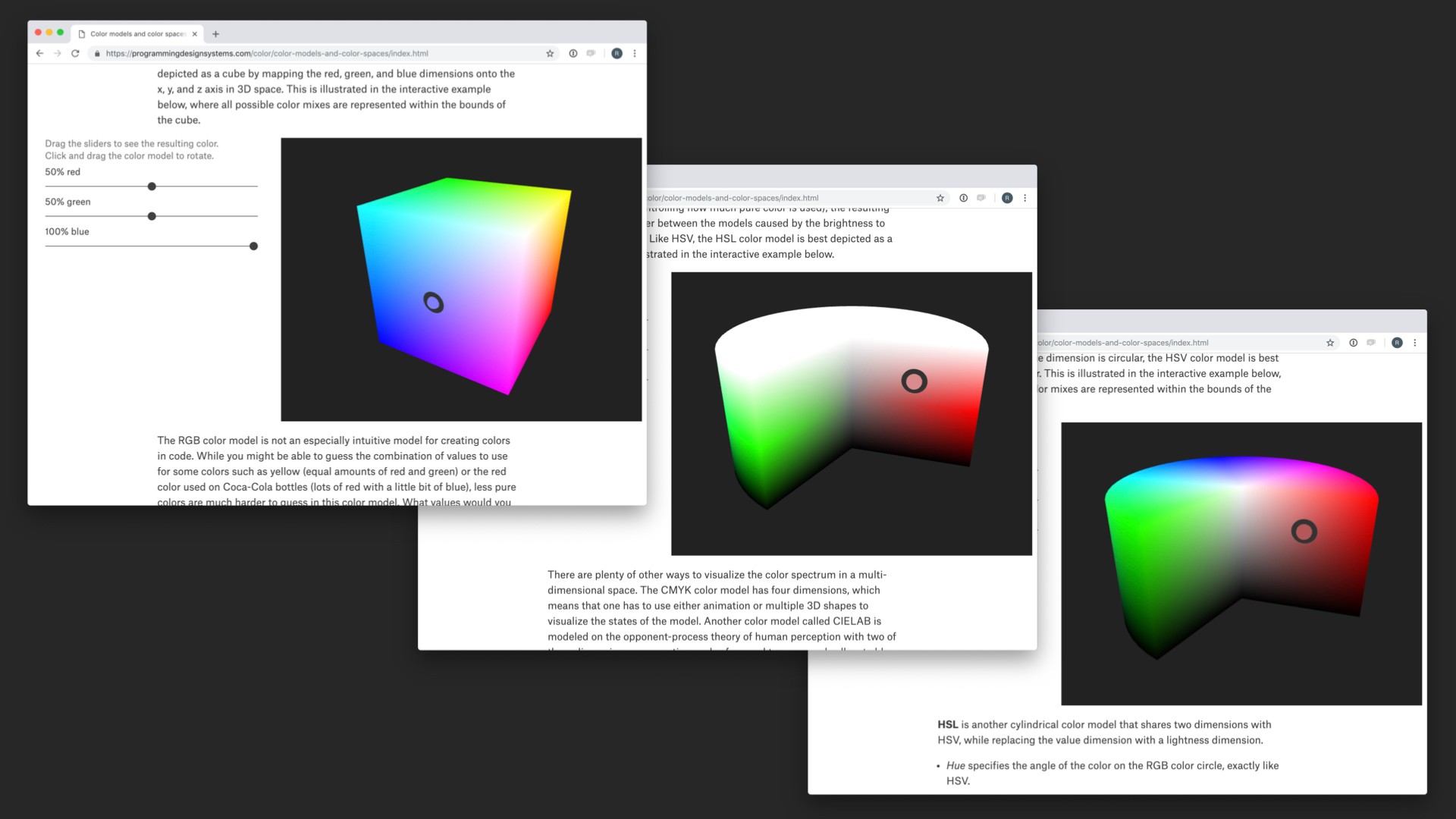
It is too complicated to explain here in detail, but the important thing is how you can stretch the color spectrum into all these different shapes, and some of these are very helpful if you are trying to do specific things in code.
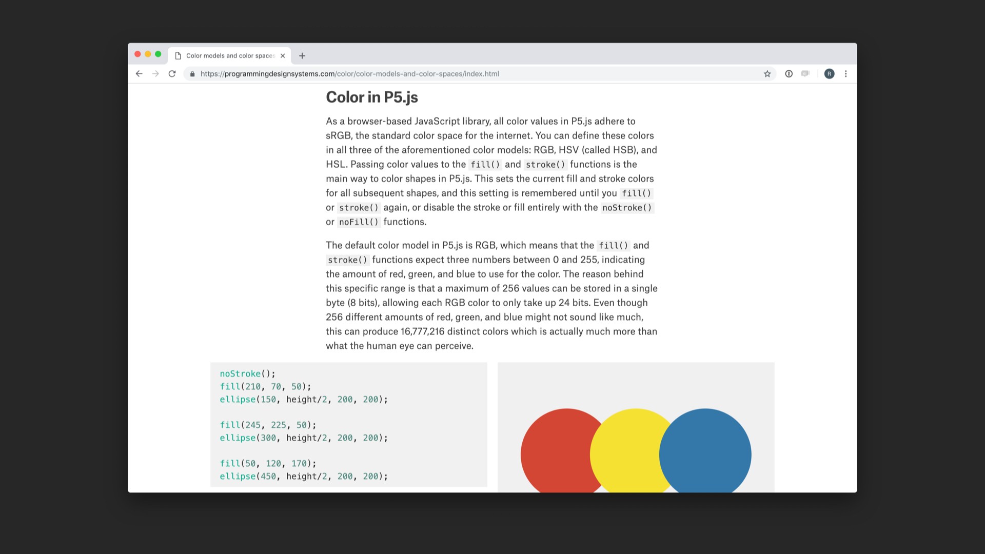
I then introduce the colorMode() function, which can be used to switch between color modes in p5.js.
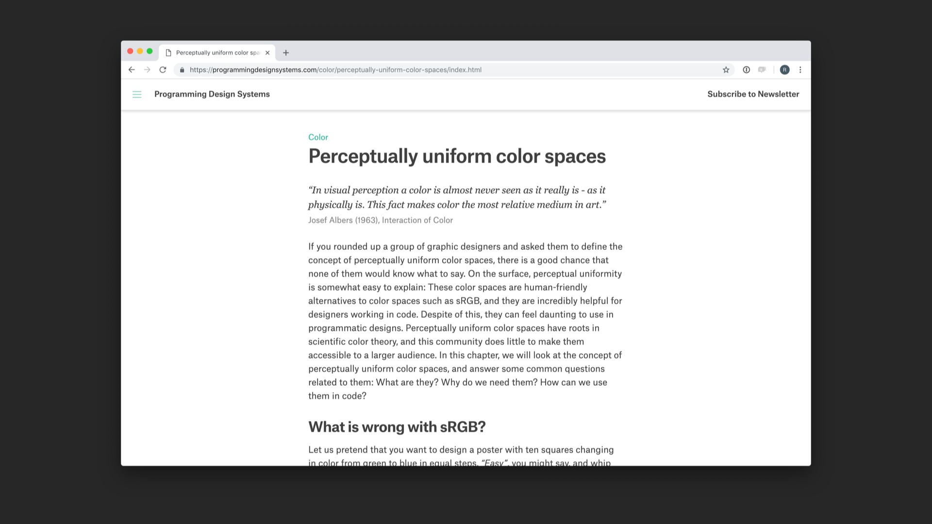
The chapter Perceptually Uniform Color Spaces explains how the human eye does not perceive the wavelengths of a color linearly, so if you want to draw a gradient that looks like it changes in a linear progression, you have to use what is called a perceptually uniform color space.
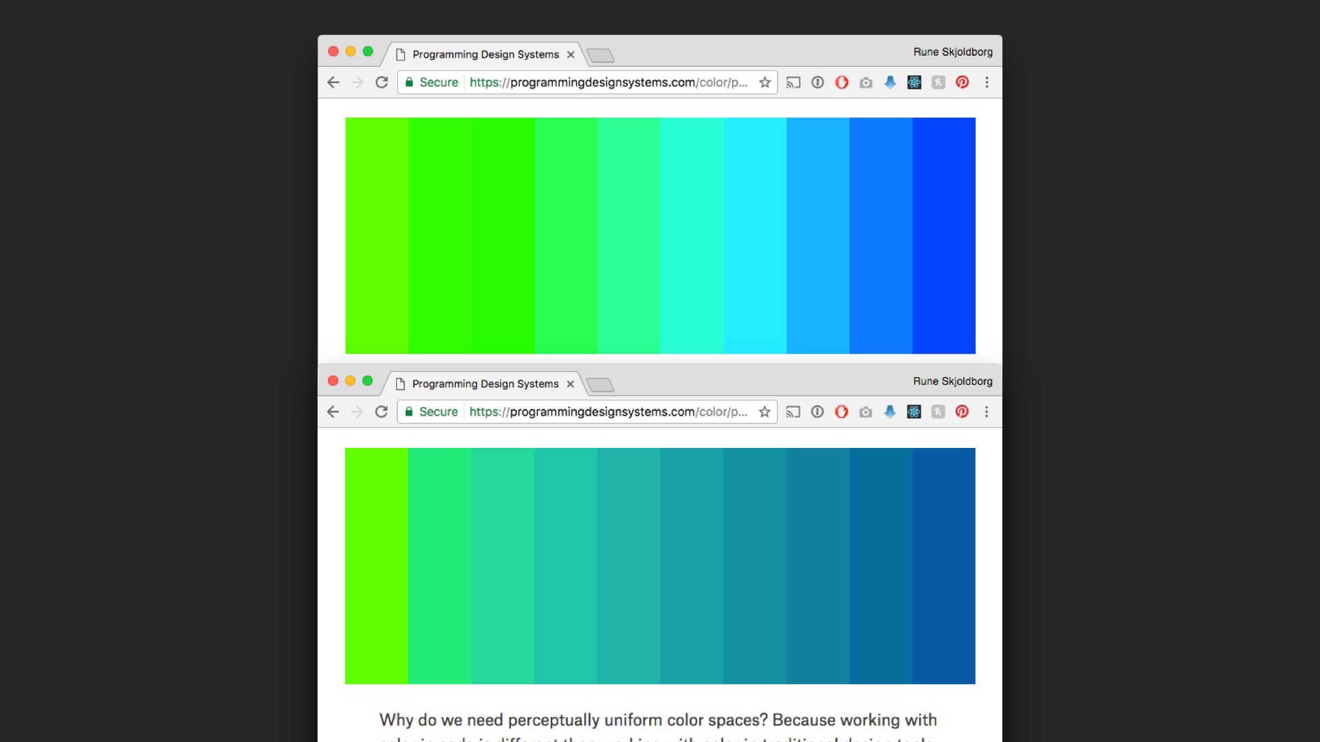
This example shows a fade between two colors with even distance between each color value in a normal color space (top) and a perceptually uniform color space (bottom). This is important to know e.g. if you are designing data visualizations so you are not lying with your color values.
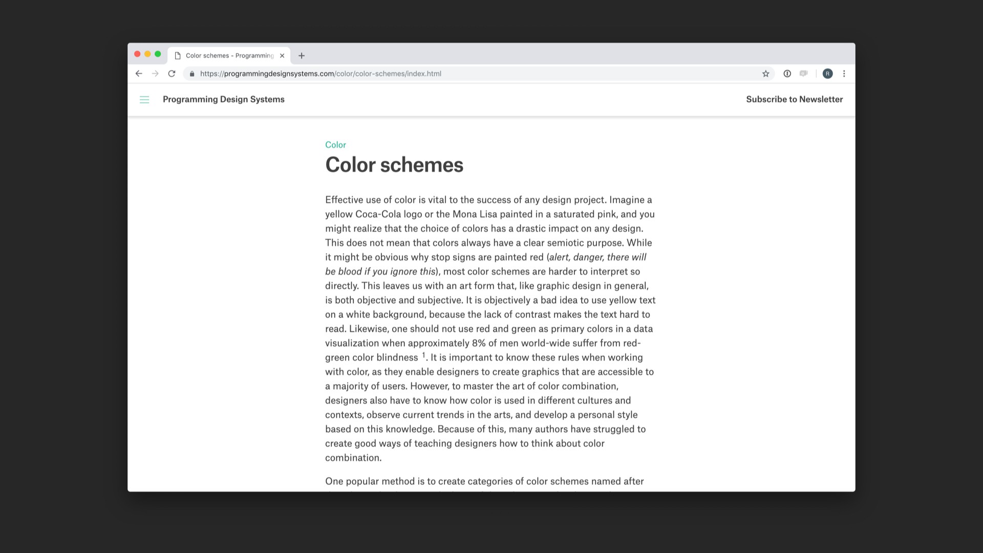
I think the most important color chapter is this one, which is on color combination. I did a lot of research around how artists and designers have thought about color combination, and I found that the way many design books talk about color schemes are actually really wrong.
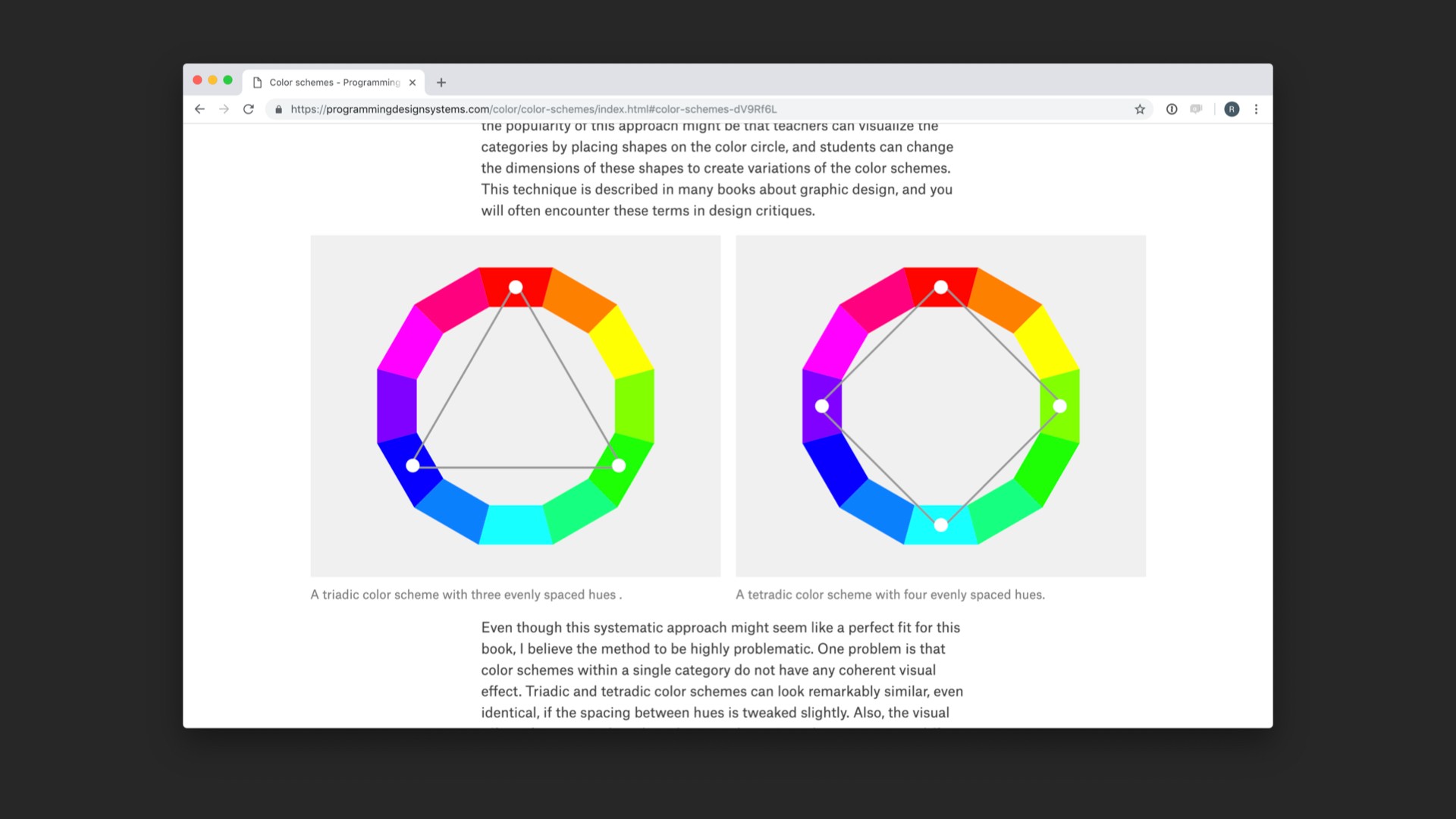
Many books will show you diagrams such as these, where a shape is laid on top of the color wheel to pick certain colors. But the problem is again that it ss treating the color spectrum as a flat space that only changes in hue, ignoring the two other dimensions of color: saturation and brightness.
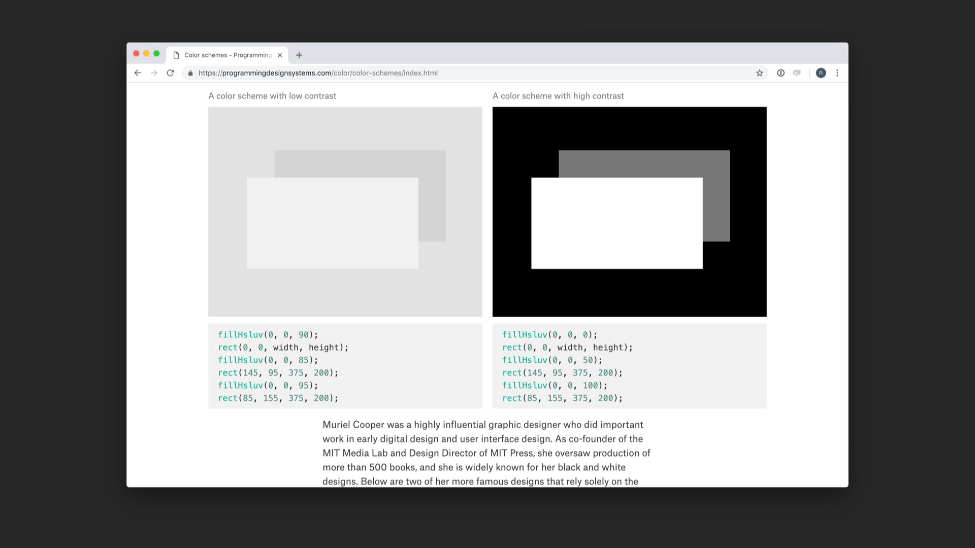
So my chapter on color combination talks about each dimension of color separately, starting out with brightness or lightness and how to create contrast in your designs by manipulating color values. Here it is brightness.
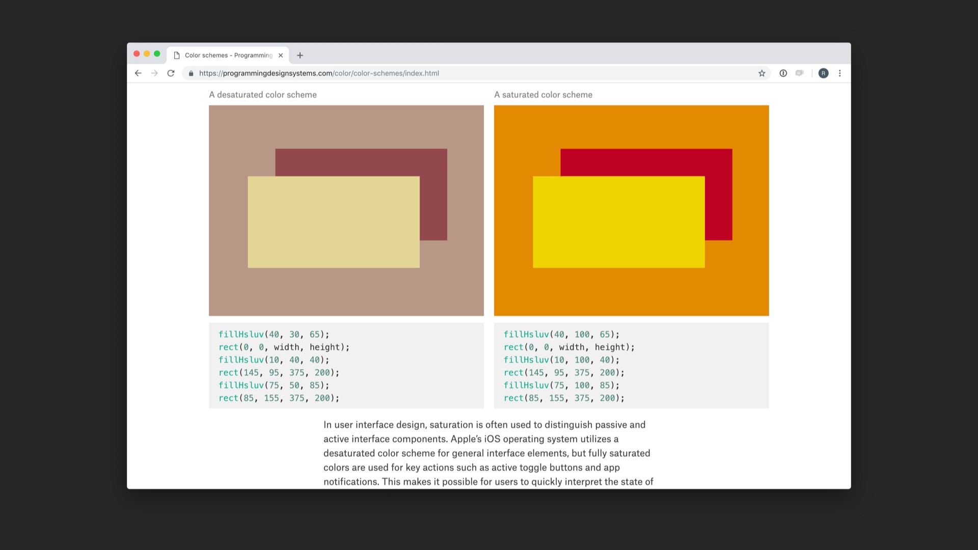
I then move on to saturation, or color purity, which can be used to create very dull or vivid compositions. Again, everything is explained in p5.js code.
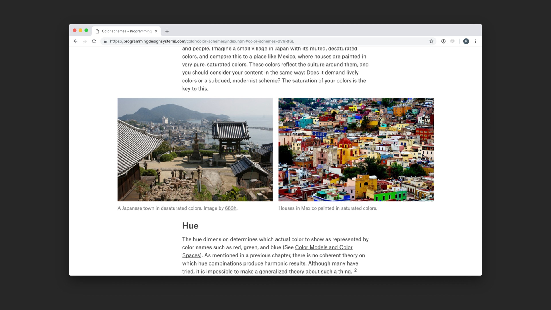
This example is one of my favourites to help the reader think about color saturation. Taking an example from the real world comparing use of color saturation in Japan vs. Mexico. What are you trying to achieve?
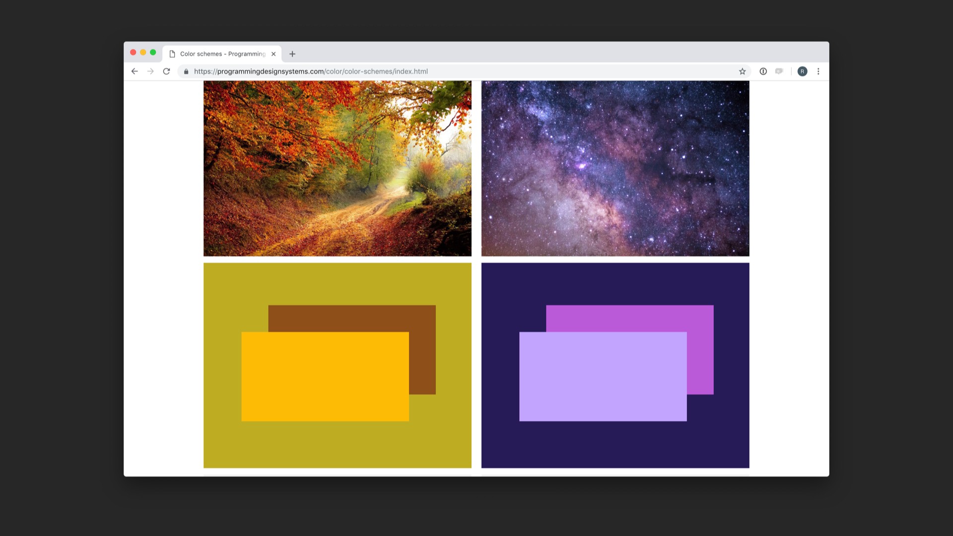
And I then move on to talk about hue and how you can create very natural or artificial color compositions.
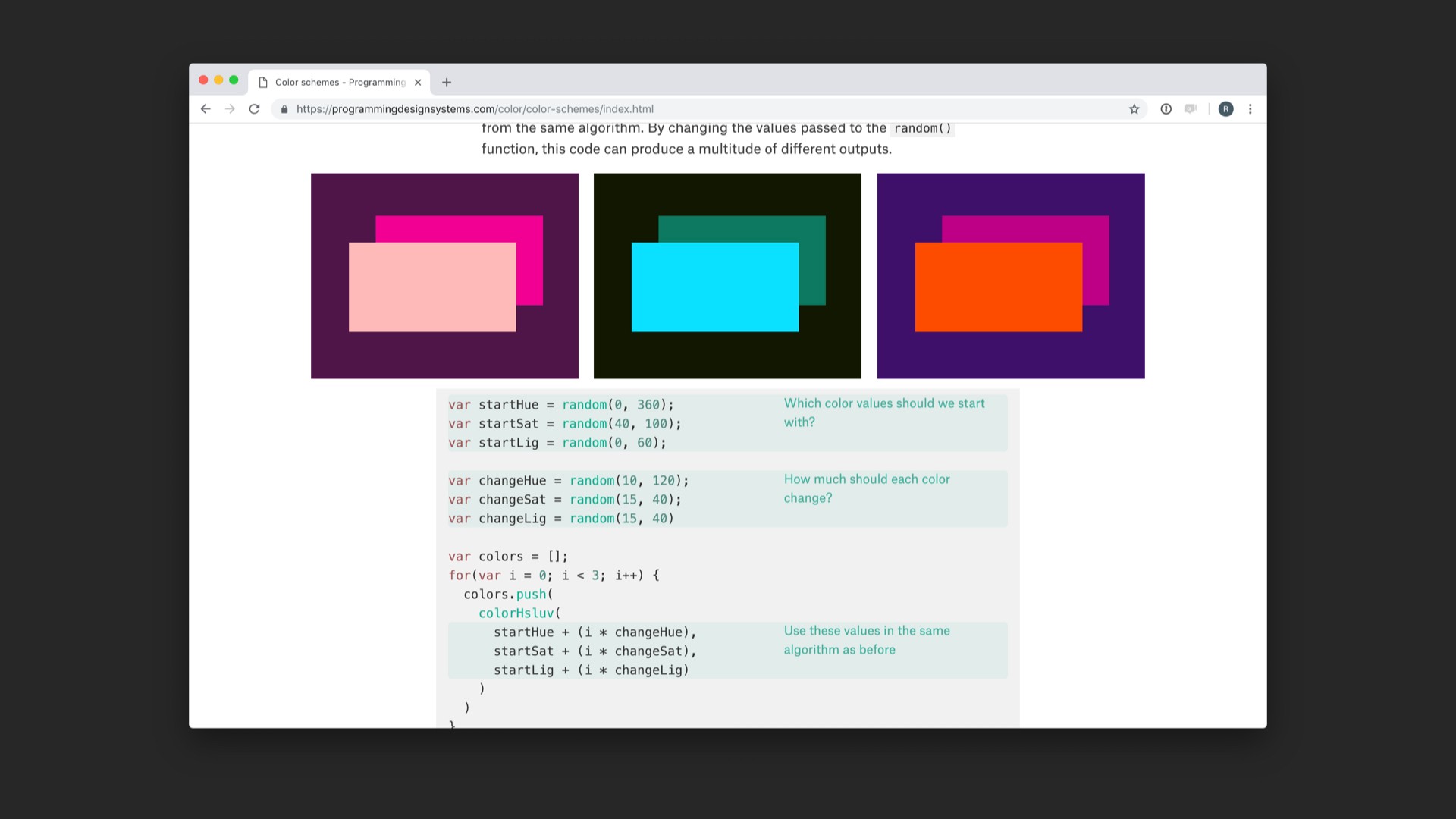
Finally, I also introduce the really fun stuff, using random() to create dynamic color schemes in p5.js that look different every time you run the code.
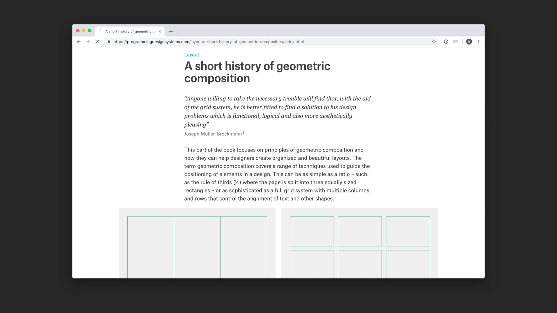
I am currently in the middle of the third part of the book which has chapters devoted to layout mechanisms. The first chapter of the book is called A short history of geometric composition, and I write about how ...
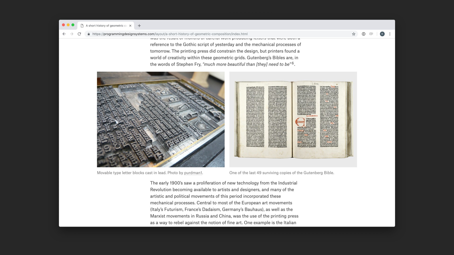
... our technology has always influence our design products, all the way back to the hand-written illuminated manuscripts and to Gutenberg’s printing press.
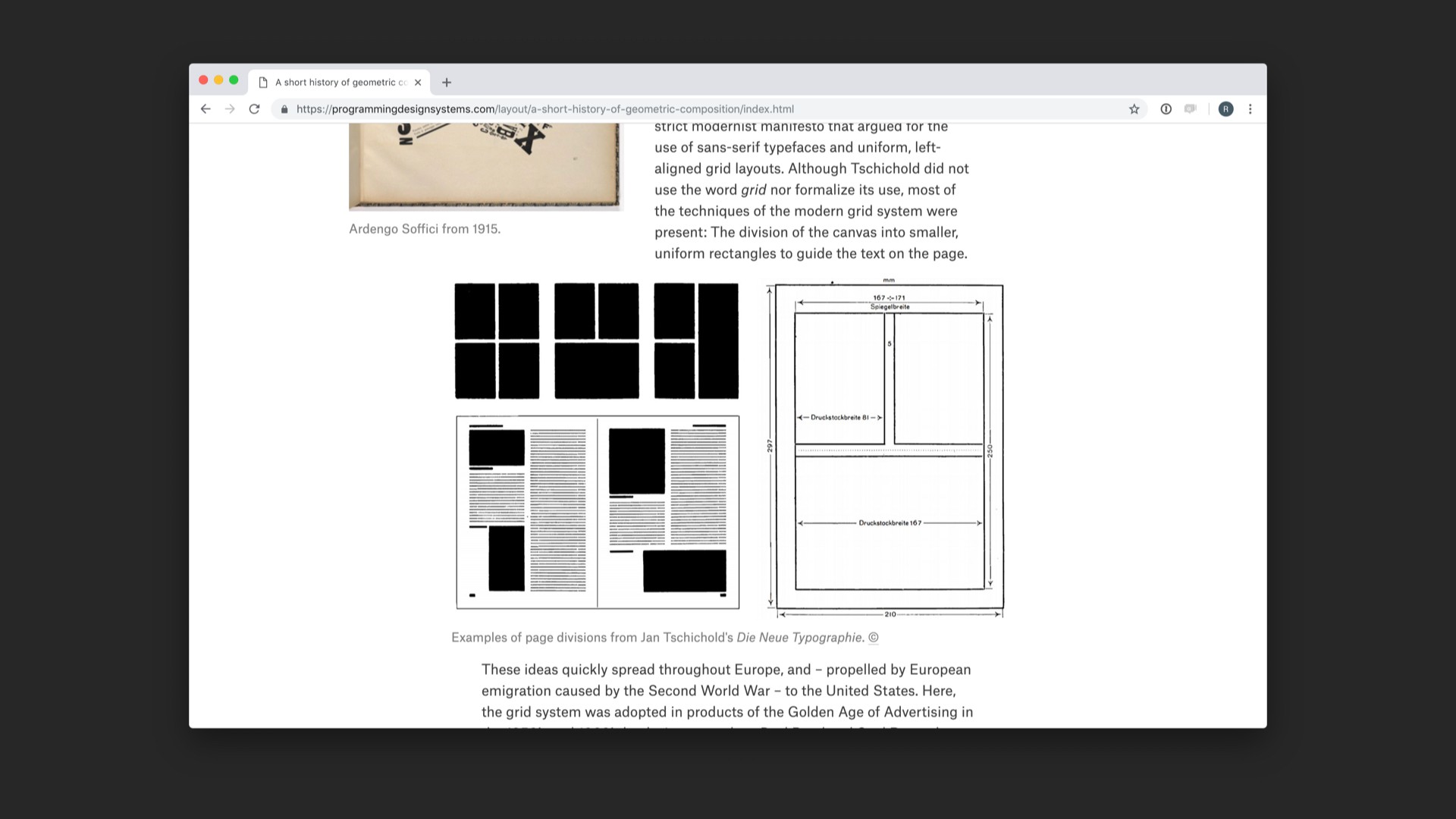
I then talk about the grid system as a mechanism for formalising the design process, and I trace this all the way up to ...
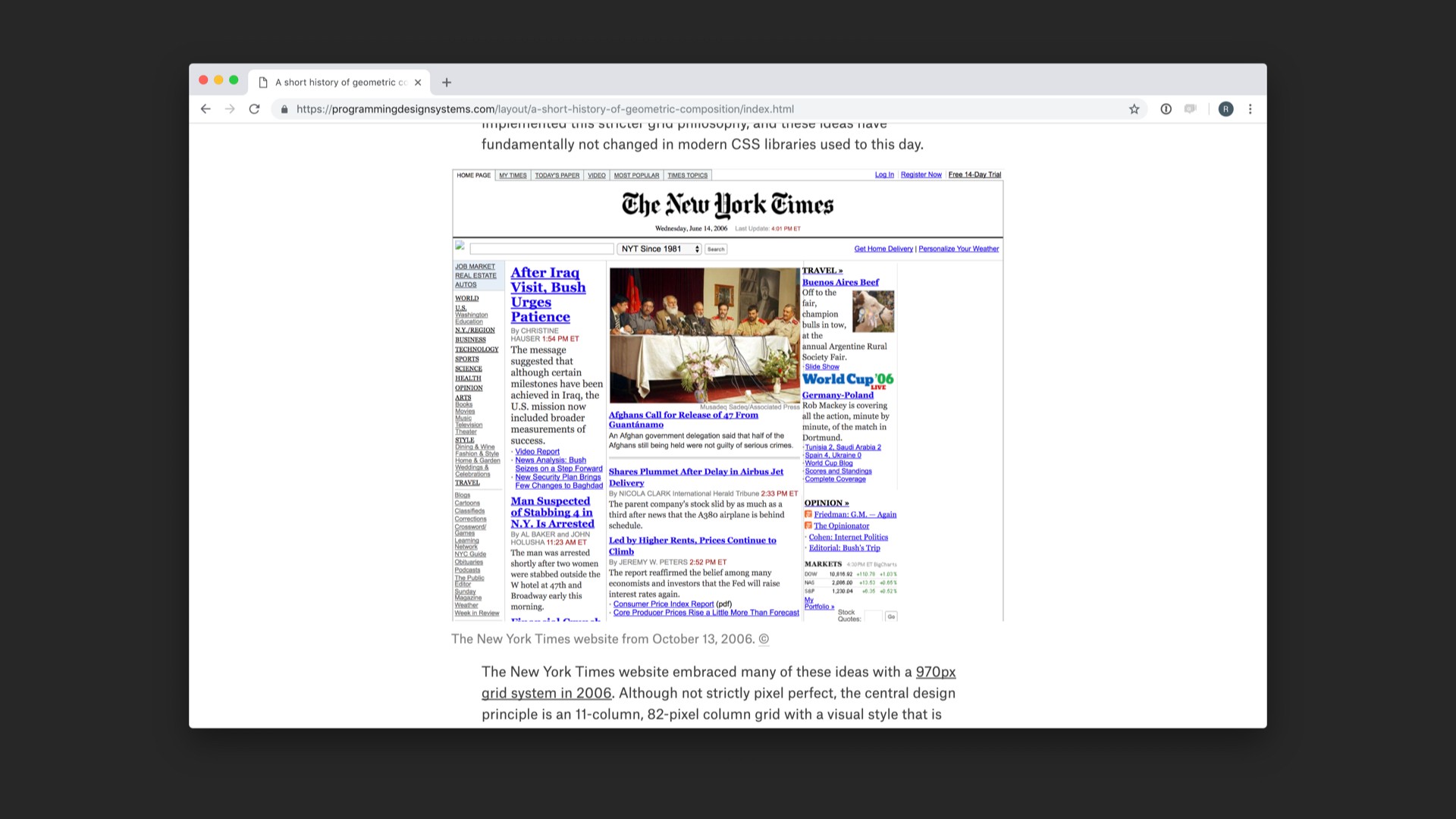
... the early web design and where we are today where most digital products use grid systems and other geometric composition methods.
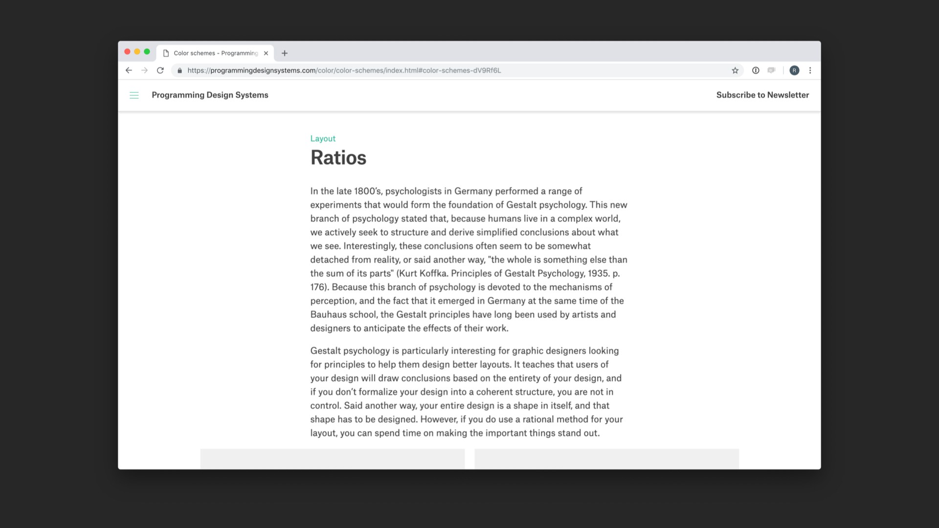
The rest of the Layout part will focus on techniques for using geometric composition and grid systems in p5.js. I had actually hoped that I could have finished a new chapter for this presentation, but it is not quite ready yet. The next chapter is called ratios, and it explains how to use simple divisions of the canvas to guide your design process.
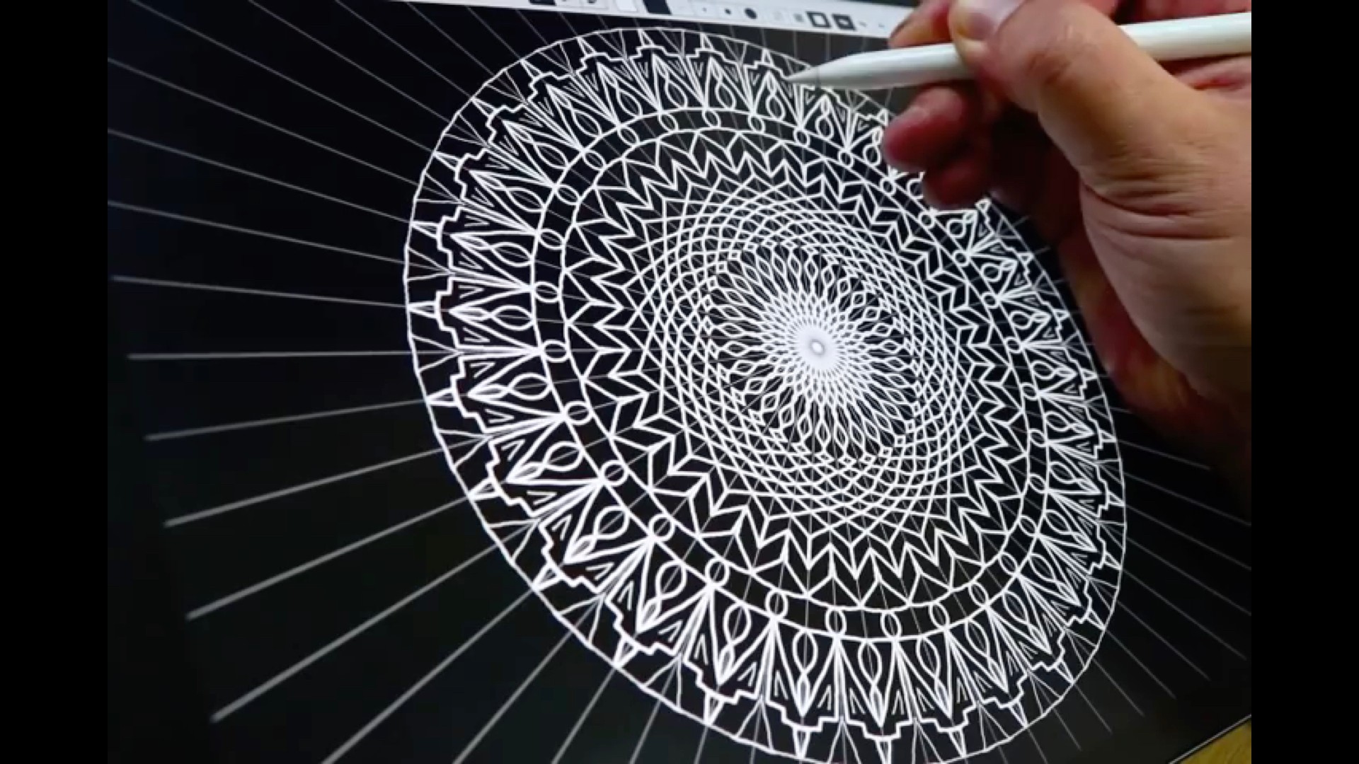
So that is what is in the book. Most of this is material I have tested on students in my classroom over the years. I figured it would be fun to show you some student projects, because I think it shows you just what happens when you introduce programming languages in a design class: I have noticed that students not only get better ideas, but they also start thinking in a different way when introduced to p5.js. Here are a few examples, all created in p5.js.
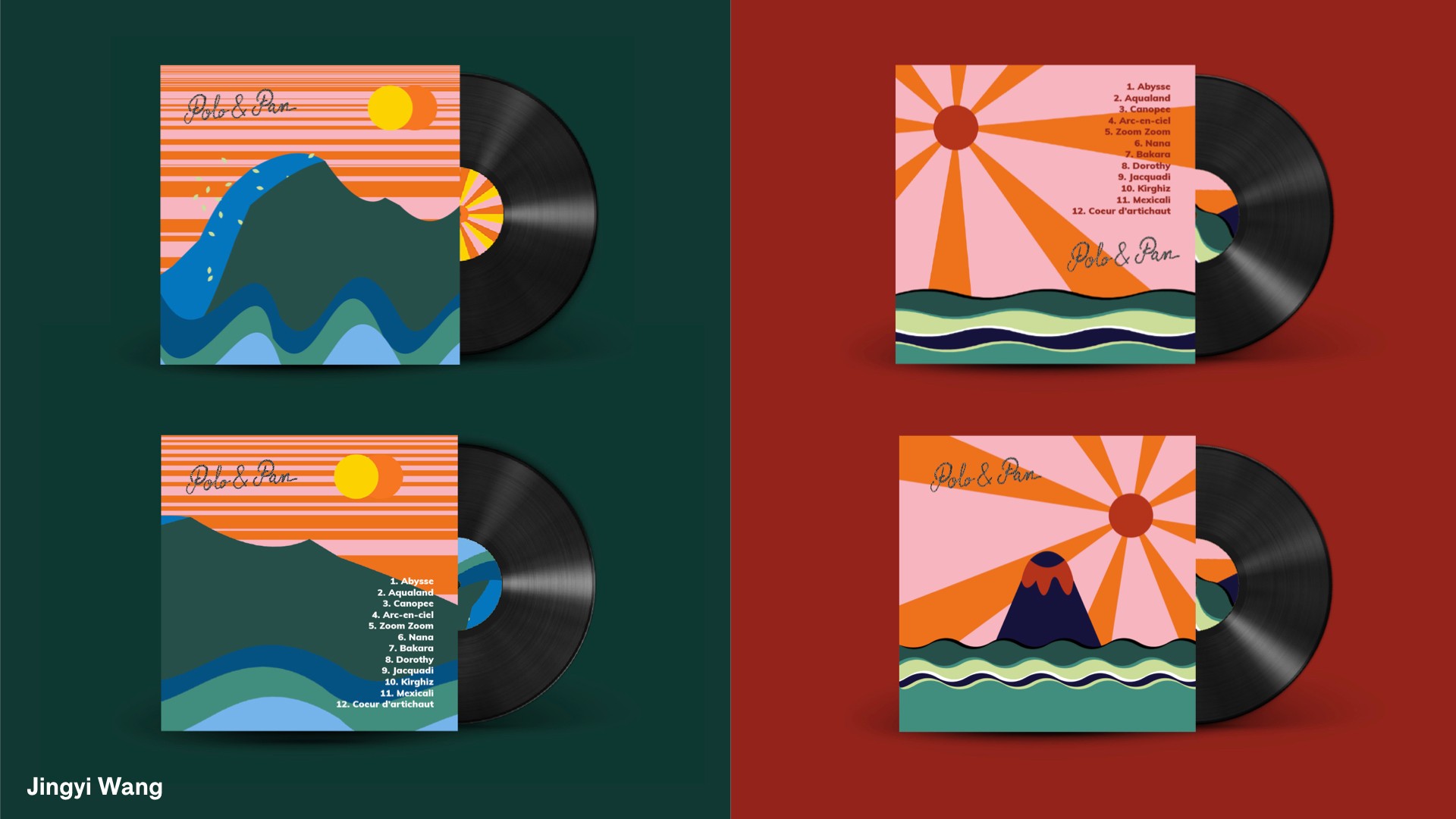
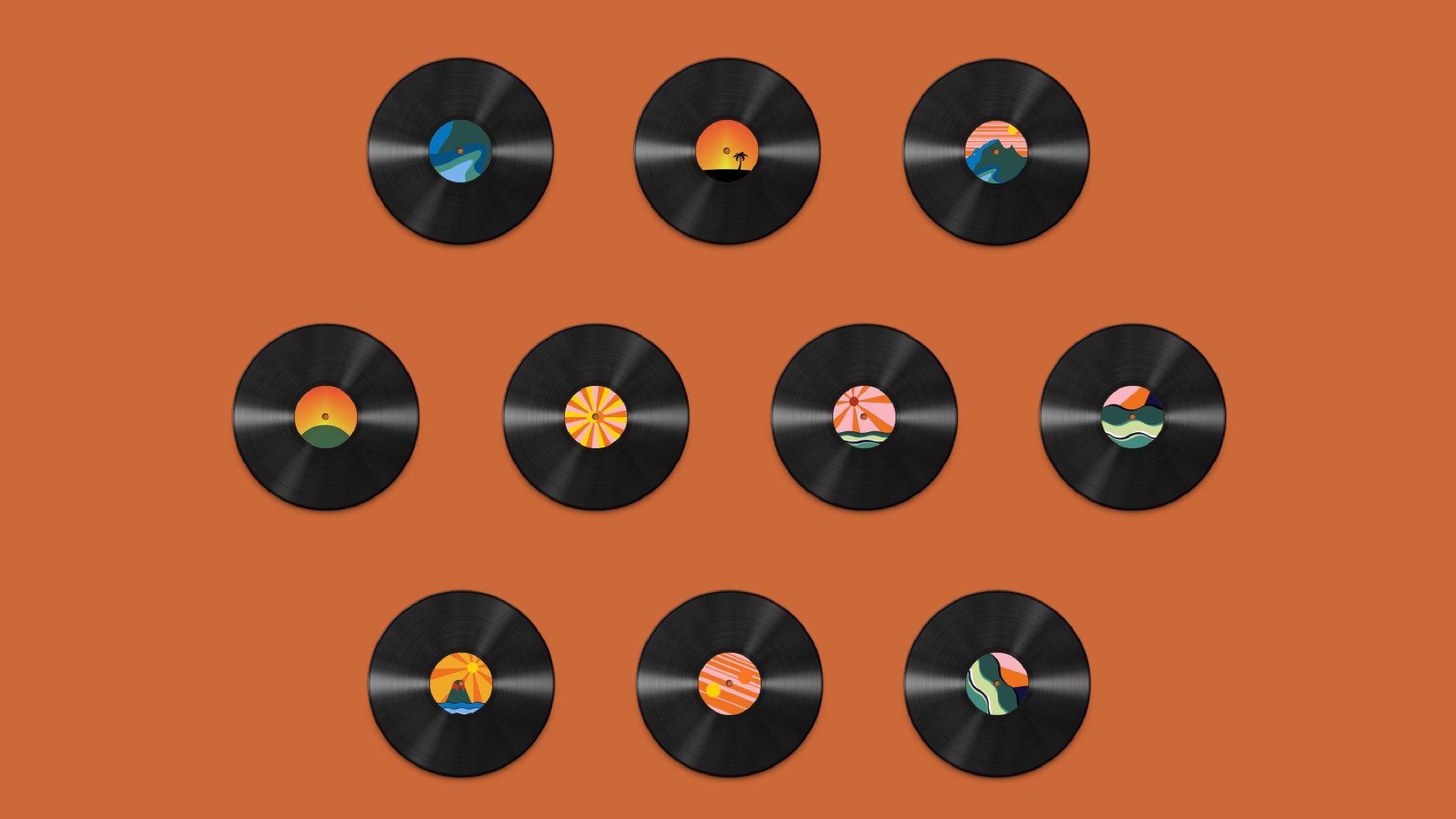
There are projects such as unique, generative album covers.
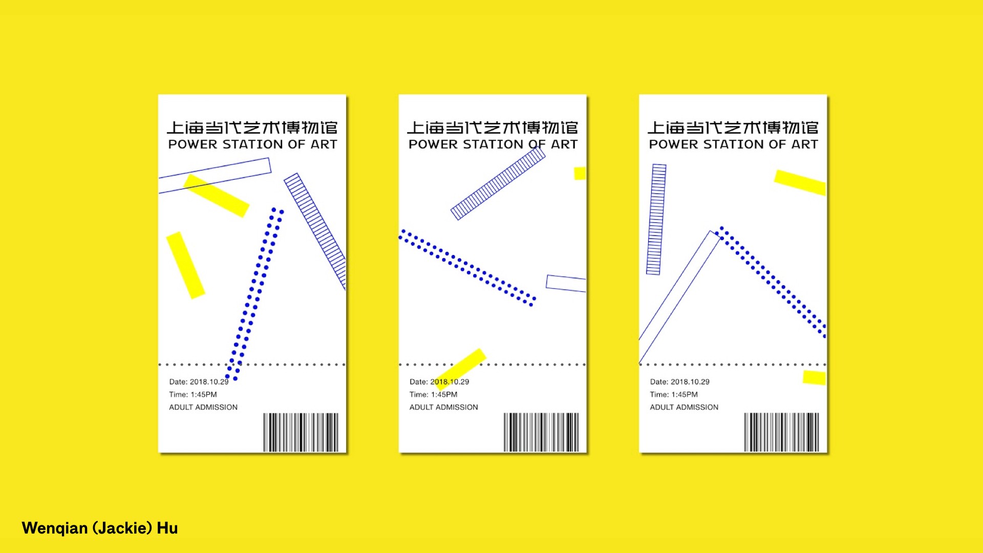
Dynamic branding for print.
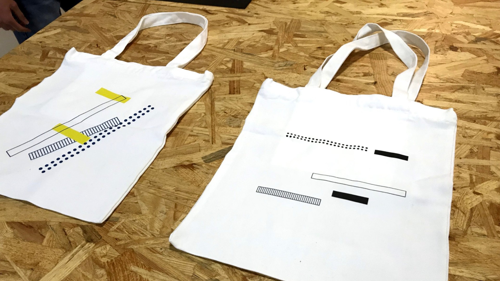
Dynamic branding for fabric.
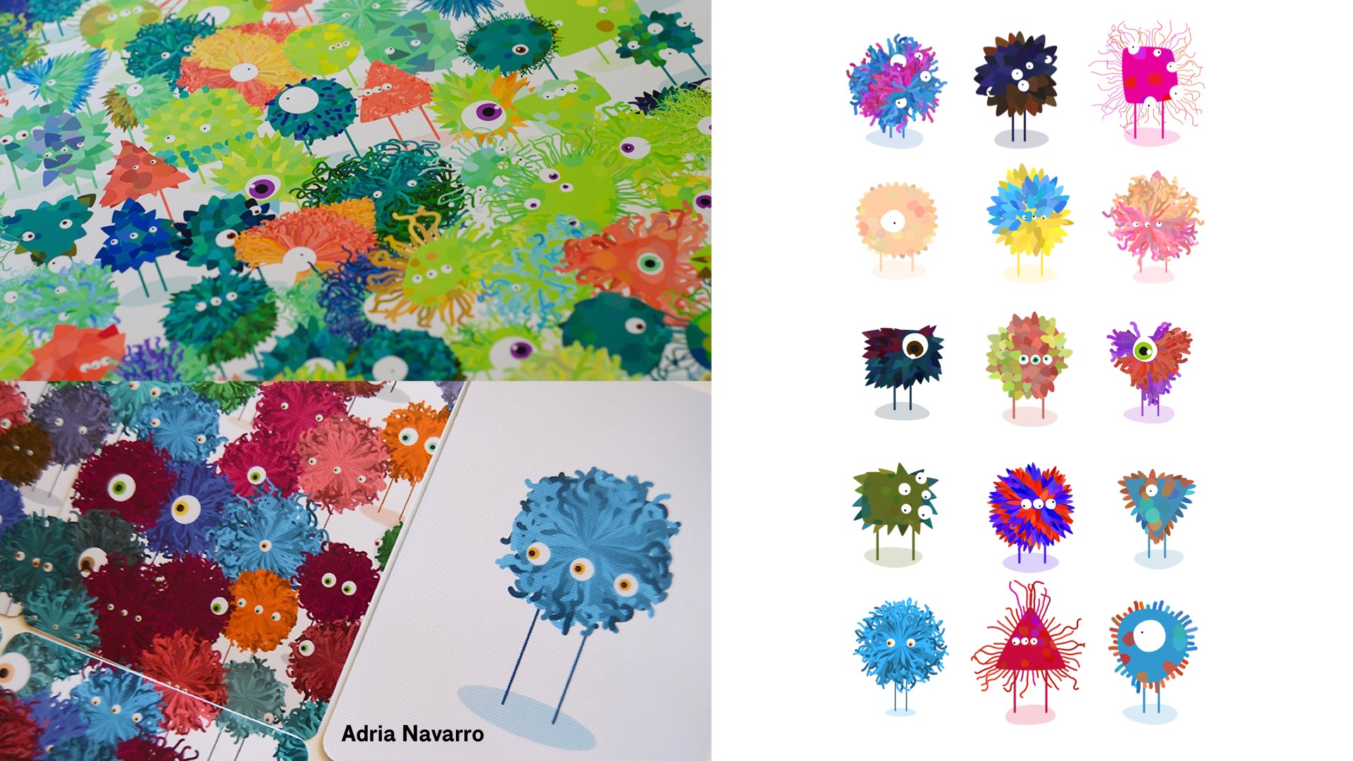
Game characters generated in code.
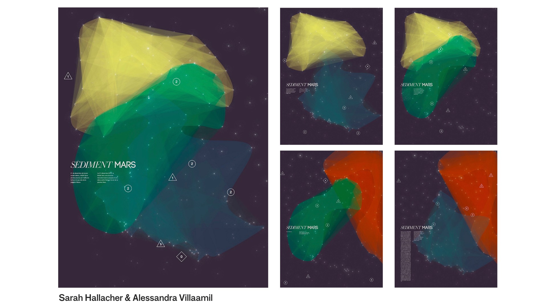
Generative posters.
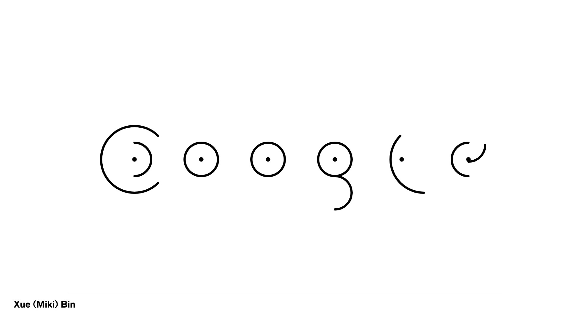
Rule-based typography.
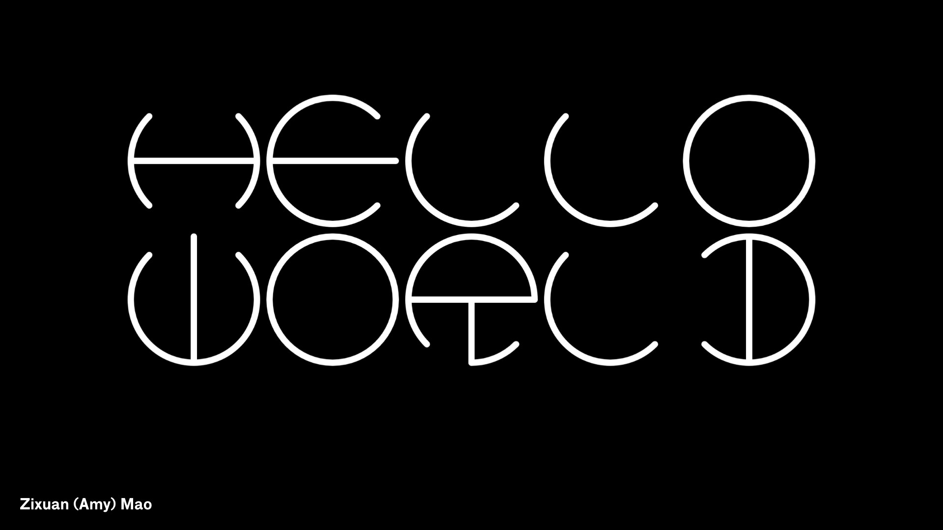
More rule-based typography.

A generative tie-generator.
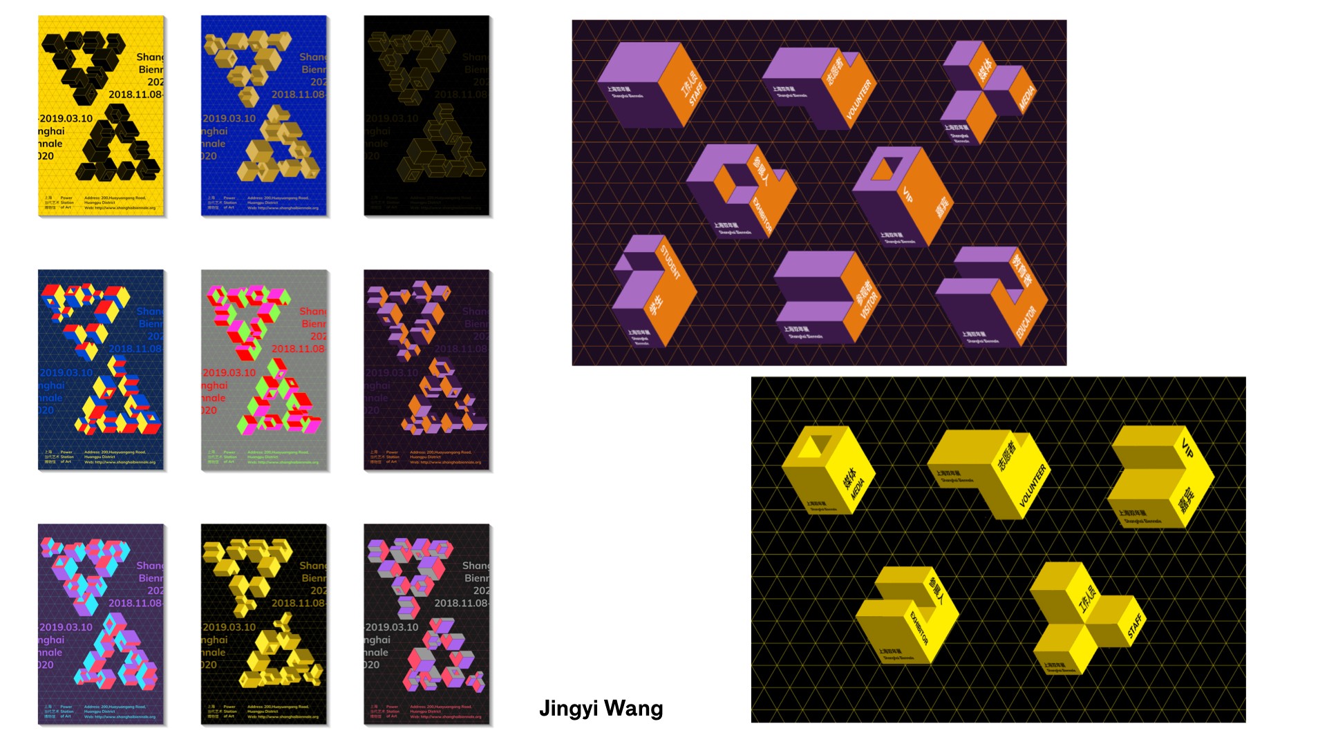
… and a lot of code-based branding projects where instead of just designing a single static logo, the student makes a design system that can adapt to a lot of different scenarios.
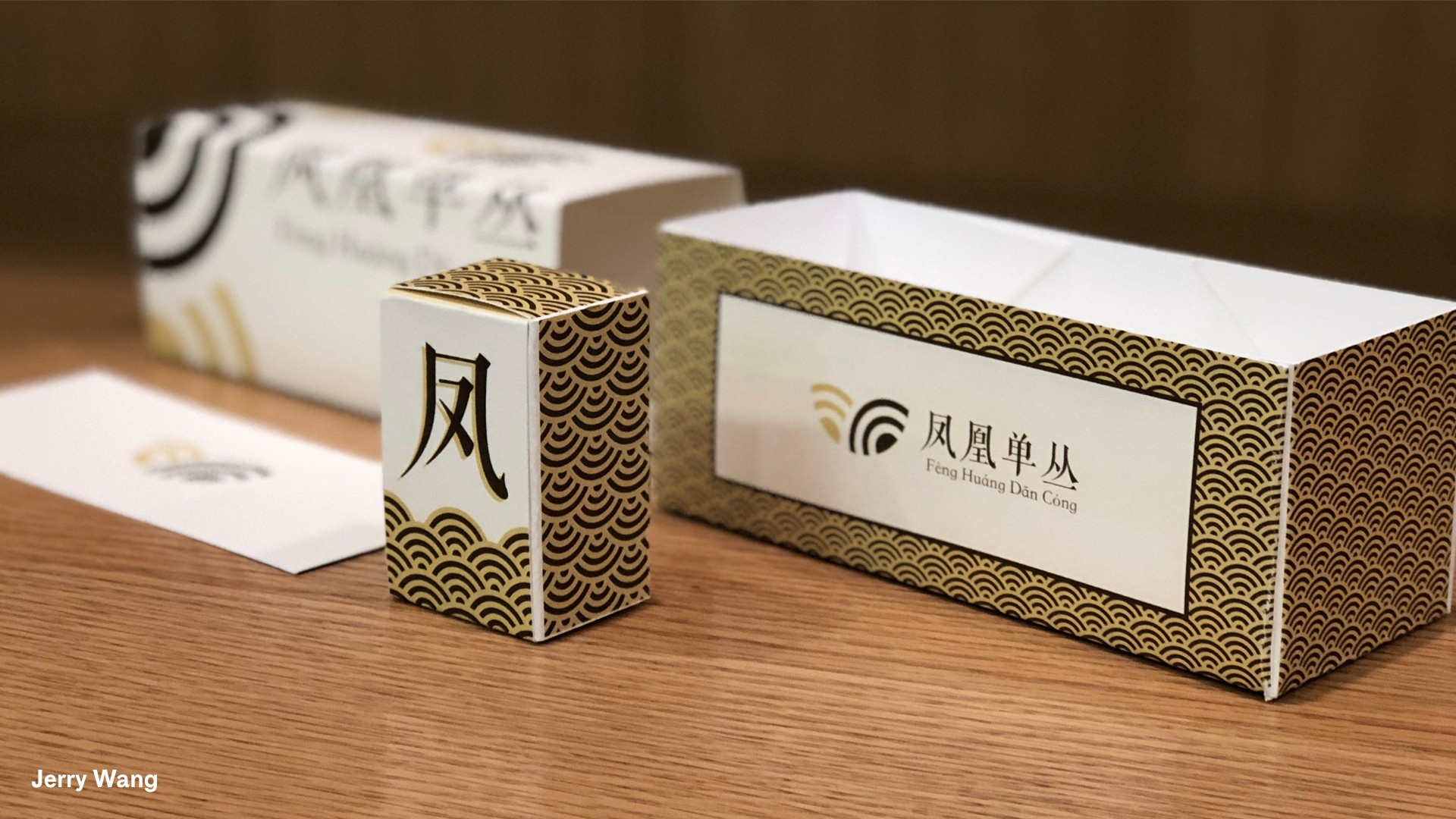
I think the interesting thing about these projects - and I have hundreds of these to show - is that you would rarely come up with these ideas if I did not teach the class in code. So I think it is a good example of how you can be focused on the conceptual part while exploring interesting code-based designs.
I would be very happy if you subscribe to my newsletter!
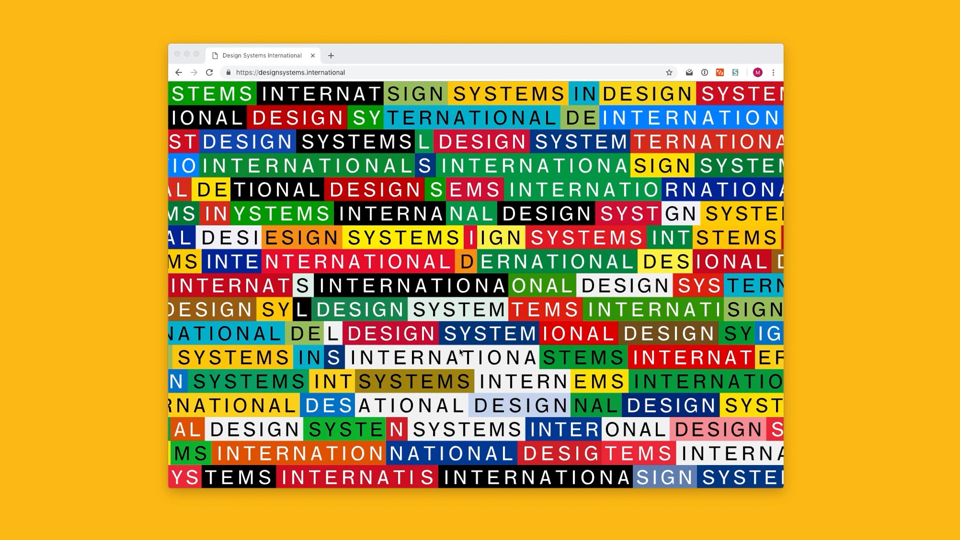
I also want to briefly touch on how these ideas influence my own design practice. As I said earlier, I recently co-founded a design studio where we focus on code-based design projects. We are relatively new, but I can show a few things that I think illustrate the kind of work that we do.

Some of our more traditional digital projects involve working with large companies to streamline their visual design in a shared code-based design system: Building smaller components that are used by higher-order components. A lot of this work is about establishing proper workflows for the design and development process.
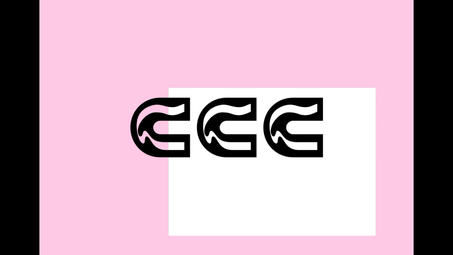
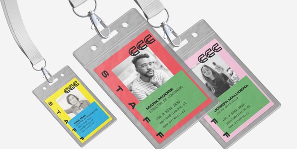
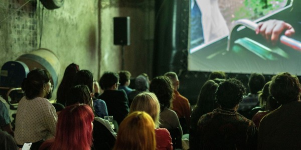
But we also specialize in more interesting branding projects. CCC is a new center for cinema that aims to revert this situation with a highly mixed approach. The center has two film theaters, offices, editing rooms, a cafe, and a large terrace. Set to open in Santiago in early 2019, the center is restoring a beautiful old townhouse to fit this program.
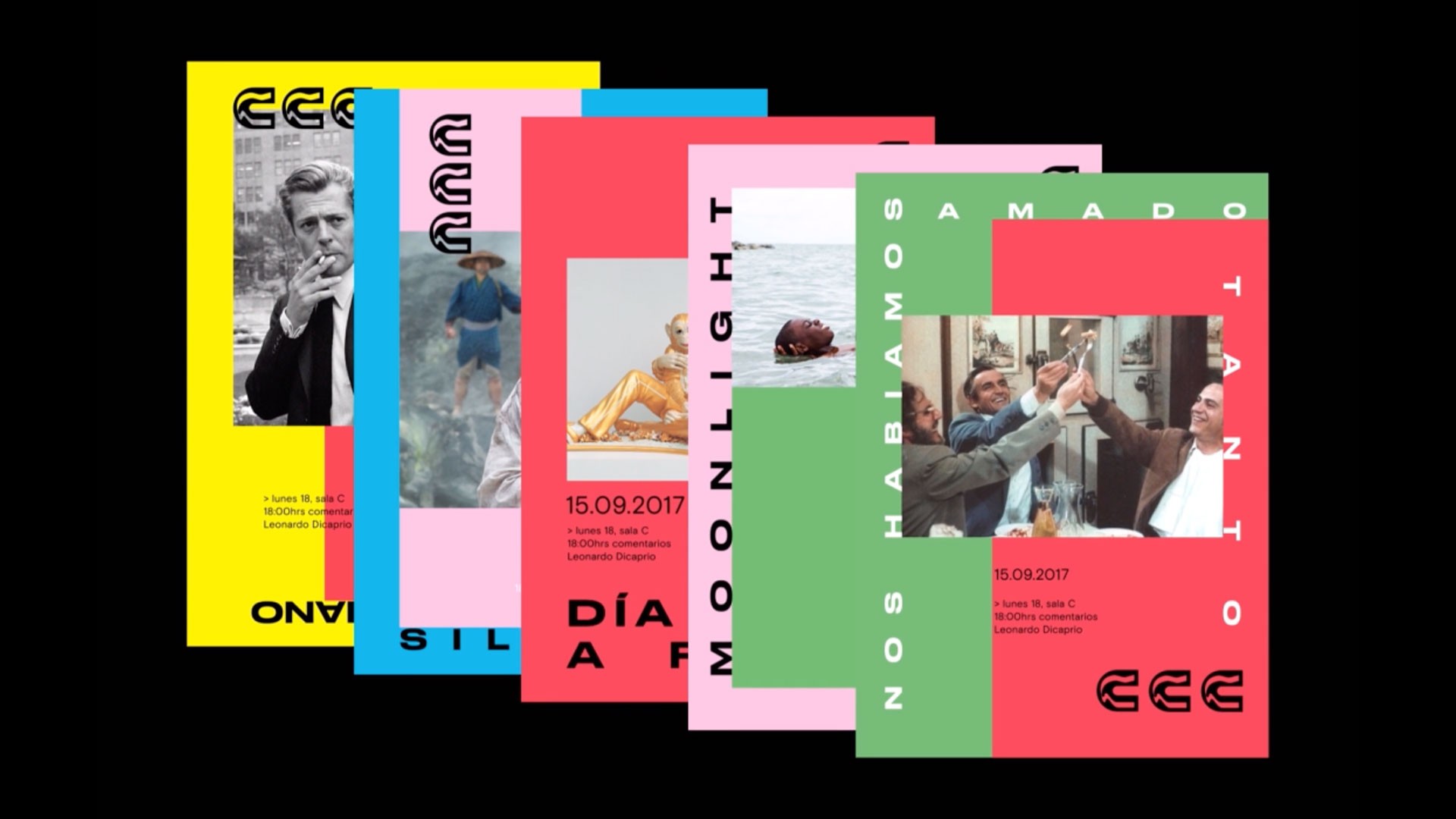
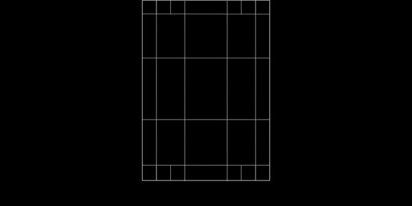
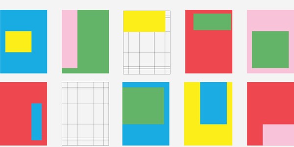
We worked with CCC to create a dynamic identity system for the center along with a toolkit that enables their team to produce a vast array of materials while maintaining high levels of quality and consistency. We teamed up with designer Simón Sepúlveda to create an identity system to be used across all communications, both in print and on the web. The identity consist of three variables that can be arranged to create endless variations of the identity: A logotype with carved C’s inspired by the graphic patterns in the floor tiles, a variable grid system based on rules of third, and a set of playful background colors to be used as blocks in the grid.
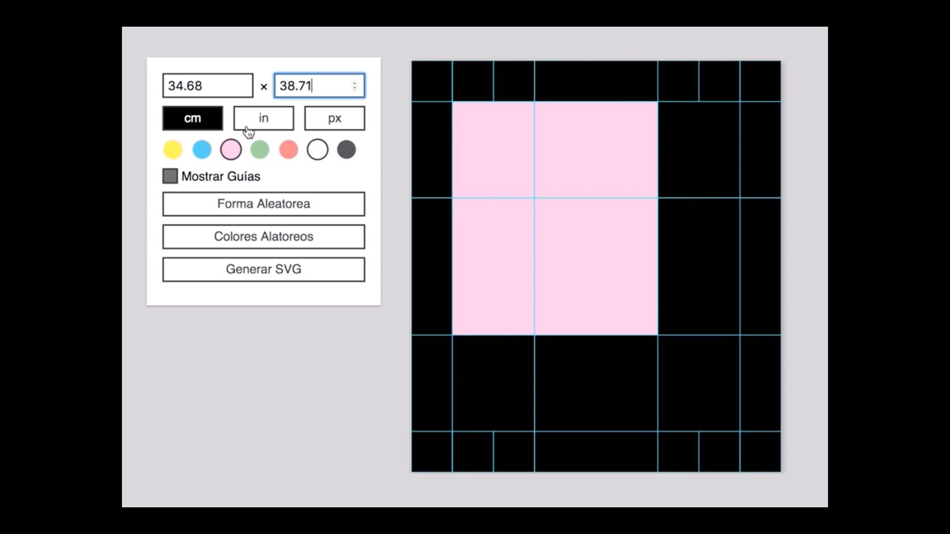
Given the wealth of materials that will be needed for the center, we developed a web application that can be used by the CCC team to create new grid patterns as a starting point for event posters or other communications material. The grid generator is written in React.js.
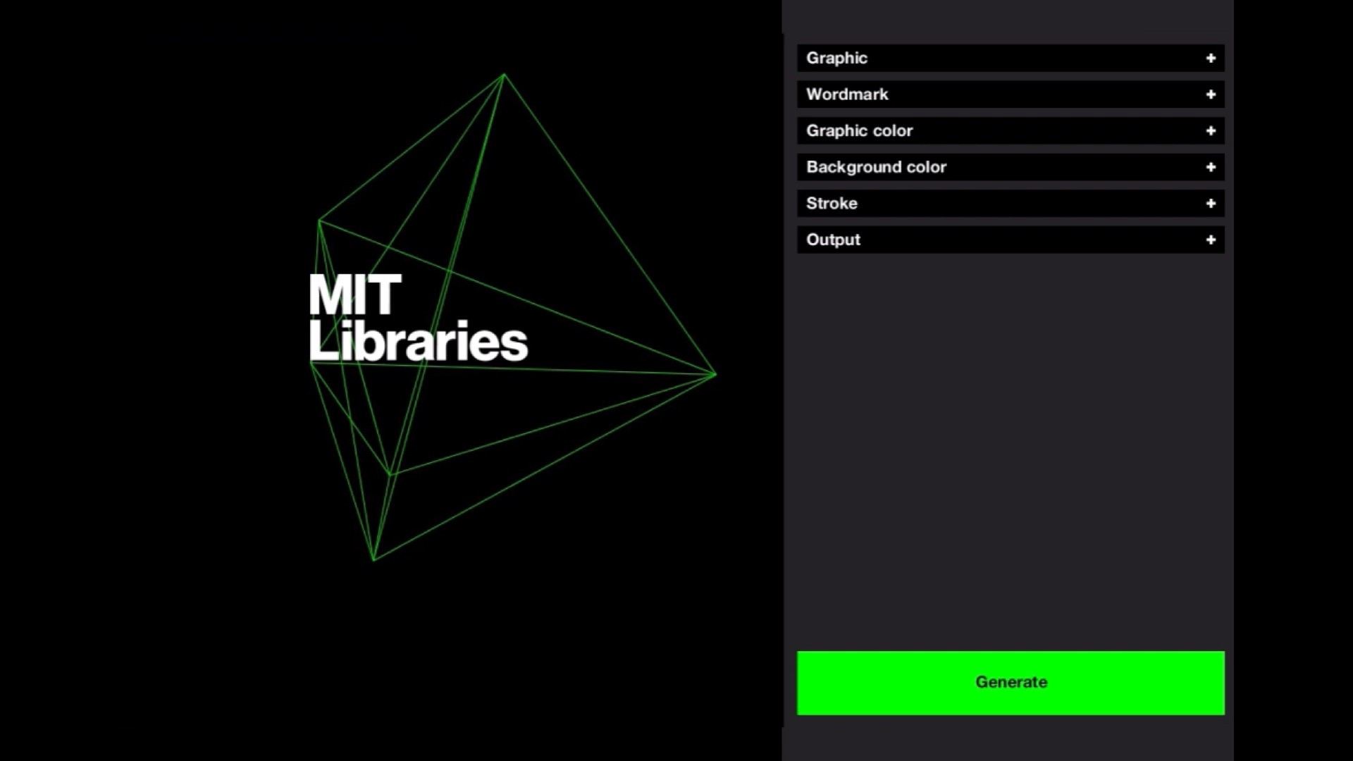
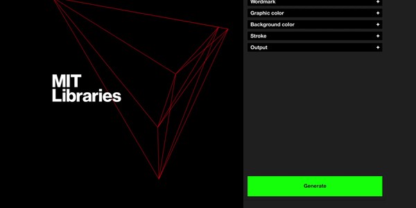
We also worked on the new visual identity for MIT Libraries, created by Michael Beirut and Aron Fay at Pentagram Design. We worked as technical partners with Pentagram on the project to create a custom design tool that can be used to generate endless variations of the logo. Rather than delivering a static set of logo files, this generator software can be used to generate new logos whether for event posters, signage, or social media.
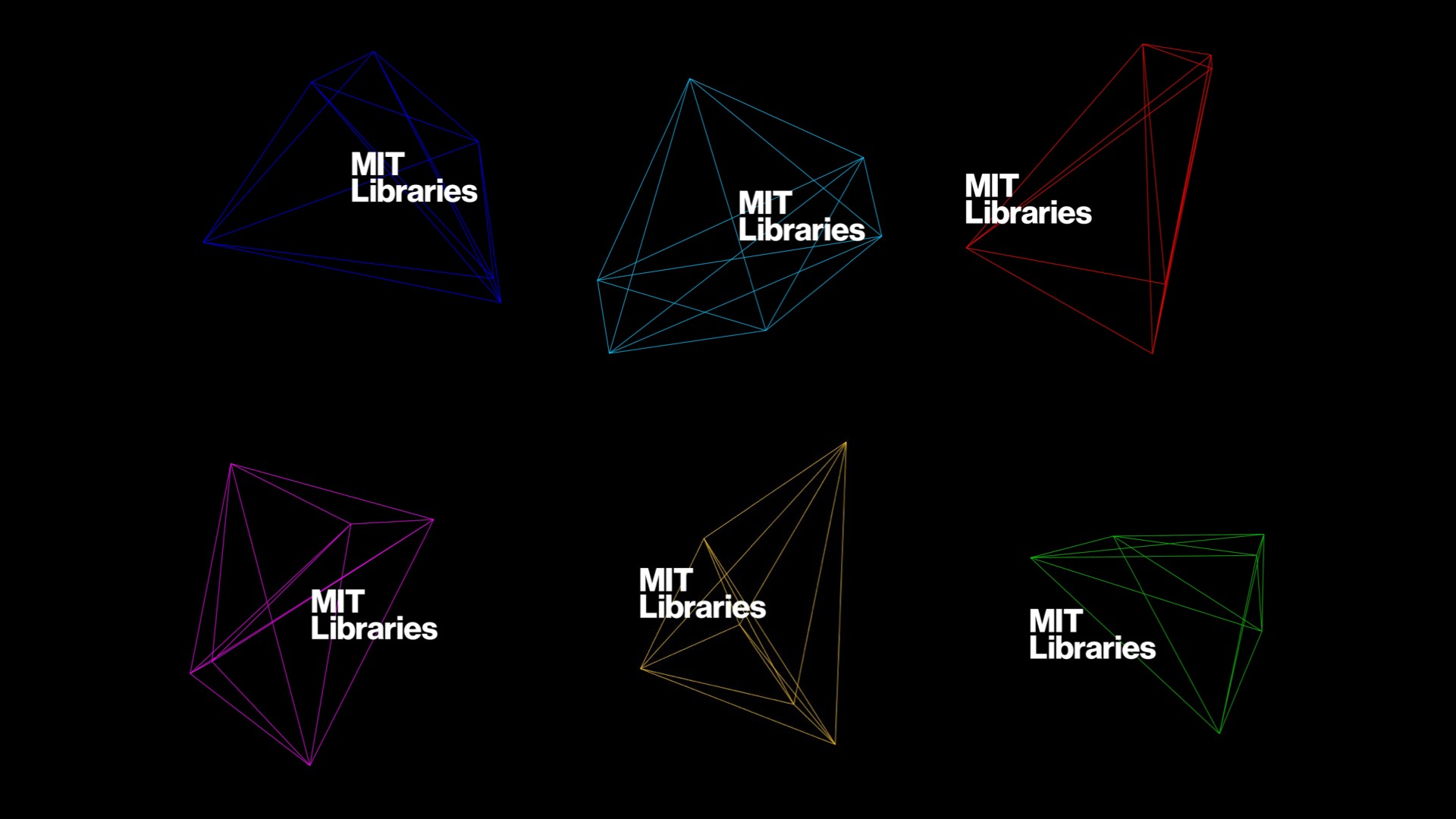
The logo software is written in the Processing programming language, which was developed at the MIT Media Lab by alumni Ben Fry and Casey Reas. A toolbar in the interface allows the user to change the wordmark, color, stroke settings, and background of the logo, and export the logo as either a static image or animated video sequence. It is licensed under the MIT open source license.
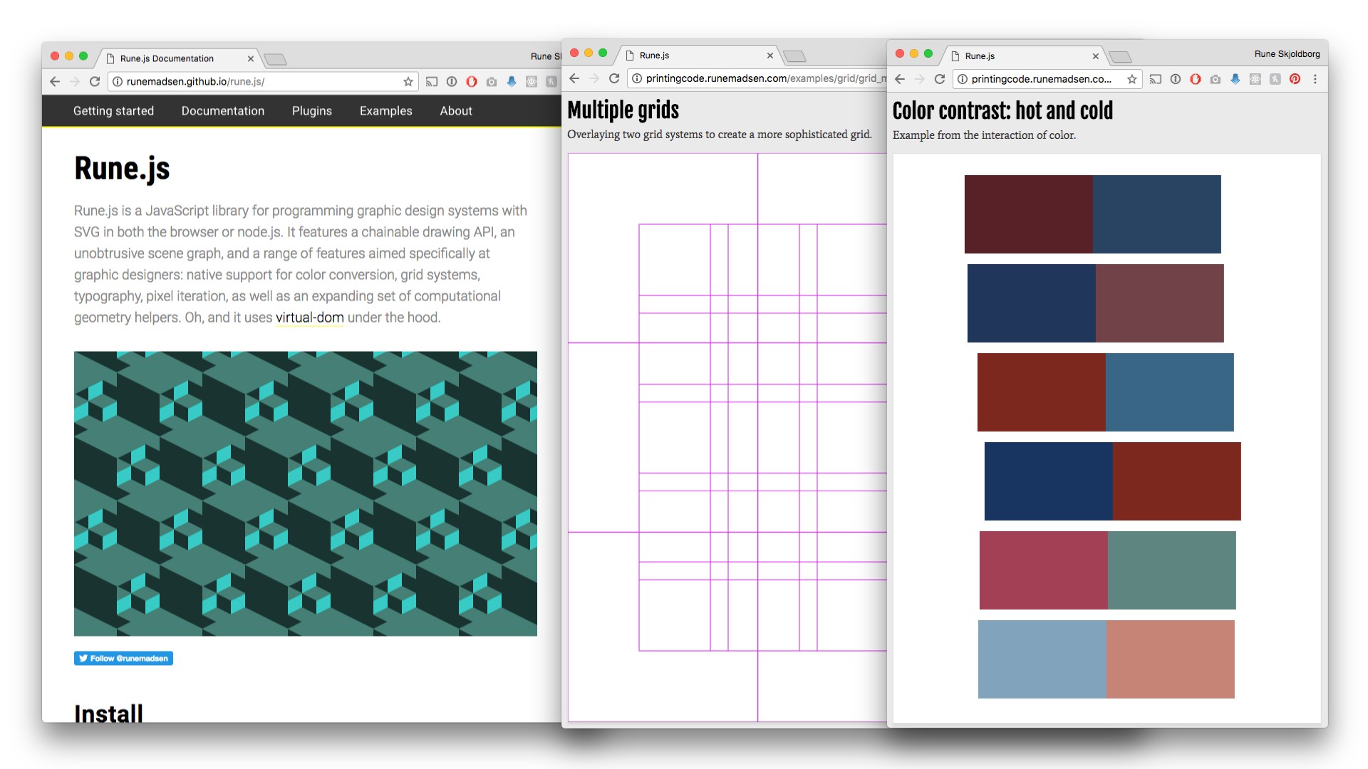
Finally, since this is Processing Community Day, I want to say that if you are interested in graphic design an code, I wrote another JavaScript library called Rune.js that generates vector files. So if you want to do generate branding for both web and print, this might come in handy.
Thank you so much!
