The ask
Founded just in 2019, Chief, a private mentorship network for women had already grown to about 20,000 members, and the Chief Marketing team needed a new workflow that could scale along with their rapid growth.
What we did
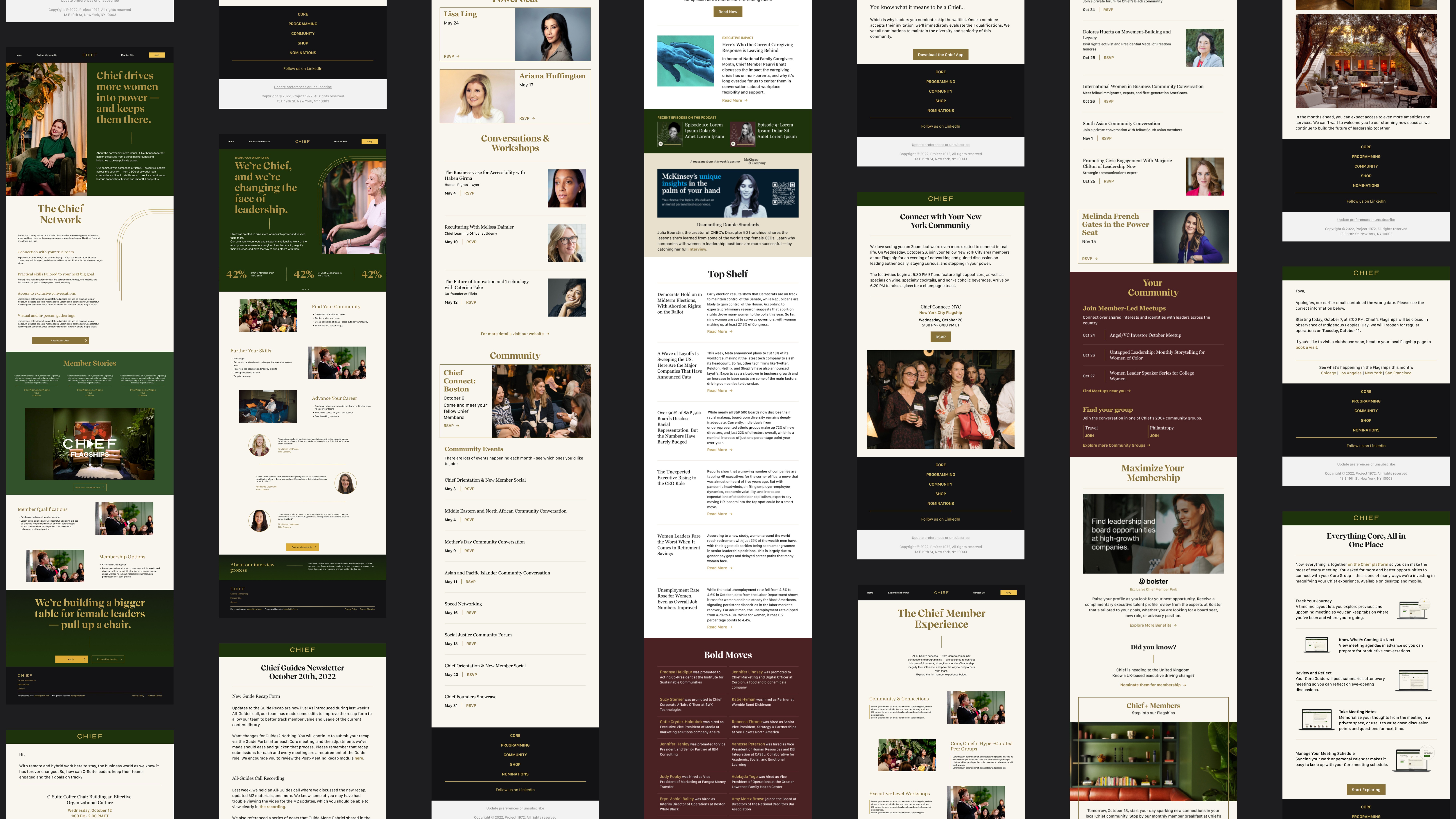
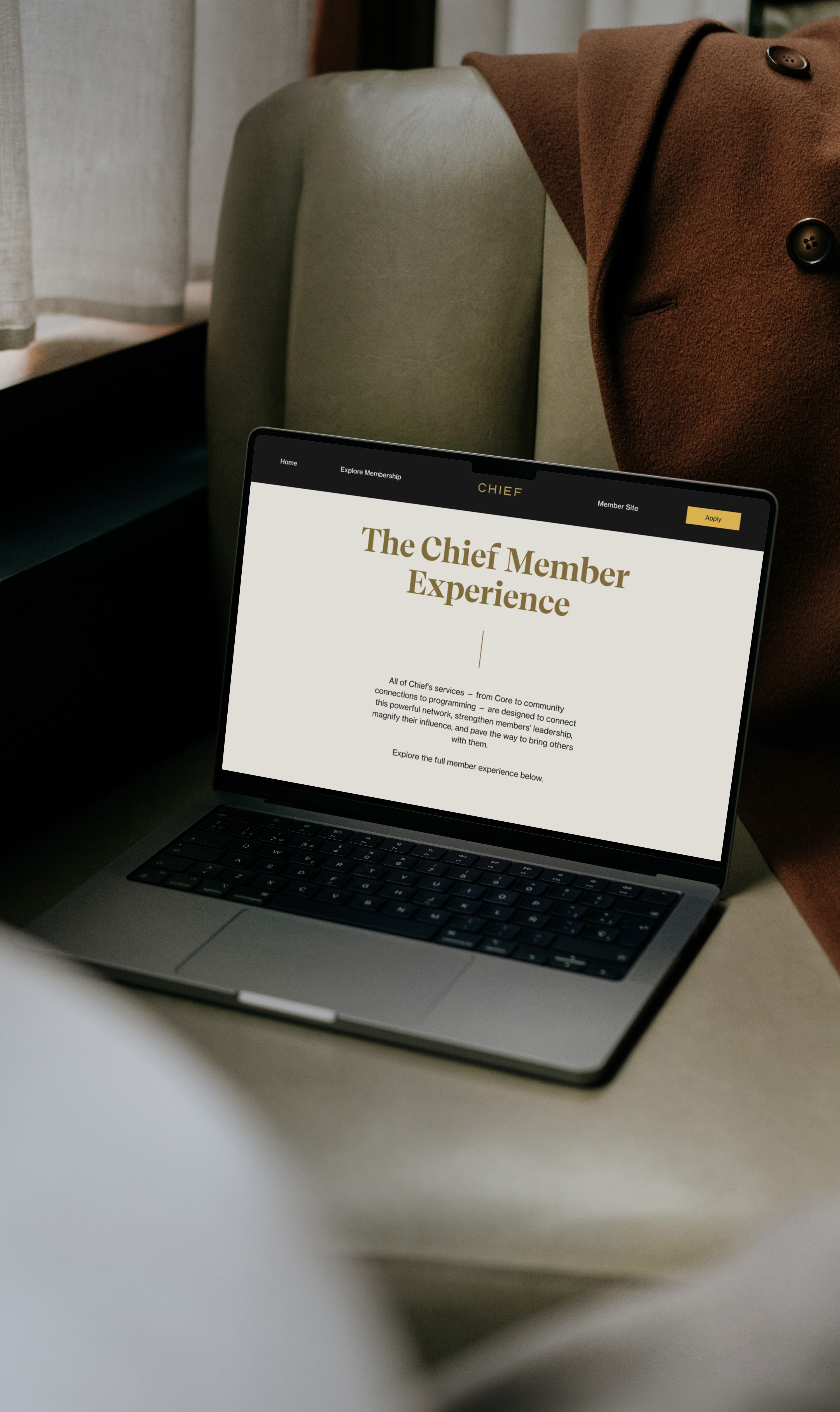
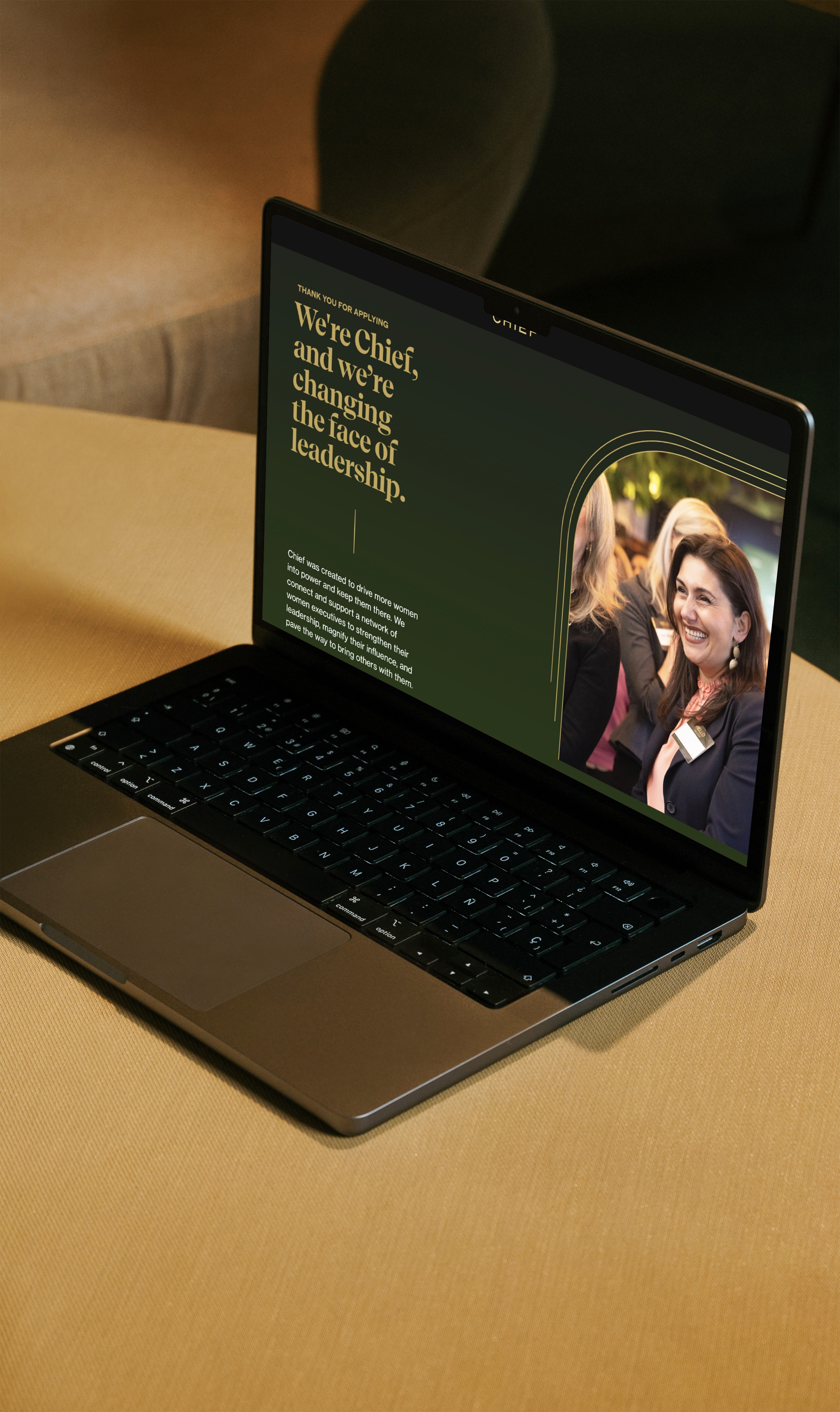
Our solution was to provide Chief with a modular design system for creating marketing pages and emails. The visual system is designed to help Chief’s external communications catch up with its expansion from startup to mid-sized company, and support the company’s brand through its next years of growth.
The design system empowers the Chief team to create new digital assets quickly and within established design patterns. This eliminates lengthy production timelines and frees design, development and marketing teams to focus on higher level impact strategies and development that push Chief into the future.

Our Process
For most of our clients, it is valuable to conduct a content audit during our collaboration, because our process naturally provides new perspectives to their existing strategy. Our experience with Chief was no different. Throughout the project, our teams had ongoing conversations around the content, the strategy behind it, and whether that strategy should be optimized to better serve the stated goals. What started as an effort to create a design system ended up being a catalyst to internal content initiatives that had already been identified but not yet put into action.
One of those initiatives was revisiting the Chief brand identity to find aspects of the visual language that needed to be adapted and evolved. Our analysis included the original brand manual as well as hundreds of web pages and emails which helped us define the core needs of the new design system. This was all done in an integrated process while developing the components of the design system.
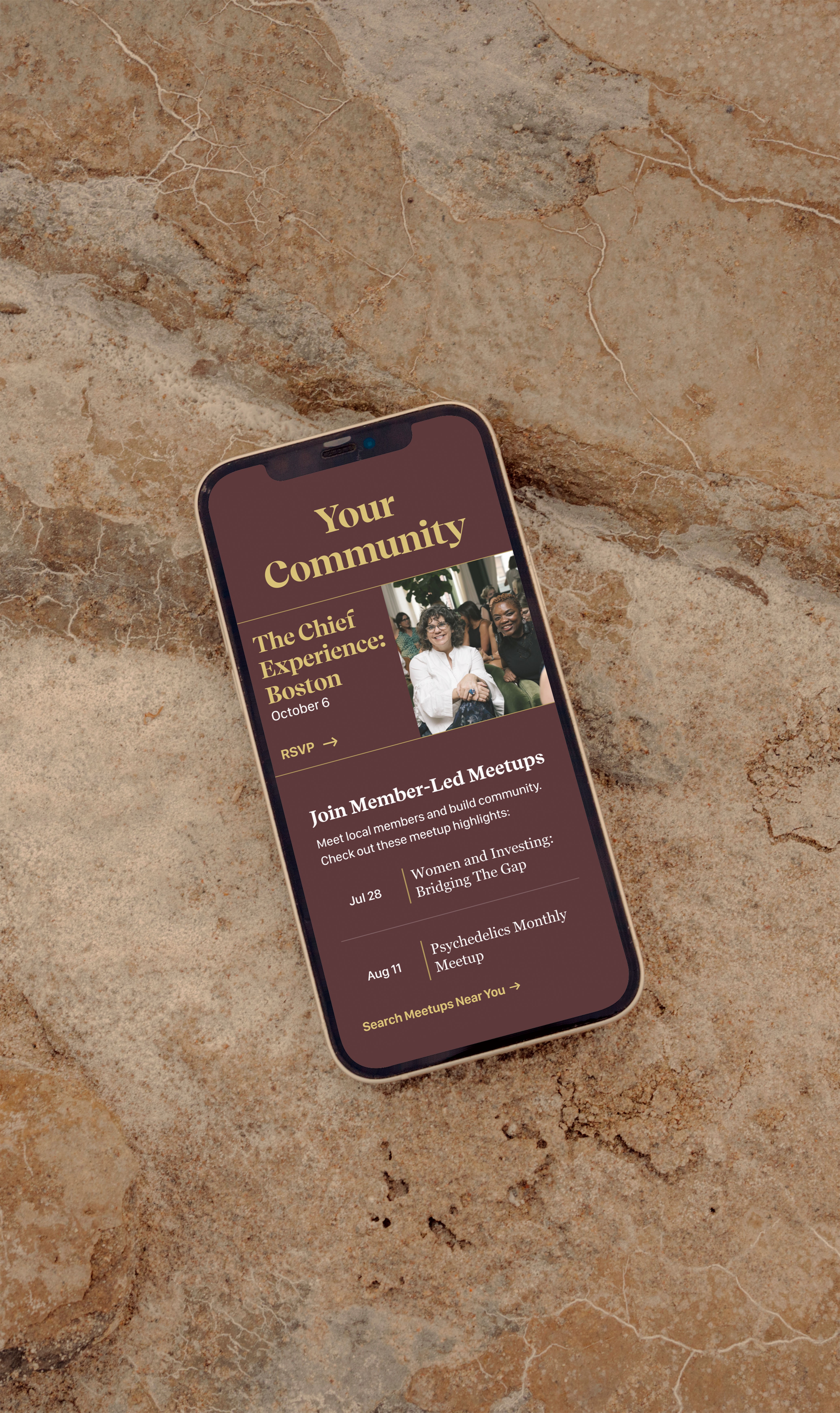
Chief moved from a case-by-case workflow to a systematic process where visual standards are encapsulated in reusable components. This drastically reduced the effort to produce landing pages and emails while increasing quality and consistency.
Technical breakdown
The new design system had the double goal of having to work with Chief’s current system, Marketo, while enabling a transition to a modern, in-house system. Because of this, we used React.js to create a set of web components which are transformed by a custom pipeline for use in Marketo. The pipeline leverages React’s renderToStaticMarkup() plus a collection of custom posthtml plugins to convert React’s HTML output into Marketo-friendly templates for landing pages and email-friendly HTML bundles that ensure the emails look correctly in all supported email clients.
Additionally, we developed a central documentation website where teams can explore the available templates. Chief used this to build more internal tools, such as a Sanity-based page builder to create new langing pages. We accompanied all React templates with a matching set of Figma components and templates, allowing the design team to easily experiment with the parts and pieces we provided, accommodating the specific communication needs while being assured that the designs they produced would be easy to implement.
