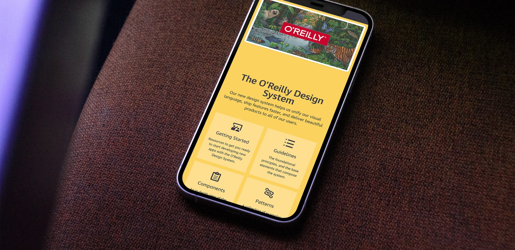
For almost 40 years, O’Reilly Media has published world-shaping ideas about digital technology. Traditionally seen as a book publisher, the company has reinvented itself as a fully fledged media organization, distributing their content as books, articles, training courses, and through an online learning platform. Here, we will dive into four of the major projects we have taken part in.
A Digital Publishing System
Writing a book is a complicated process. First, an author struggles for months or years to write it. Then, a production editor manually puts the content into an appropriate design for both print and e-book formats. It is a slow and tedious waterfall process that leaves much to be desired: Authors cannot see what their book looks like until the very end. Word files are emailed back and forth. Production editors have to repeat a sisyphean process whenever a single comma changes.
In 2014, we set out to reinvent content production at O’Reilly Media. The result was Atlas, a web-based application that allows authors and production editors to work in the same interface. Every edit made in Atlas is automatically saved, which makes it easy for authors to track changes made by external editors. By the push of a button, a book can be exported into several production-ready formats for print, e-readers, and the web. After more than eight years in production, Atlas has been used to produce more than 3000 books, saving tens of thousands of hours of production time.
A book can be exported into several production-ready formats for print, e-readers, and the web.
The Atlas platform consists of several pieces of software. The most prominent is the web application, built with Ruby on Rails and Backbone.js, which exposes the user interface. In this application, book content is authored in HTML or Markdown using either the WYSIWYG or plain text editor. Like many web frameworks, Atlas separates content and presentation: A custom theming framework allows styling of books in CSS, which means that the same content can be used to generate many variations of a book in different lengths and designs, and changes in content are automatically reflected in the layout. The service uses Git repositories to version-control book content via a separate server running Gitlab, the open source Git-hosting platform. A third system, a set of background processes, are responsible for transforming book content, applying the theme engine, and exporting it into PDF, ePub, MOBI and HTML formats.
These processes intelligently clone and cache the Git repositories, run a custom set of transformations written in JavaScript and XSLT, and upload the final formats to S3 storage. This setup allows non-technical authors to write in an interface close to that of Word or Google Docs without needing to know anything about Git, whereas more technical authors and editors can approach their book writing similar to what they know from software development, using Git to write in a local text editor and push the updates to Atlas via the command line.
New Design System and Website
After a successful launch of Atlas, O’Reilly Media wanted to focus on a major revamp of oreilly.com. Their website was primarily an independent online bookstore — a big success story in the age of Amazon, but it did not reflect the full range of products that the company offered. Worse, a decade of feature improvements and quick fixes had left it in a state that —aesthetically and functionally— did not support the brand. The company who created the world’s first commercial website needed a makeover.
In collaboration with Josh Clark and Dan Mall, we created a new visual language, incorporated this into a design system, and built a new infrastructure for oreilly.com. While the intent stayed the same —to spread the knowledge of innovators— the website took a new approach by showcasing articles, videos, long-form reports, and interactive content on curated topic pages that could be followed by users.
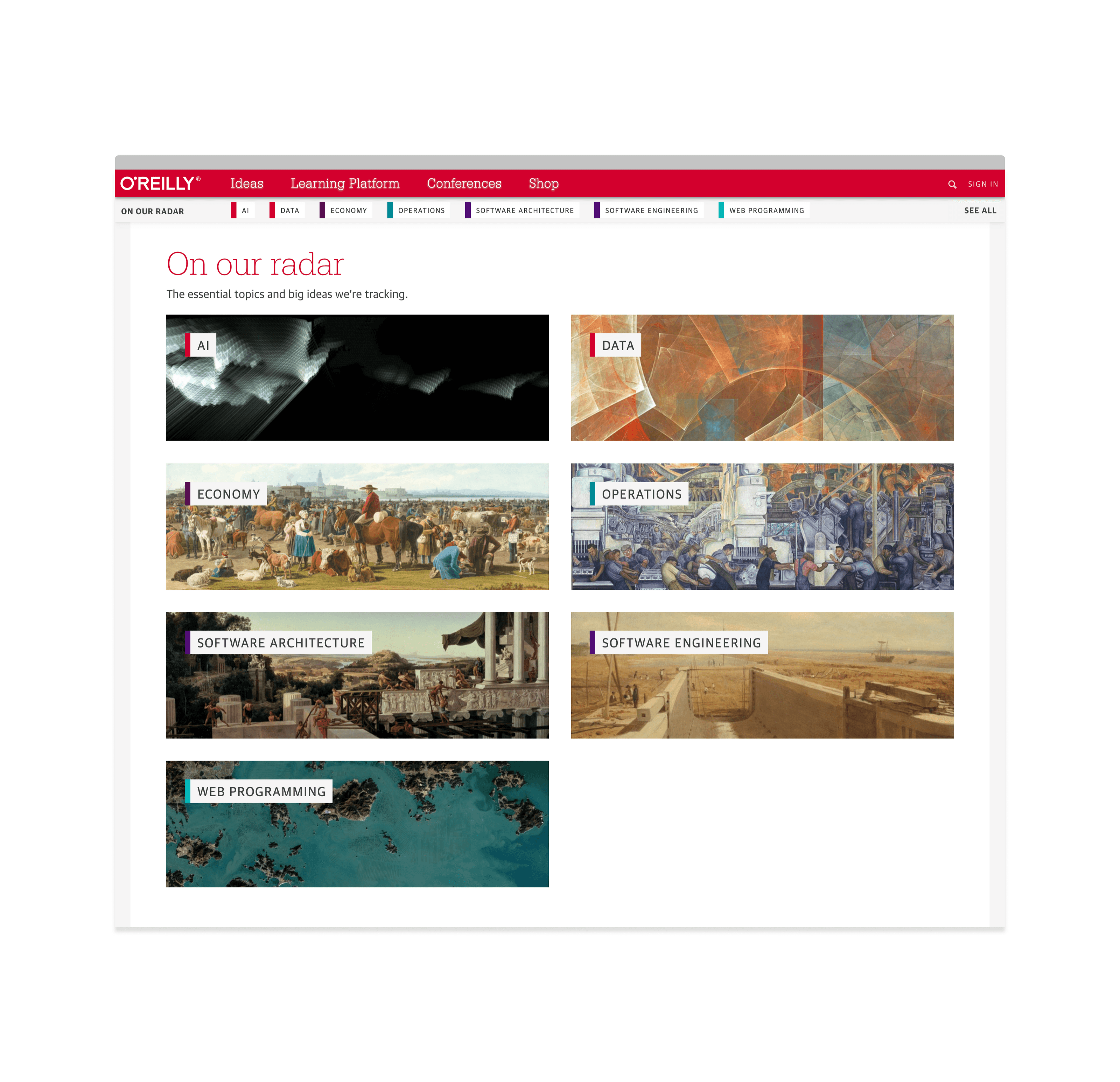
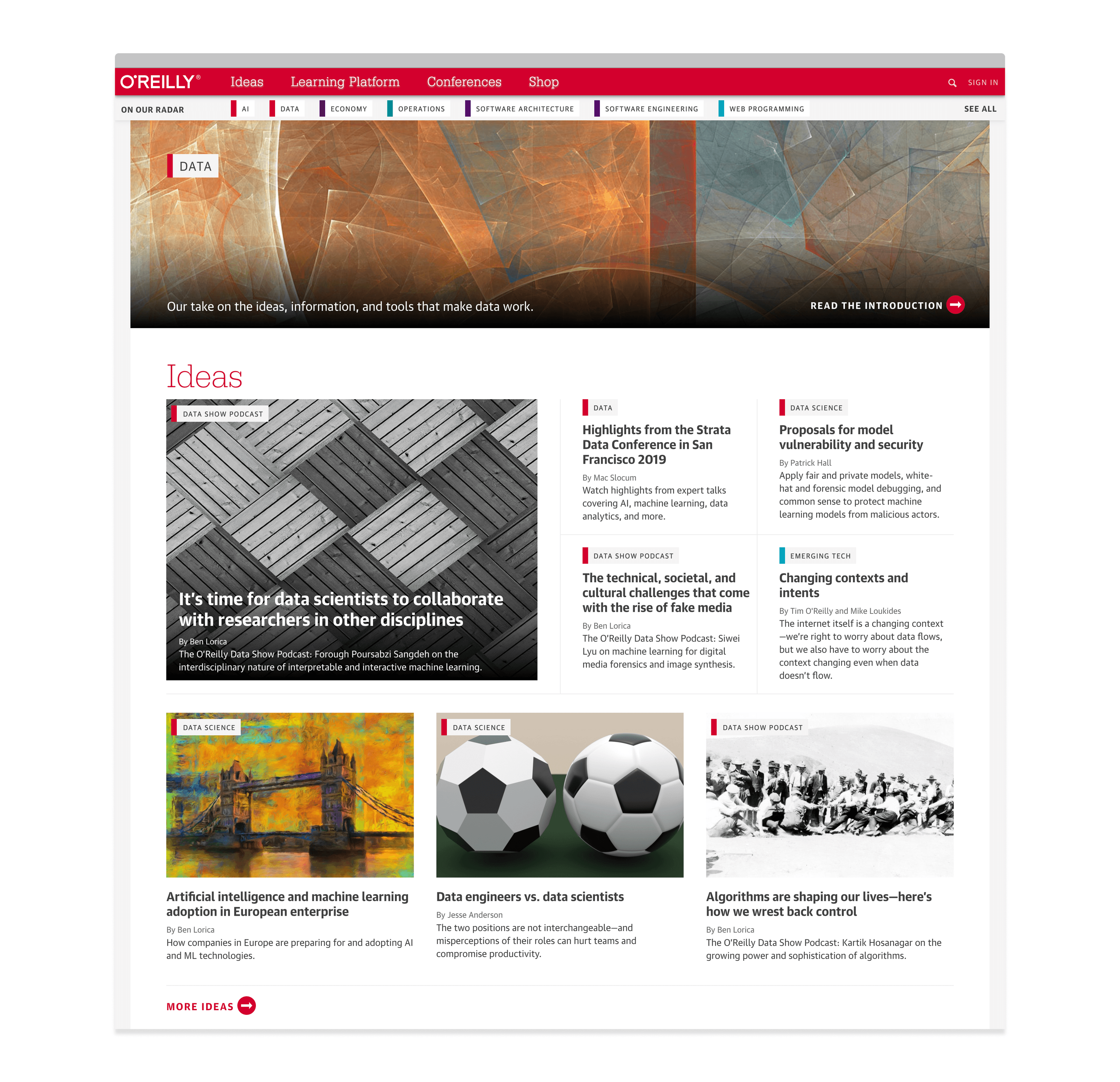
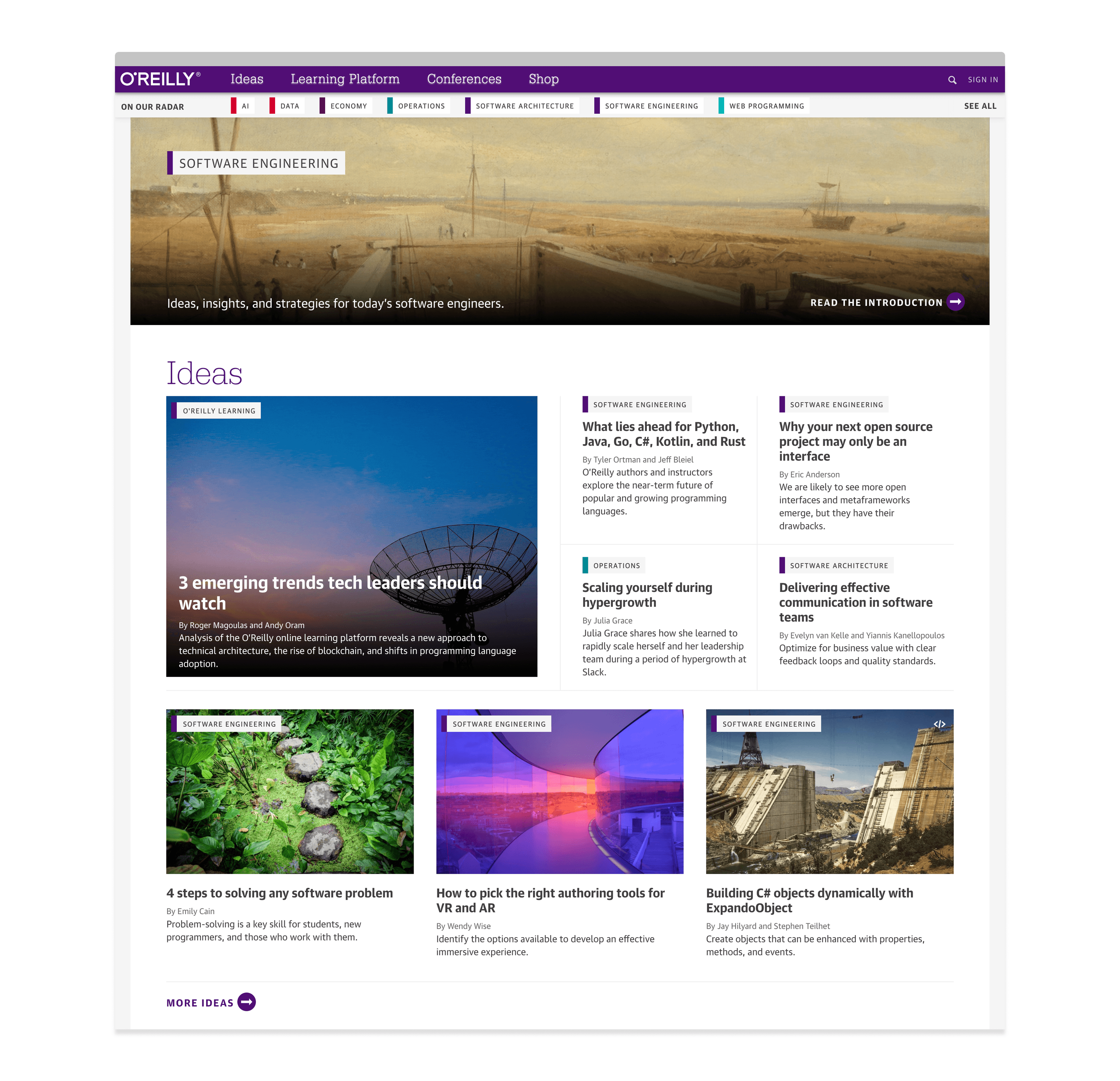
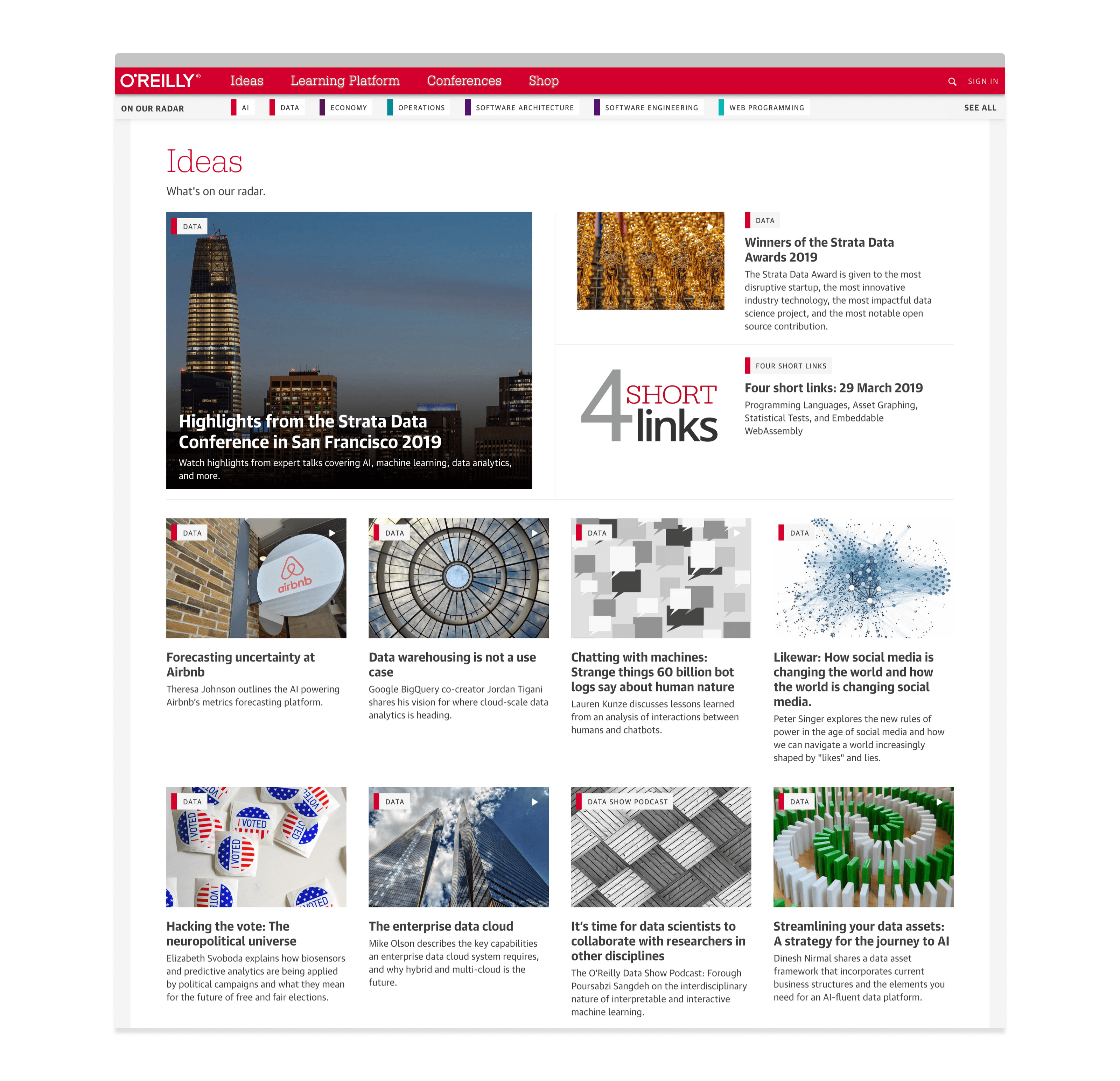
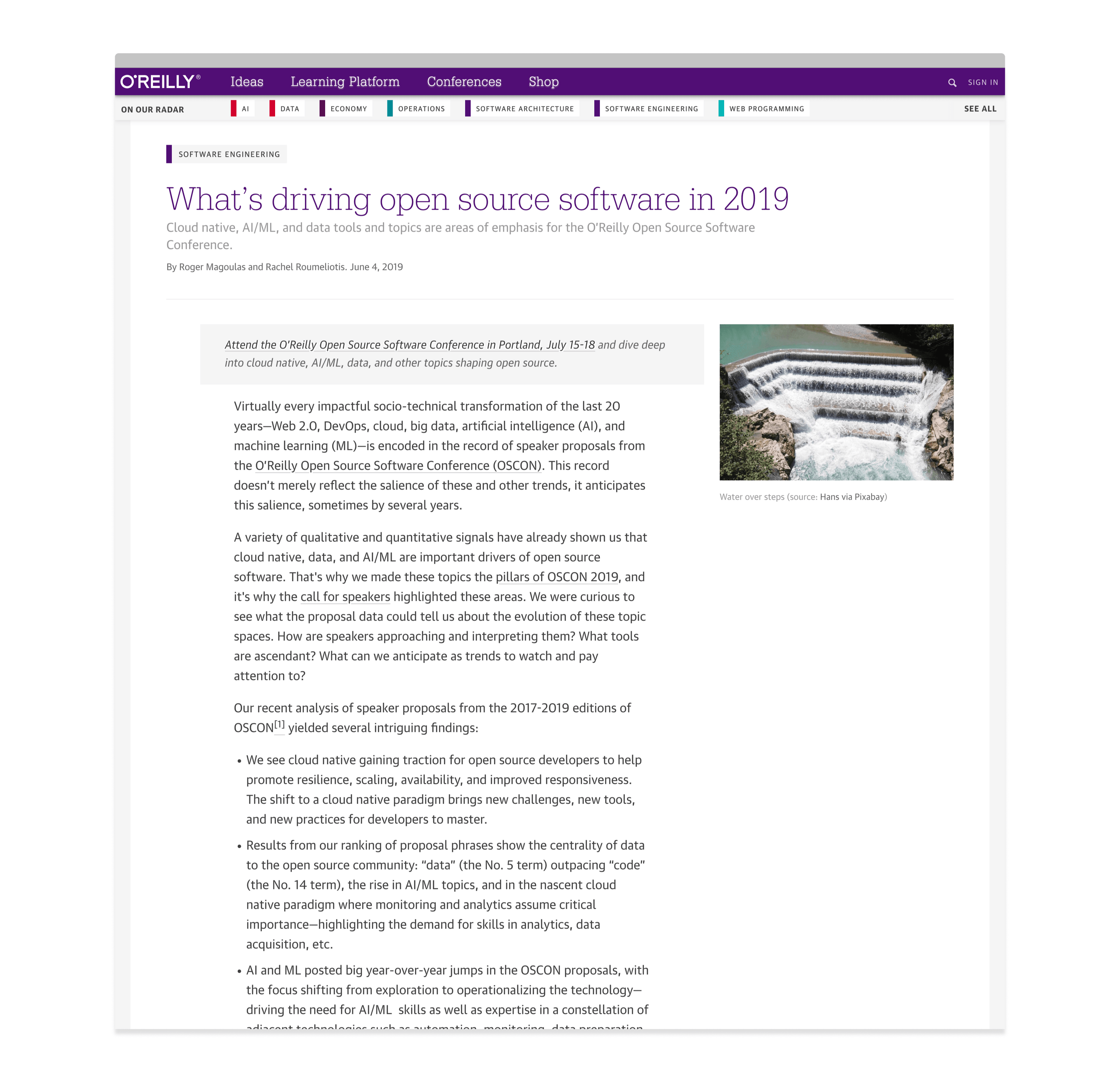


A redesign of a website from 1997 with millions of weekly users is not a simple matter. The lack of a central design repository had resulted in code duplication across a range of legacy systems, each responsible for a subset of the website. These systems had their own metadata handling and no external API’s, which made it near impossible to use their data on other parts of the platform. This also caused major inconsistencies between different sections, both in the visual design and interaction patterns.
The system translated the new visual language to a set of reusable components to be distributed in a centralized package.
The first major milestone was to translate the new visual language to a set of reusable components to be distributed in a centralized package. We opted for a low-tech setup, using Handlebars.js templates that could be used by both a server (Python, Go, Ruby, Node, etc) and in a web client via Backbone.js. With a simple import statement, teams were now able to use the new colors, typography, navigation and layout structures in their applications. We created a data-extraction task and an API gateway to collect, shape and expose data from the legacy systems in a common endpoint. On top of this, we created a new backend CMS to curate this data for use on the new website. The website itself is served by a new web server written in Go to support massive traffic loads with impressively low latency while keeping a small server footprint. We also created a custom analytics dashboard for editors to evaluate the success of their content and executives to evaluate the overall success of the platform.
The result is a fast and responsive website that reflects the values of the brand and supports the needs of the business without having to wait for substantial changes to backend legacy systems.
New Learning Products
In early 2016, we began a research project focused on new ways of reaching O’Reilly’s audience through the new website. Most tutorials on oreilly.com used a single medium —often text or video— to explain technical concepts. Although this content is popular, these formats can be problematic because the learner is required to go through a complicated installation process on their own computer before a line of code can be written. O’Reilly had already solved this problem at their conferences where attendees receive ready-to-go virtual environments to start coding immediately. The goal of the project was to emulate this experience on the web.
The result was Oriole, a unique new medium that blends code, text, and video into a narrated learning experience with executable content. Led by some of the most brilliant minds in technology, each lesson is an easily digestible and engaging thought-by-thought tour of the instructor’s approach to the problem in both narrative and executable code. Users can write and execute code directly in the interface, and it requires nothing more than a browser and an internet connection.
We created the Oriole interface with React.js, the Kaltura library for controlling videos in real-time via JavaScript, and a custom JavaScript library for executing code in a cluster of Jupyter notebooks directly from a browser. This library sends the code over a socket, executes the code on a Jupyter kernel, and sends any output or error messages back through the socket connection. This allows developers to create fully customized experiences on top of the Jupyter framework.
Safari Design Systems
When the online learning platform Safari became a wholly owned subsidiary of O’Reilly Media in 2014, Tim O’Reilly wrote that “there are substantial opportunities for both organizations working much more closely together”. After several years as a separate entity, Safari was embraced as an extension of the O’Reilly brand in 2017, which had to be reflected in the look and feel. At the same time, Safari was eager to transition from a waterfall process with little interaction between designers and engineers to a more collaborative process centered around a solid design system.
Over four months, we worked with an internal team at O’Reilly to create a new design system and a documentation site with resources and best practices for using the components. We also helped establish a team of designers and engineers responsible for the continued development of the design system, as well as a workflow where designers are directly involved in the development efforts of the components.
The core of the design system is a set of composable React.js components that also bundle into a stand-alone CSS file for use in simpler client applications. The documentation site is generated directly from the React.js source where a component’s PropTypes and inline comments are parsed into a readable structure and used to generate a static site for the component. With the design system also comes a separate project generator script similar to create-react-app, making it effortless to spin up a new application set up with the design system. Projects generated with the tool automatically have a streamlined development environment, server-side component rendering, and a mock API for data loading. This not only allows designers and developers to quickly prototype new ideas, it also saves significant time during deployment since every project is generated with the plumbing needed to run on Safari’s Kubernetes production setup.
