The Coding Train needed a new visual identity and website built around its increasingly complex needs, where creators and members aren’t forced to fit their vision into the constraints of the YouTube interface. As long standing believers in The Coding Train’s mission, we helped design and build this new home for Daniel Shiffman and his community.
The new visual identity for The Coding Train.
Sometimes you have to build your own corner of the internet
The Coding Train is an active community built around a YouTube channel in which Daniel Shiffman, an infectious delight of a human, teaches programming for all. Any potential drudgery of coding is diffused through Dan’s signature energy-bomb style, emboldening even fledgling coders to keep at it. Many of the channel’s subscribers, who number well over a million, interact with Dan in the comments as one would a goofy old friend. The Coding Train’s approachable, no-one-left-behind teaching philosophy made YouTube an attractive tool for carving out its uplifting home on the internet. The platform has afforded the serious level of accessibility required to pull off the community’s ambition to welcome any learner to experiment with code as a form of self-expression.

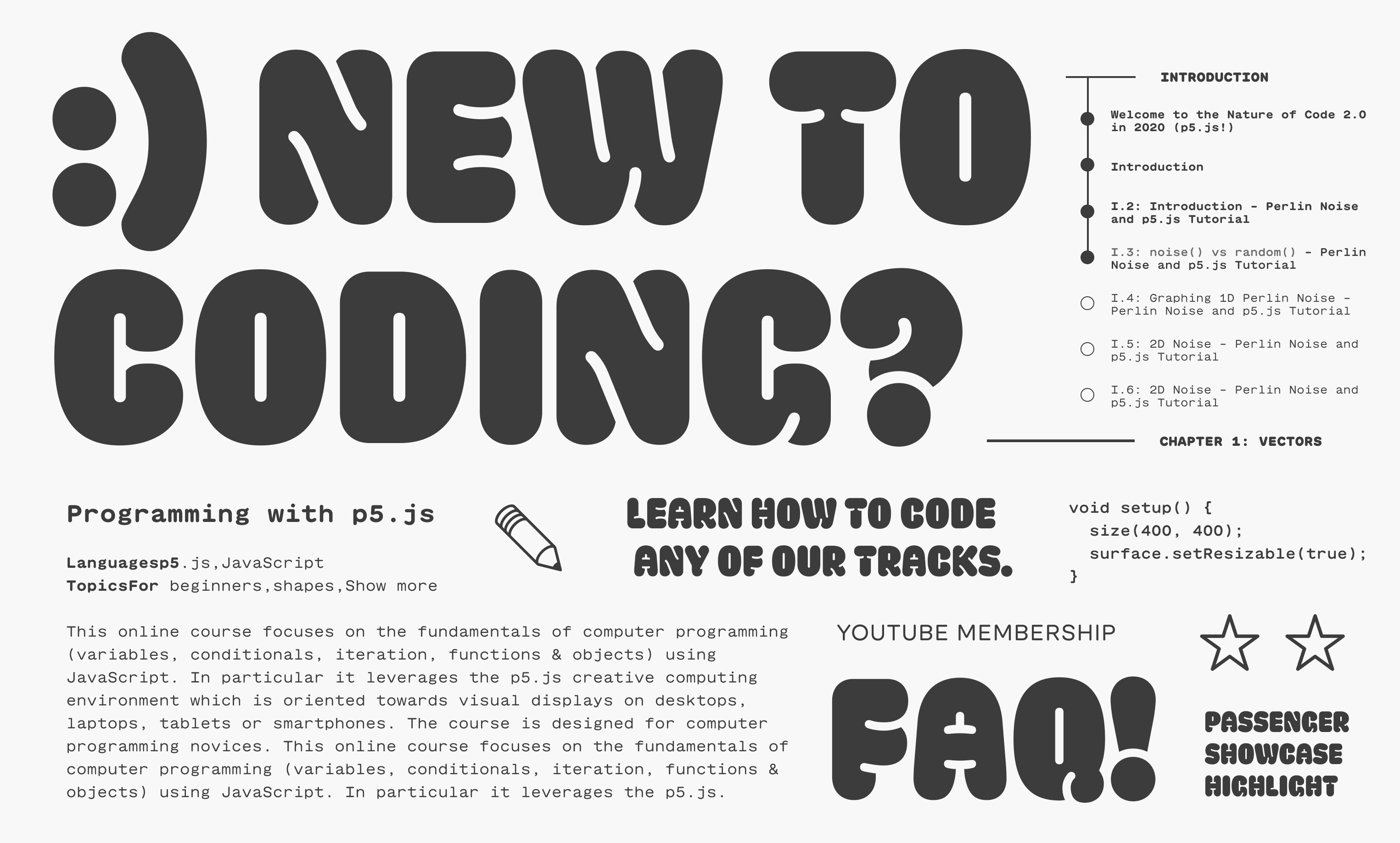
The typography and colors reference the vibrant identity to signal playfulness and accessibility to all users.


Character illustrations by Jason Heglund
Upon starting this project, it quickly became clear to us that the very ubiquity and ease of use that made YouTube an ideal place to build a community could also be limitations to that community’s development. Most fundamentally, the platform limitations affected one of the community’s most cherished assets: its library. Much of The Coding Train’s knowledge is contained in Dan’s videos, which include one-off challenges, sequential lessons, and additional content encompassing several different programming languages. On YouTube, the videos could only be organized into simple playlists. And Matryoshkas of playlists within playlists within playlists.
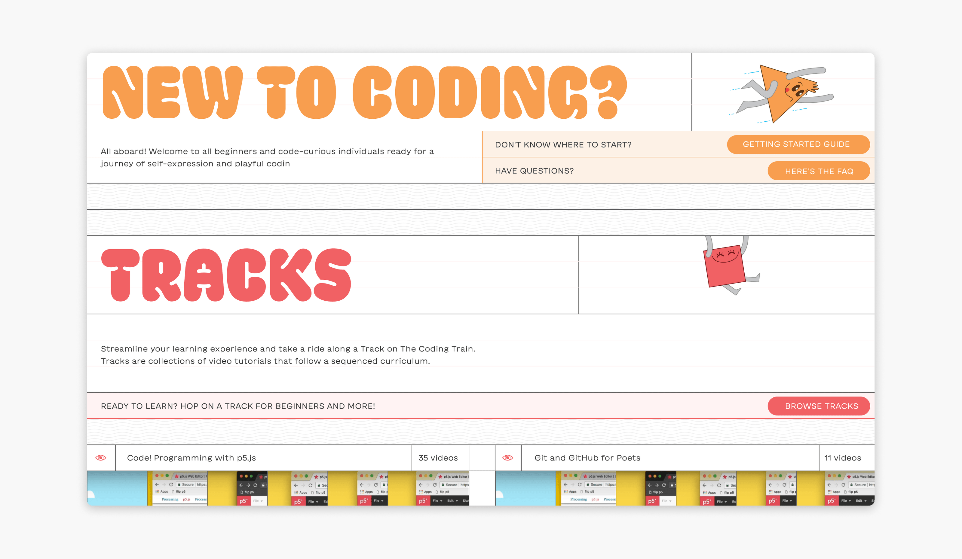
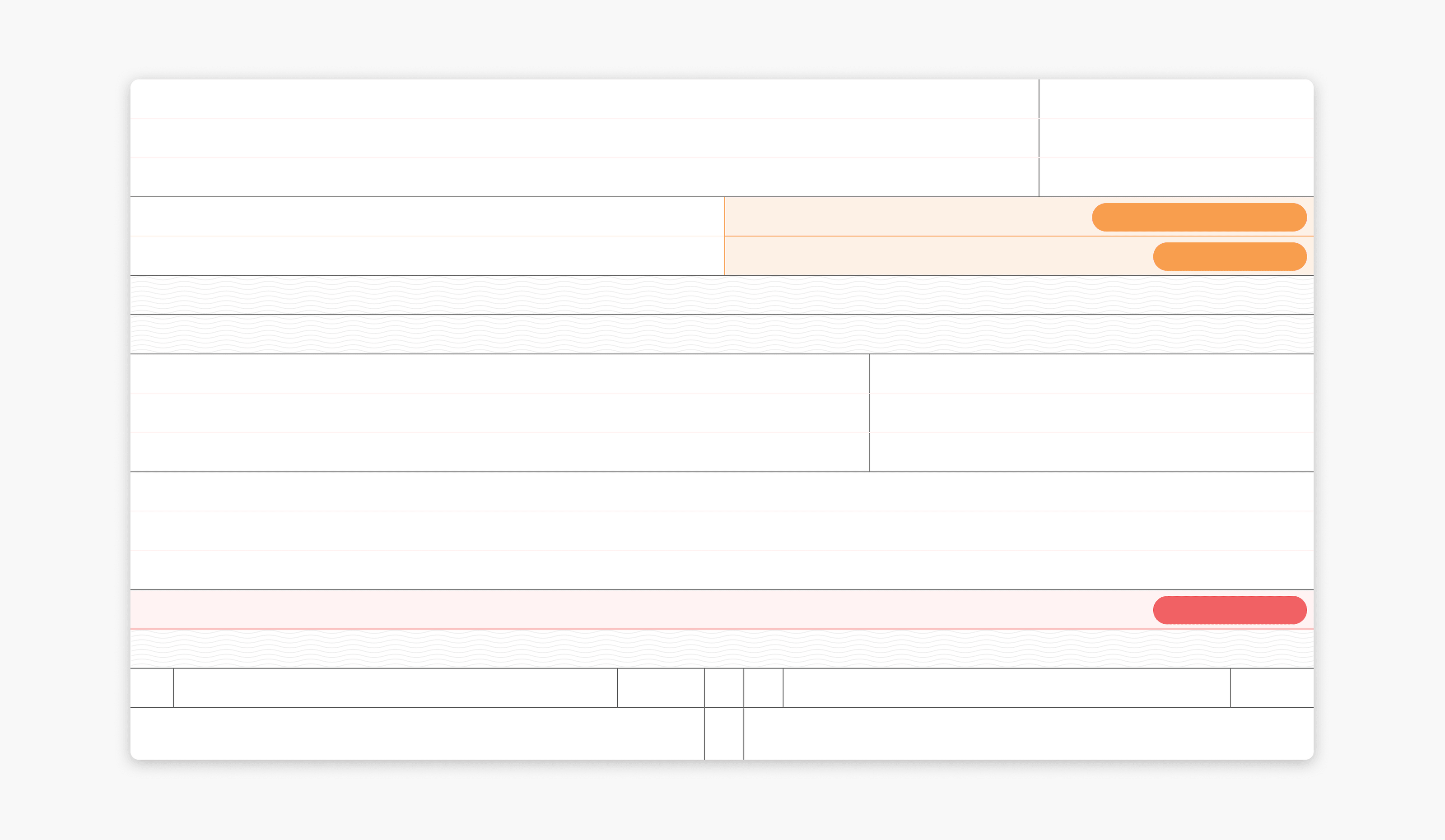
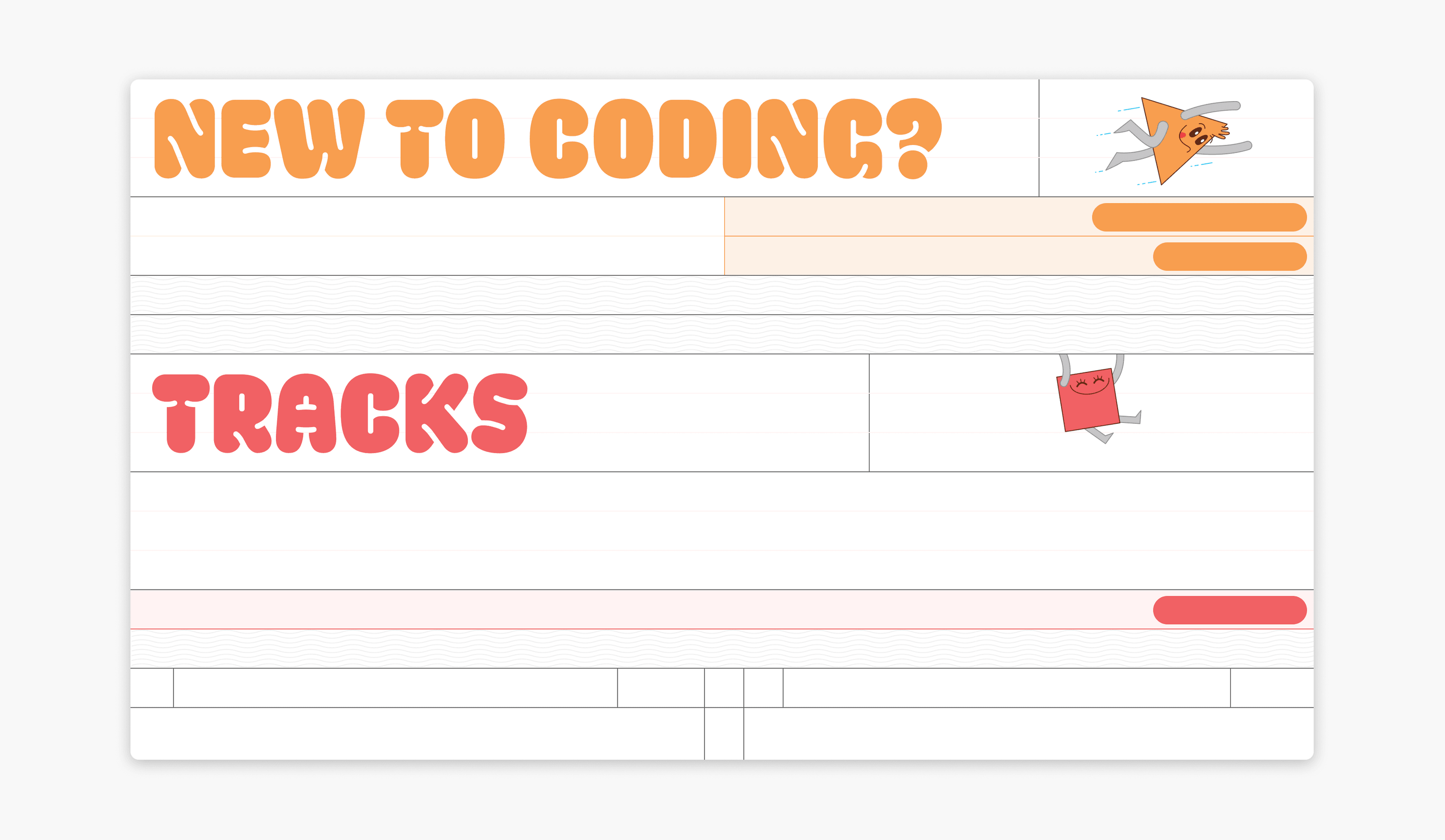


Just as a train ticket uses a horizontal grid to organize travel information, we built out the page layouts in a horizontal grid format containing buttons, headings, text, and images .
The community’s former site mirrored this structure, meaning that no matter where users went to seek out their coding teacher, the abundance of tutorials would not be organized in their favor. Our first step was to examine the hundreds of preexisting Coding Train videos to create a content hierarchy native to the community. This layer of information design was necessary to prioritize the learning experience and make the most of the incredible material the community already has, even before considering visuals.
Not the content, but the way it’s organized
Because The Coding Train is already an extremely successful community, we needed to design an organizational system retrofit around the existing content. Taking inspiration from The Coding Train itself, the videos are now housed in the website under individual “tracks,” which are linear courses on particular topics. They sit in a separate category from “challenges,” in which Dan pushes community members to apply their new skills alongside him.
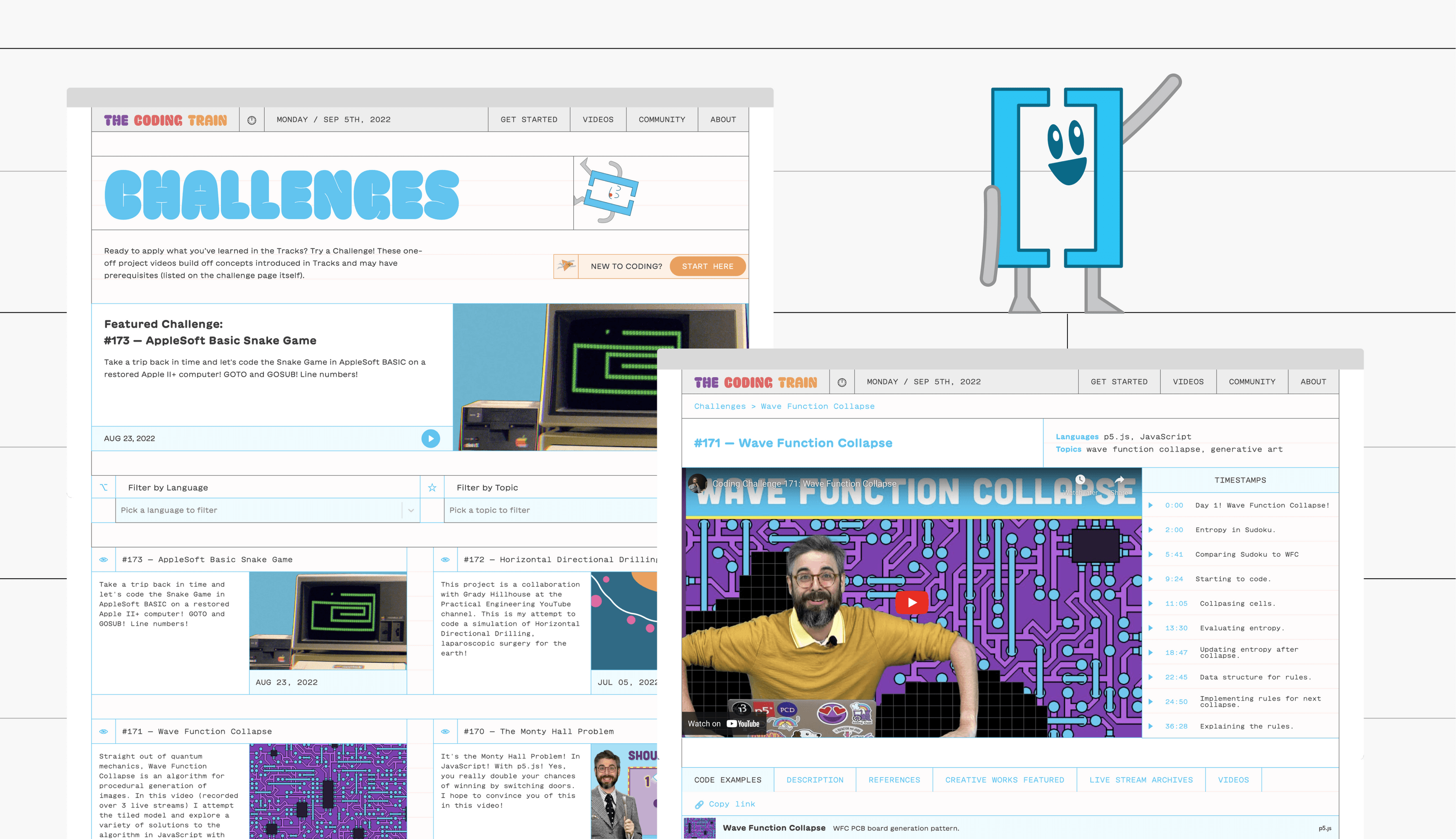
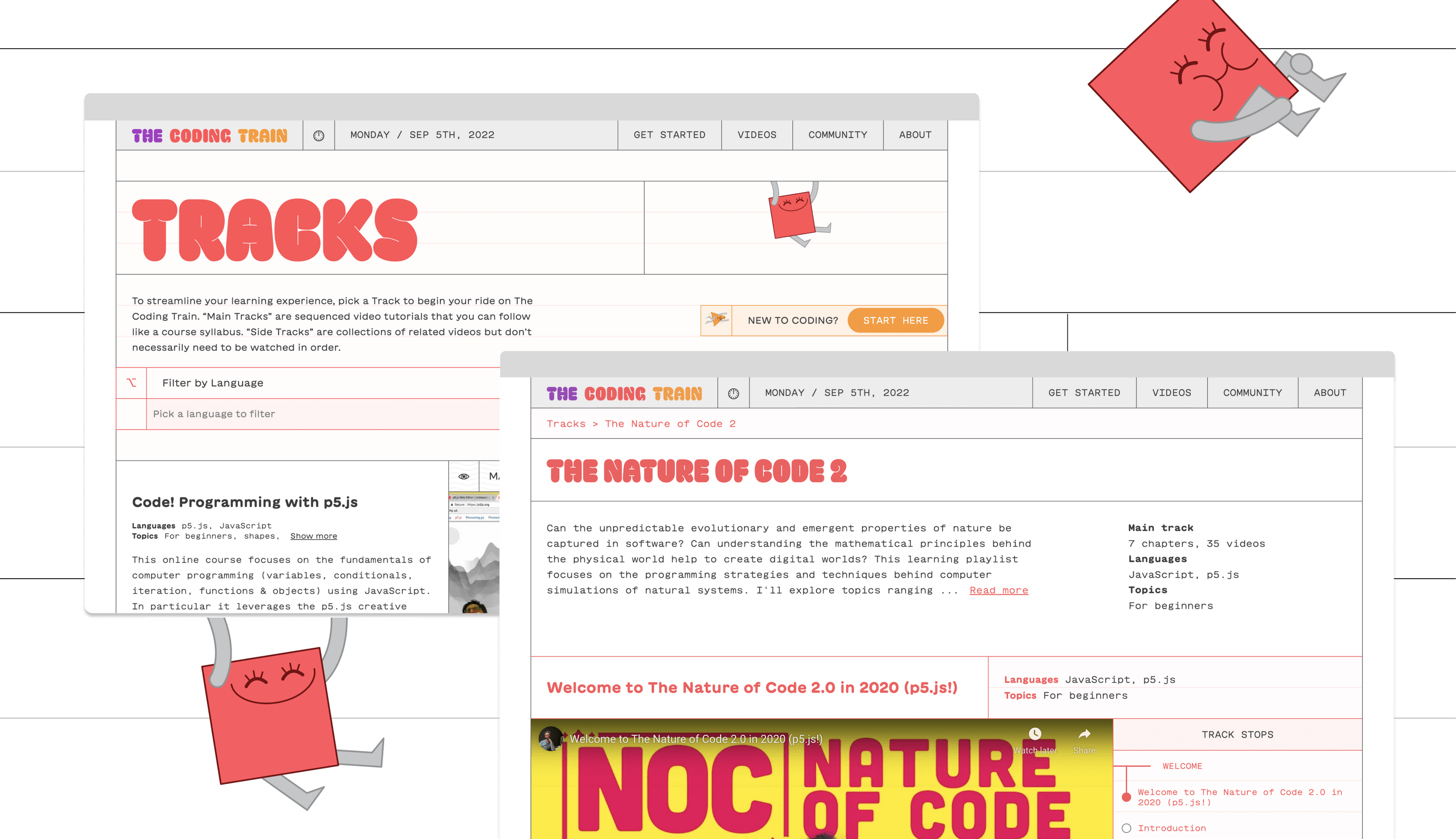
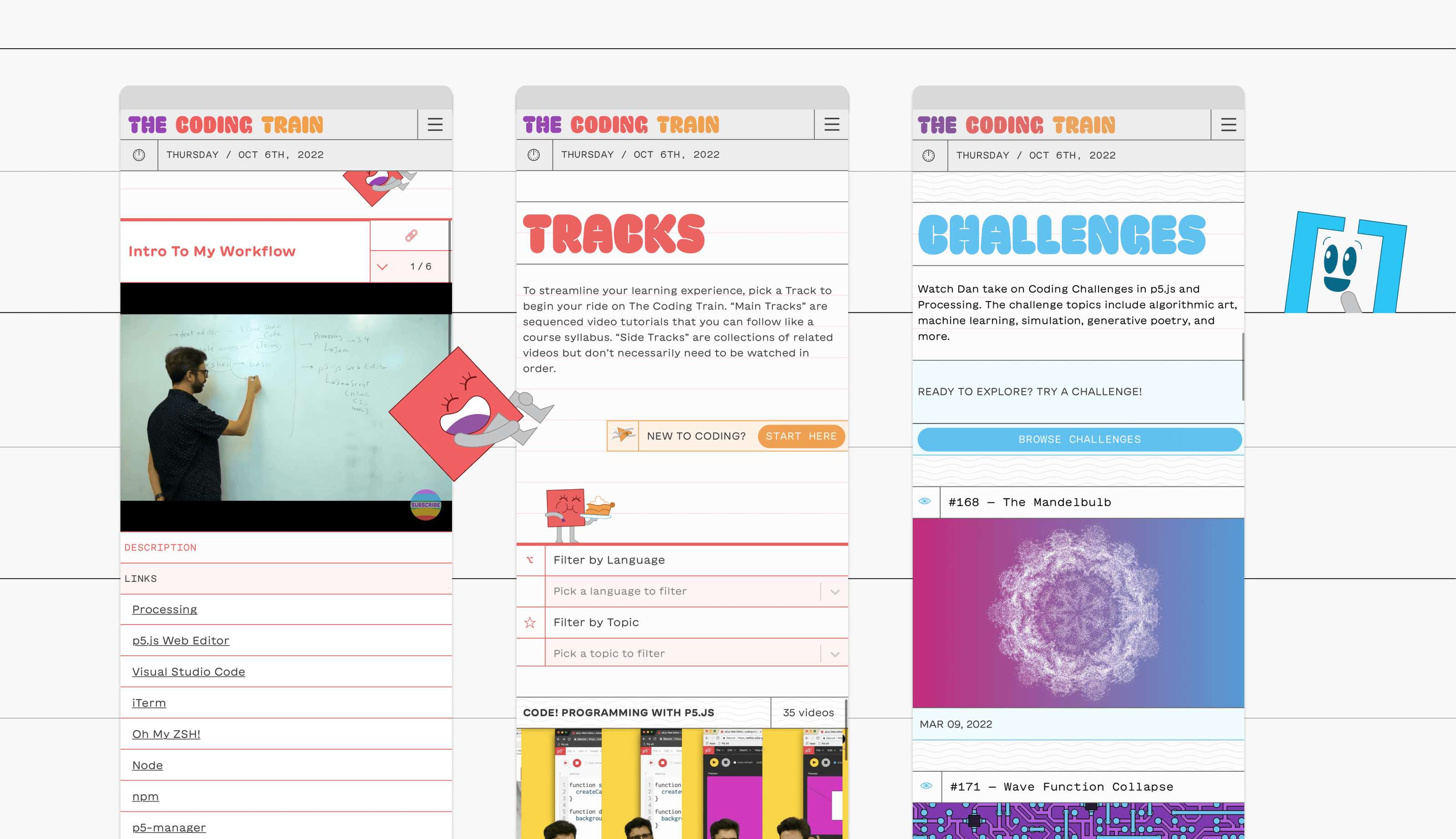


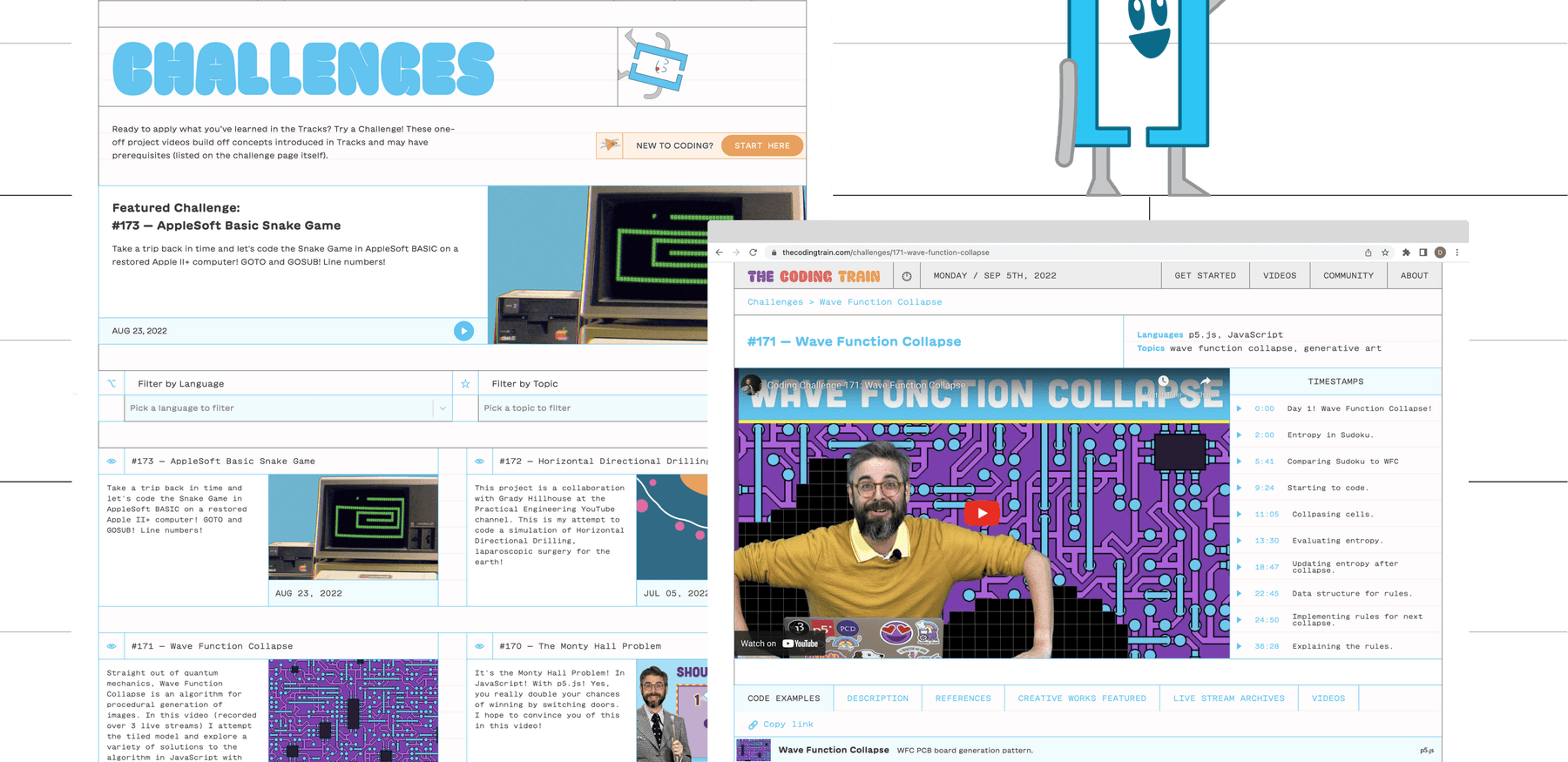
Tracks and Challenges are the two main categories on the website.
Tracks are accessed easily through the main menu hierarchy and can be additionally filtered by topic. Videos play alongside graphic “track stop” tickers, giving learners visual feedback as they progress through the lessons, and providing a clickable overview of the whole course. Tidy tabs below the player organize additional references and examples that could otherwise only be found in the YouTube description box. Using the community’s encouraging language, we also built out a “get started” page for new coders and gave it a dedicated button in the main navigation. Before even diving into the site, new users and longtime members alike are met with a delightfully fuss-free guide to riding The Coding Train.
The new website provides users with a variety of interactive tools.
Building space for the community
The new taxonomy was designed from the ground up with The Coding Train’s own community in mind and in designing the system, we saw another opportunity for encouraging community input. While Dan is the charming face at the helm of the videos, there are many other enthusiastic members who also contribute to the website. Putting their needs at the center, we chose to have the new site as an open source project hosted on GitHub, allowing any contributor to help add incoming videos from YouTube into the information system.
Because the code of the entire website is freely accessible, it turns the digital home of The Coding Train itself into a space in line with its teaching philosophy. In his videos, Dan approaches each problem, planned or otherwise, as a demonstrable learning opportunity. In the same way that Dan externalizes his problem-solving processes for the collective, the new website’s open source code provides any curious learner access to the guts of her online community’s home. The opportunity for learning this set-up provides is far more than a gesture; it’s part of an ethos that informs even the smallest building blocks for this project.
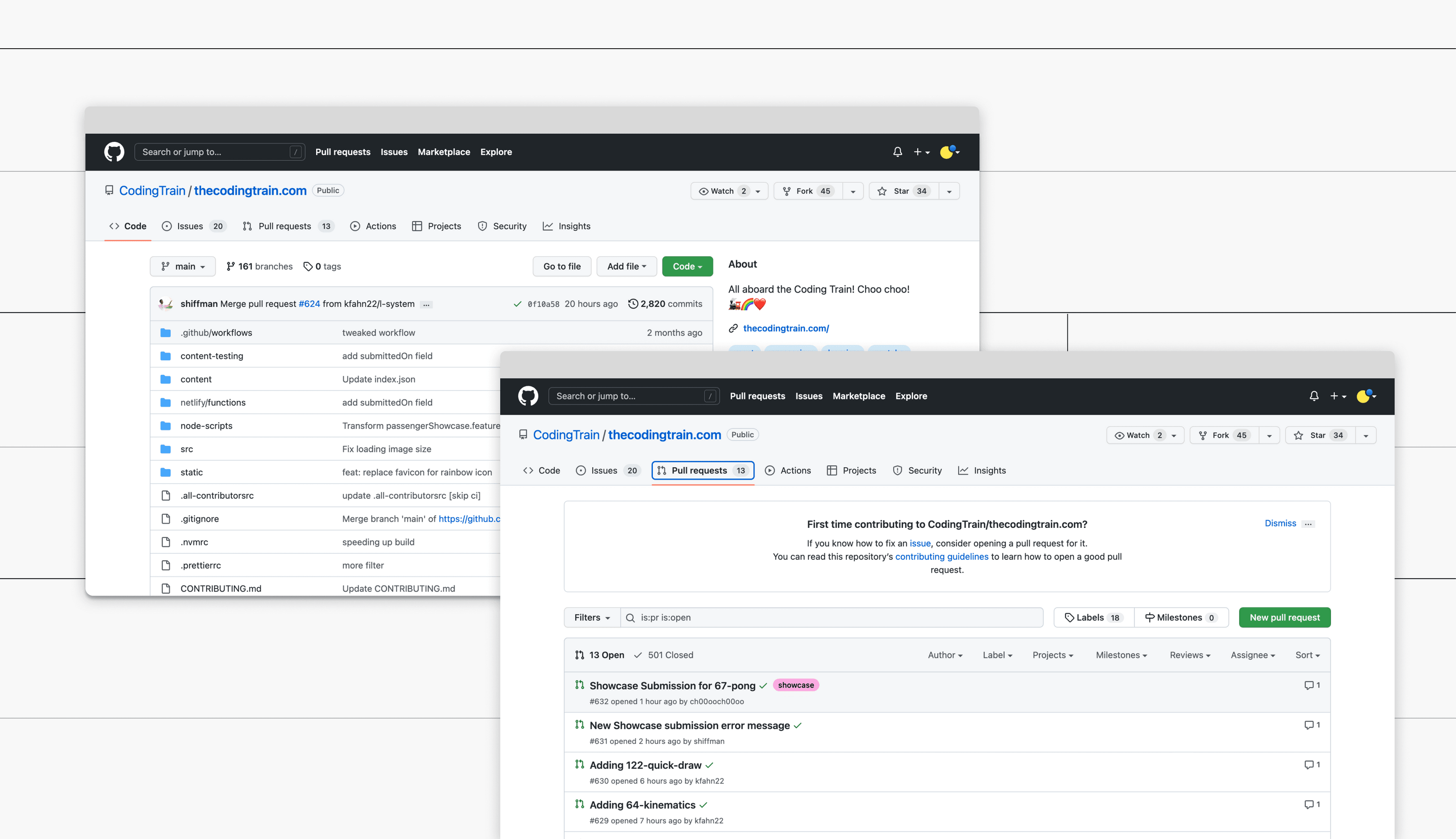
Hosting The Coding Train’s website in this format allowed us to implement an additional feature for community participation, which we’ve named the “passenger showcase.” The Coding Train has always encouraged community members to share their responses to various lessons and challenges with one another. However, in order to have one’s project included on the former website, one needed to learn how to submit a pull request through GitHub. The process was a big enough barrier for newer learners that the old website contained few community submissions.
Because the website is meant to act as a public square for sharing inspiration and information, we needed to figure out a sliding scale of participation, where passengers who aren’t quite ready to get their hands dirty on the website backend still have a chance to contribute. To accommodate this part of The Coding Train membership spectrum, we built out a simple submission form that automates the pull request process, allowing any user to quickly share their work with as much effort as making a social media post. Projects submitted through the form and pull requests are published to the passenger showcase gallery under the video to which they correspond. They’re found alongside additional outside resources, elevating these contributions to a position that reflects their importance to the community’s spirit. In recent Coding Train live streams, Dan goes through the latest passenger showcase items on the new site, and viewers on the YouTube channel have a chance to be inspired by their peers’ work and submit their own.
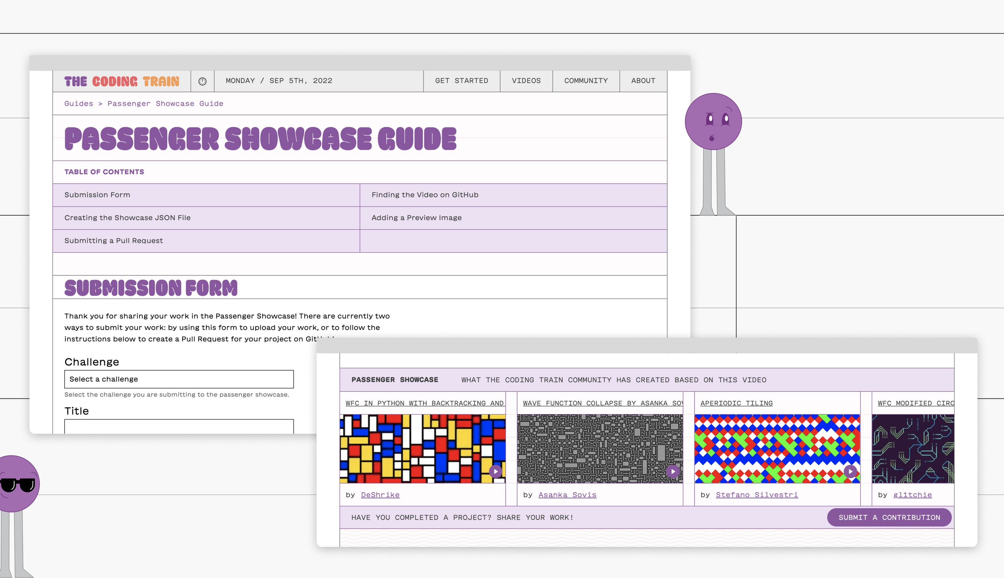
we built out a simple submission form that automates the pull request process, allowing any user to quickly share their work with as much effort as making a social media post.
A new house that already feels like home
The previous website of The Coding Train was playful and adventuresome, conveying the energy of the project through brightly colored buttons, an illustrated site-wide banner of beloved characters riding a rainbow-emitting train, and plenty of casual, welcoming language. However, the success of Dan’s videos is due in part to his ability to humbly demonstrate expertise alongside all the fun. In the website’s success of channeling the platform’s spirit, it also missed this important paradox, ultimately freezing the community in a permanent state of informality unable to convey its legitimate chops. It needed a visual identity to honor the creativity of coding without running the risk of seeming like a tool exclusively for children.
With a thriving community already in place, we needed to move delicately, developing a brand identity without creating something so new that it no longer felt like home. To do this, we chose to work within the visual language of the “train” around which the community is centered, researching the familiar layouts of train tickets as our starting point. Just as a train ticket uses a horizontal grid to organize travel information, we built out the page layouts in a horizontal grid format containing buttons, headings, text, and images. The presence of the grid is flexible but consistent, running in a system of 50px increments through each page of the site. The horizontal system stands out from typical vertical column-based web design and allows this top layer of branding to exist in seamless visual communication with the native content taxonomy we created.
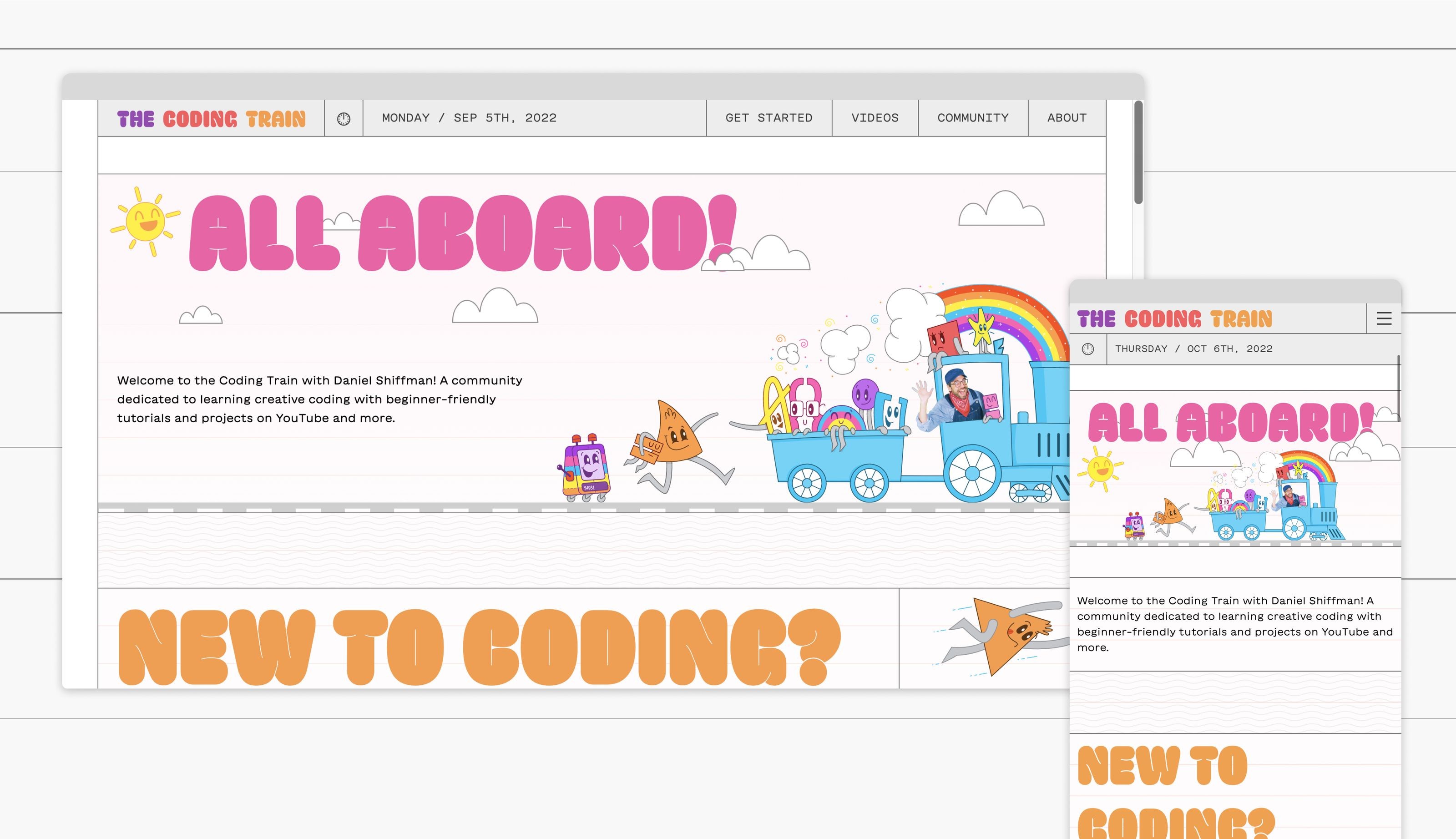
The new website for The Coding Train.
Working within the grid as the systemic base, we focused on bringing the vibrant Coding Train identity back into view. We pared back the preexisting color usage to a smaller, cohesive palette in a homogenous tonal range. The palette is still invitingly bright, but predictable enough to build some brand association for the community, and is now utilized even more frequently throughout the site. Using language that matches the fun of community videos, body text is written in a more expressive version of the type of monospace font used in programming. Headings are given a colorful balloon font – GT Maru by Grilli Type – that imbues each page with a bit of playfulness. The lovable Coding Train characters, which represent various programming commands and symbols, were a non-negotiable for the community and for us. We worked with the illustrator Jason Heglund to increase their presence throughout the new website. The existing characters are now rendered within the consolidated Coding Train color palette, interact with the grid system, and react alongside the rest of the site to changes in window size.
The internet is a powerful tool with which a community like The Coding Train can do a lot. Even on a platform like YouTube, which is full of other creators and tutorials, The Coding Train’s magnetism built a community of almost a million and a half global learners. But making the unmodified internet “work” comes at the price of certain user needs, which differ so vastly among communities that one platform couldn’t reasonably serve them all. It’s in these cases the aim should be to build not just a functional website or recognizable brand, but a true home for a group of users. A group as special as The Coding Train deserved a system equally willing to break convention in the name of creative fun.
