The ask
UNIT is a global consultancy specializing in innovation and strategic design with a focus on imagining futures, building teams, and enabling collaborative innovation ecosystems. Partnering with the leadership at UNIT and Ritmo Media, we set out to design a visual identity with two main goals: highlight their impactful strategies to generate change through a bold and recognizable visual language, and create a system that empowers easy adoption by their entire team.
What we did
We developed a visual language to help UNIT stand out in the landscape of service design. The new brand strategy presented three main pillars: the Audacity to create change, Working methods that strive for Excellence, and the Ability to Imagine a new future – making UNIT bold and smart with a face toward the future.
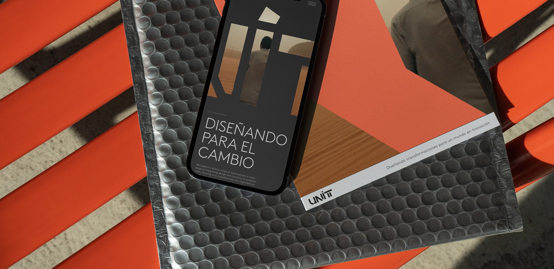
Along with bringing the ethos of the company to life, the visual identity needed to prepare UNIT for the next 5 years of growth. To do this, we created a scalable system that extended across all touchpoints, including websites, proposals, work documents, presentations, social media content, and new ventures. The system is robust enough to handle a wide variety of use cases yet simple enough to be easily adopted by the entire UNIT team, all building from a unique and memorable logo mark.
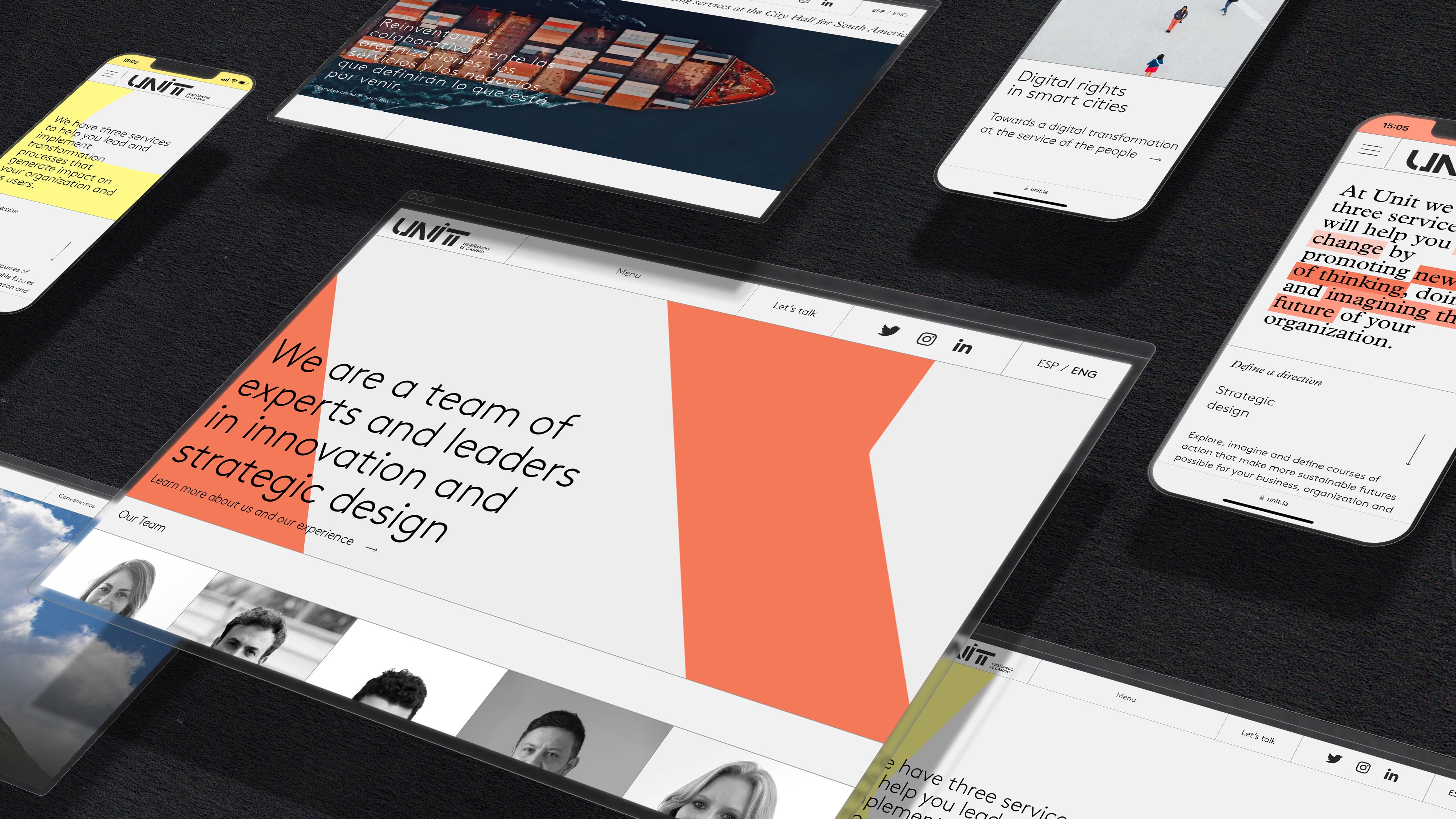
The logo, colors, and typography all support UNIT’s new form of service design: solving the complex challenges of today's organizations while staying ambitious, aspirational, and approachable. To do this, we chose to create a solid new look, divorced from current trends or old-fashioned service design that would stand on its own for the years to come.
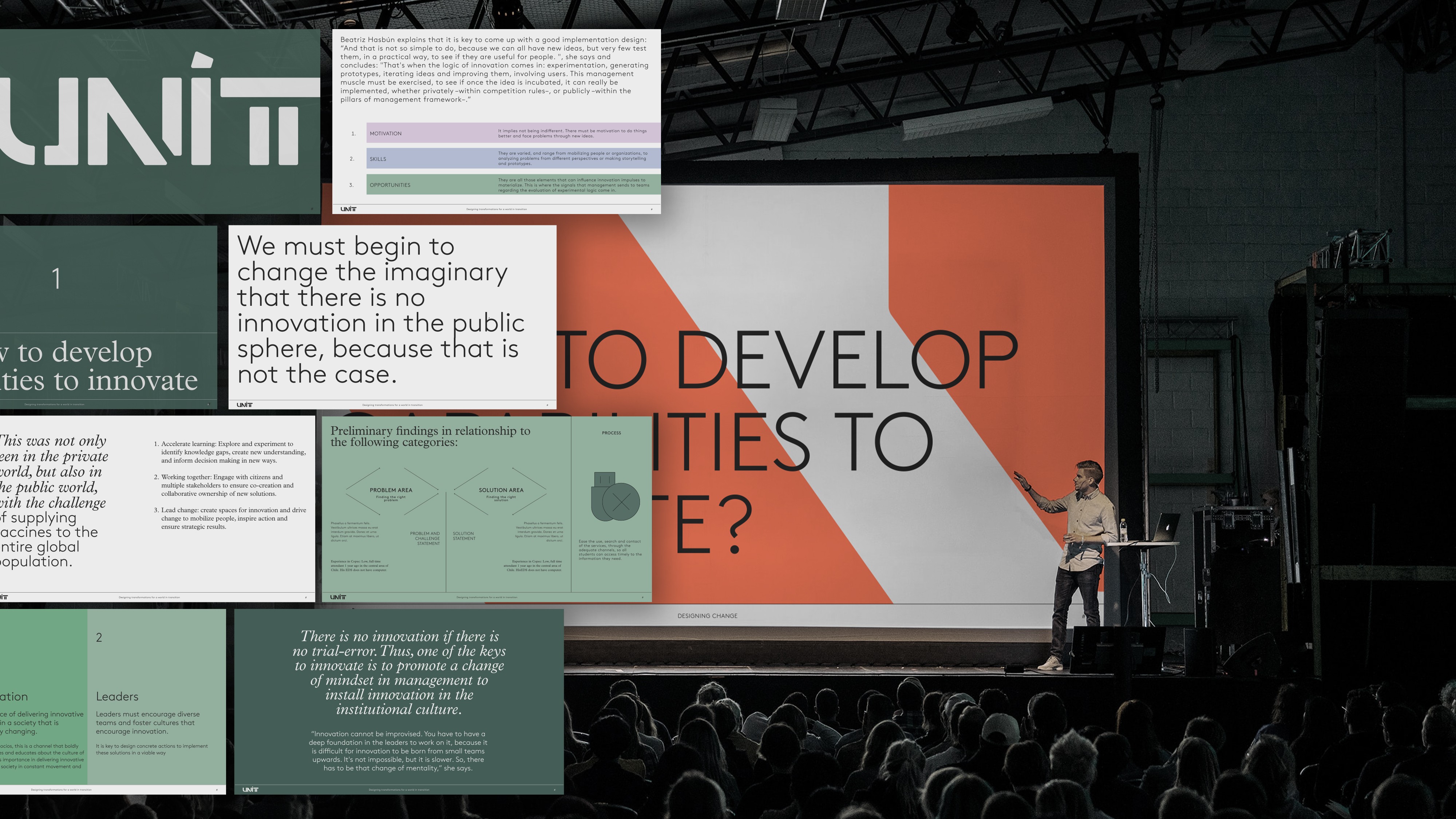
A sample of slides built with the system.
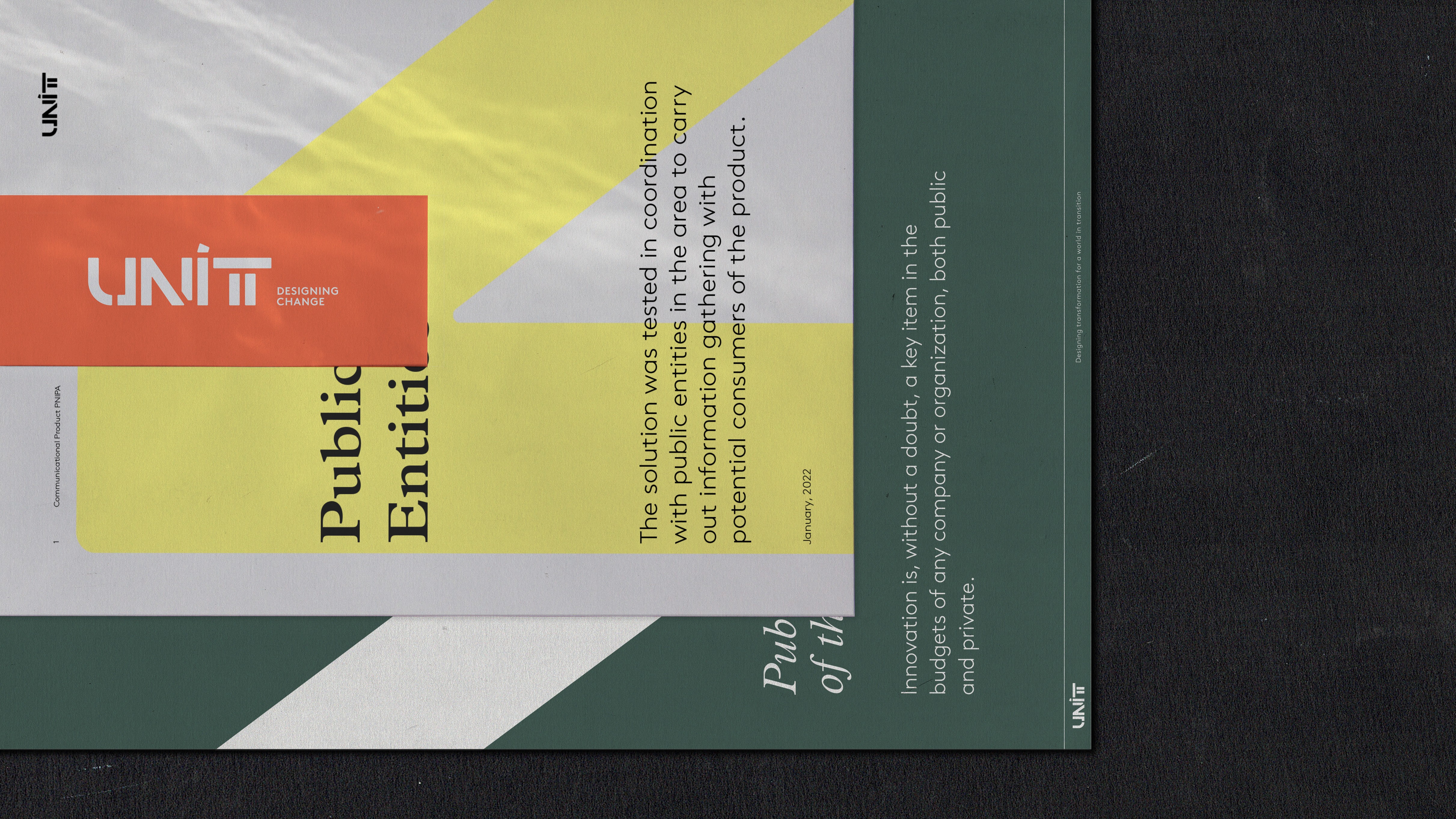
Set of documents using UNIT's branding.
Technical breakdown
The logo is the key organizing element of the system, with each of the letters in the word UNIT built from blocks – constructive units. With its combination of straight and curved elements, the letter U emphasizes the alliance of predictable systems with the humanistic aspect of modern service design while the final T resembles an architectural column representing stability and a long-term vision. The wordmark combines elements of uppercase and lowercase, adding a factor of tension and surprise. In every letter, the blocks and the cuts that separate them have a consistent thickness – evoking unity and precision.
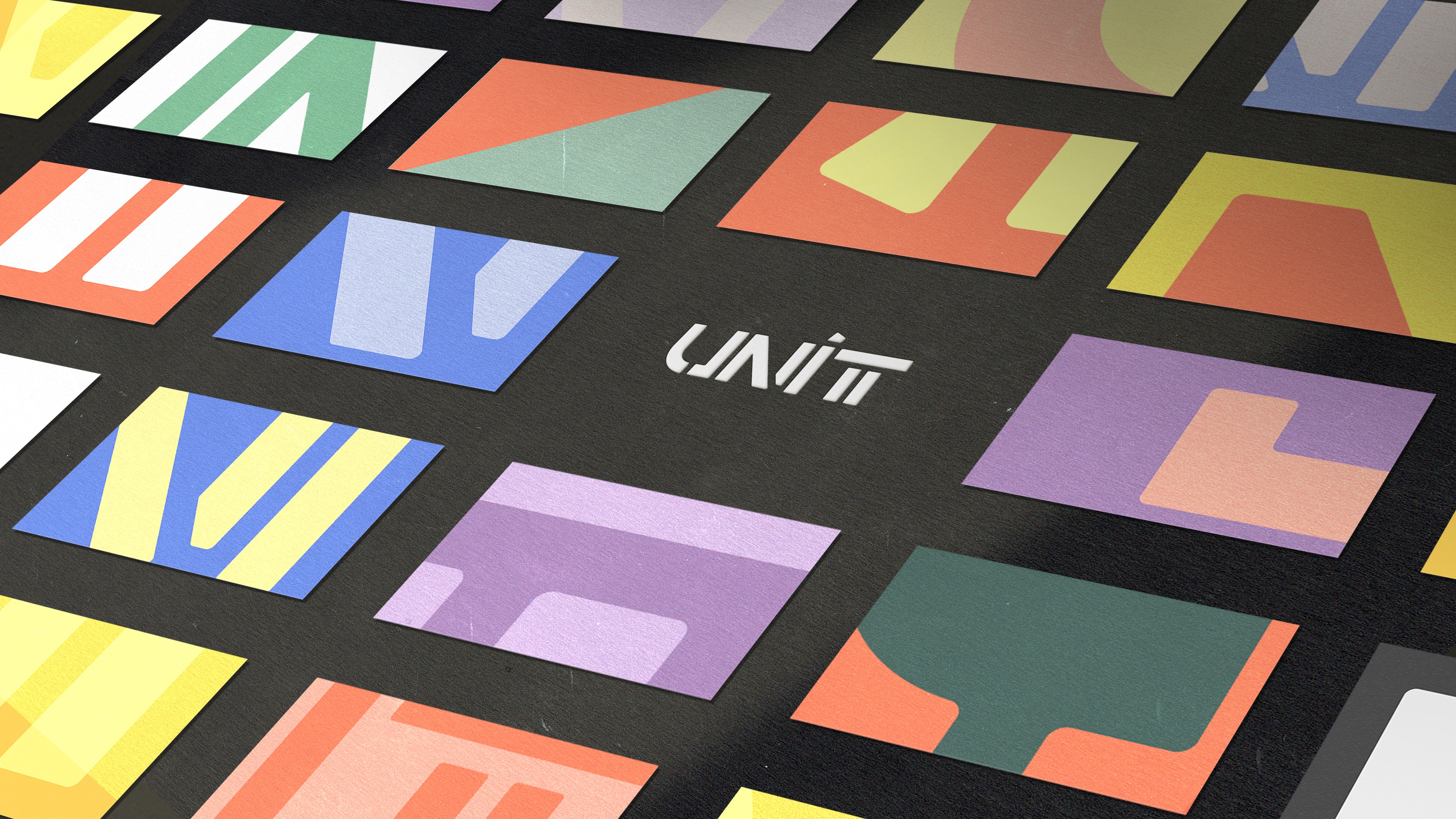
The core idea of the visual system lies within the logo – the zooming and cropping of it create the visual background for UNIT. Using the letter shapes as color fills or as a mask for images provides a multiplicity of compositions for content. With this principle, we created a custom design tool that is used across UNIT’s teams to create base layouts for their slides and other graphic needs, allowing them to generate random variations to play and explore the possibilities and customize them to fit their specific needs.
Finally, we created an extension of the system that provides greater flexibility for use in social media, providing more variety and space for expression while still being consistent with the core UNIT identity.
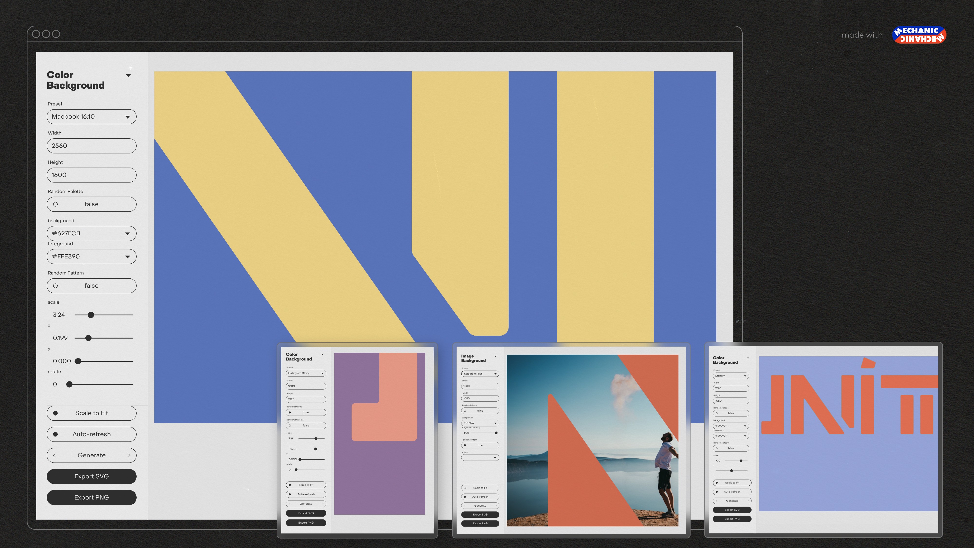
Different outputs of the design tool: slide background, Instagram story, and Instagram posts.
